Many thanks to everyone who entered Character Contest 45 - The Kirby Train. Before getting to the fun stuff, I have a bit of bad news to report -- the following entries were not considered for stated reasons. I feel particularly bad for those with multiple entries like kyle and venomfang666, but the state of my internet connection just doesn't allow me to process characters that are not directly downloadable from the link. In some cases, I could see from the name that the character wouldn't qualify, as they were supposed to be a color and a mode of transport.
The number in parenthesis is the comment number on the original thread.
- Galactic Ketchup (9) - bad link
- ajw (11) - not a mode of transport
- DANIEL ENGLAND (12) Bad link, and "ding thing" has neither a color nor a mode of transport
- Neon Sequitur (18) Bad link
- kyle (36, 96, 138) - bad link (imageshack)
- TJ (52) - bad link (photobucket)
- Hanna (62) - bad link (imageshack)
- Galahad (102, 104) - not a mode of transport
- venomfang666 (109, 119, 121, 130) - bad link (photobucket)
- abominal401 (110) - "Mystery Crimson" not a mode of transport
- Grip (141) - no color ("Ice Skater" -- ice isn't a color)
- Grip (148) - "Trance" is neither a color nor a mode of transport
Since most of these are bad links, here's how to get good ones.
Most of the time the bad link is from copying the URL in the address bar of your browser, but that won't work for right-clicking on the link and saving the image directly because it usually has some other bits of data in it for you, the image creator, that no one else can use. If it has something like "?action=rotate" in the address, then it's useless to me.
PhotoBucket: PhotoBucket puts a big giant box over on the left side of the image screen labeled "Share this image". You want the link in the "Direct Link" box. That goes directly to your image without all the other PhotoBucket crap loading around it.
- Bad link: http://s742.photobucket.com/albums/xx70/celticdragon79/?action=view¤t=brownhornet.jpg
- Good link: http://i742.photobucket.com/albums/xx70/celticdragon79/brownhornet.jpg
ImageShack: ImageShack has a set of boxes on the right side of the image viewer screen. In the one called "Links to Share This Image", you want the one labeled "Direct".
- Bad link: http://img195.imageshack.us/f/hannascarlettchopperpng.png/
- Good link: http://img195.imageshack.us/img195/817/hannascarlettchopperpng.png
Those are the two major culprits, hopefully that will help for next time; I'm sorry I wasn't able to use your entries this week.
Now that we have the unpleasant bits out of the way, on to the happy news!
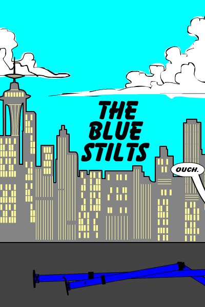
First, "Blue Stilts" from Danny Beaty literally made me laugh out loud:
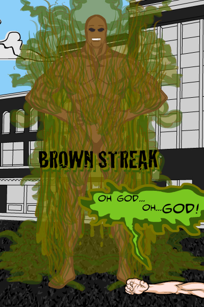
Another one I thought was funny came from Galactic Ketchup, called "Brown Streak". The effects on the word balloon were particularly nice.
Joel would win for "Best Slogan", if that were a category. Regardless, it made me laugh.
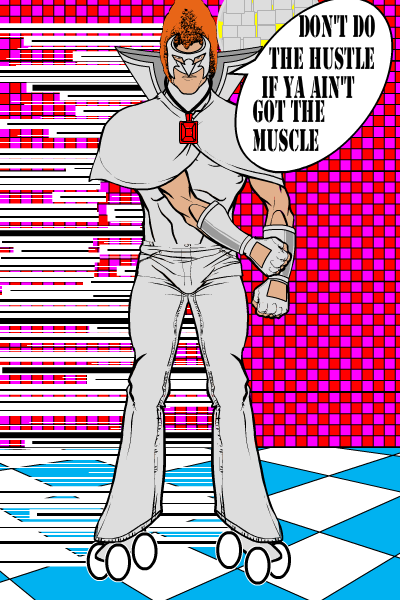
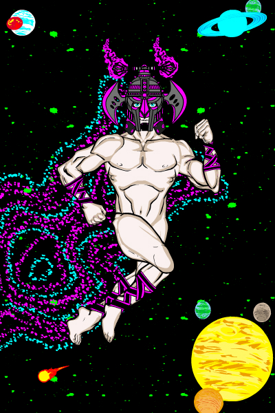
The final "Funny and Good" entry I wanted to highlight was Gargoyle323's "Silver Streaker", wearing nothing but a fancy Galactus helmet and sporting classic Kirby Krackle.
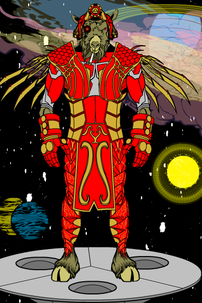
A number of other folks presented illustrations that didn't quite nail the overall challenge, but which I thought were outstanding enough in some way to bring to your attention. For instance, Atomic Punk's "Crimson Camel" features a spectacular space background, particularly in the upper right corner of the image.
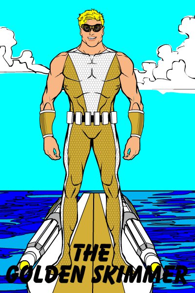
Danny Beaty also had a more serious entry that featured a really kick-ass surfboard with custom mounted rockets, "Golden Skimmer":
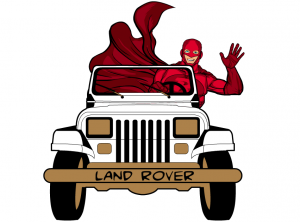
Blue Blazer's "Red Rover" is a well done and funny image, and although it's not particularly Kirby-esque I would pay cash money to hear the phone call on the hotline from the Police Commissioner -- "Quick Red Rover, Red Rover, send Red Rover right over!"
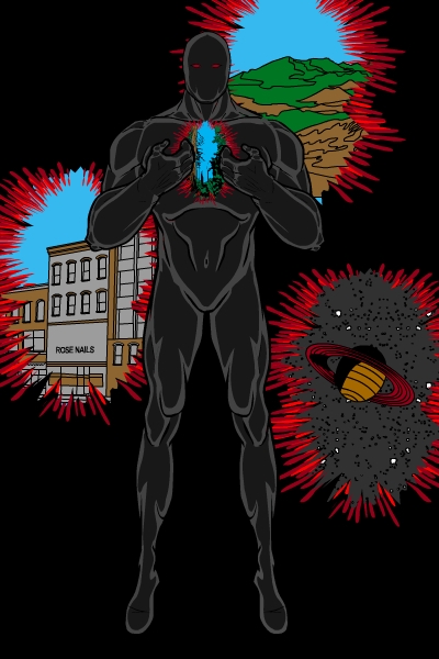
Galahad's "Onyx Gateway" used masking very creatively to emulate a cool series of interstellar gates.
While those entries all had something great about them, and while there were others that I thought were wonderful overall character designs and illustrations (like Imp's "White Walker", Solander's "Crimson Rider", Phatchick's "Punch Buggy", Martian Blue's "Scooter Red", Galahad's "Blue Blazer", Cliff's "Black Biker", and abominal401's "Light" -- that one had spectacular effects but didn't have a valid Kirby name -- among others), a few stood out for not only being cool to look at but for capturing the essence of a "Kirby Character". Thus the following images I thought were the overall "Final Finalists".
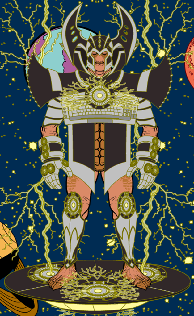
Frevoli's "Taupe Transporter" not only looks very Kirby-like, but he used a keyboard in the chest piece. Classic!
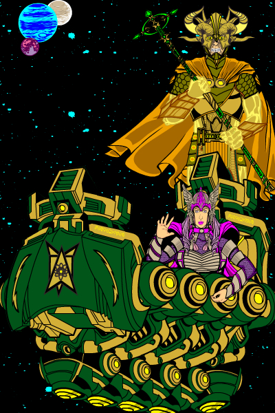
I thought Gargoyle323's "Golden Gondolier" was cool and a very good Kirby vehicle, but I didn't quite get enough of the characters themselves. Great job though.
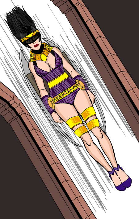
Jack Zelger did a bang-up, spot-on, very cool "Big Barda" style character with his "Lavendar Luger". I love the use of the top-down perspective and the flying hair, too. The armor and the collar are what really nail this one as Kirby.
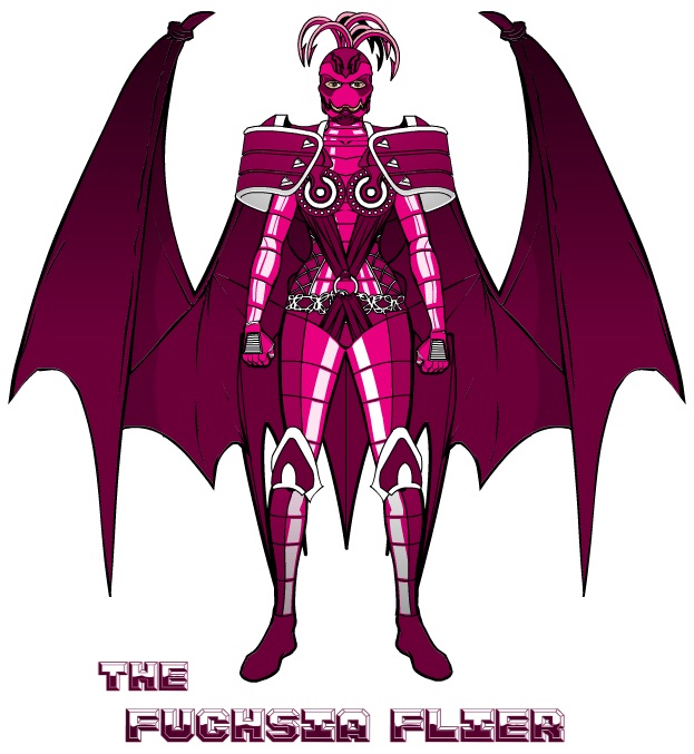
Me, Myself, and I had great harness and shoulder gear in "The Fuchsia Flyer":
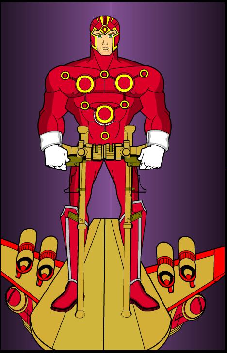
The first entry I came across that I thought really nailed it was Rancid's "Red Zoom". It too has a very New Gods vibe, especially with the improvised power sled. Just a very cool looking guy and totally in the spirit of one strain of Kirby's vision.
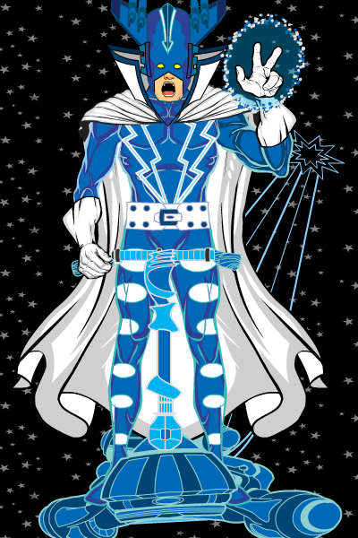
Watson Bradshaw's "The Sapphire Segway" also nails the Galactus-era Kirby. If the background had been a little stronger on this one, it might have won, but even as-is I think it's extremely well done.
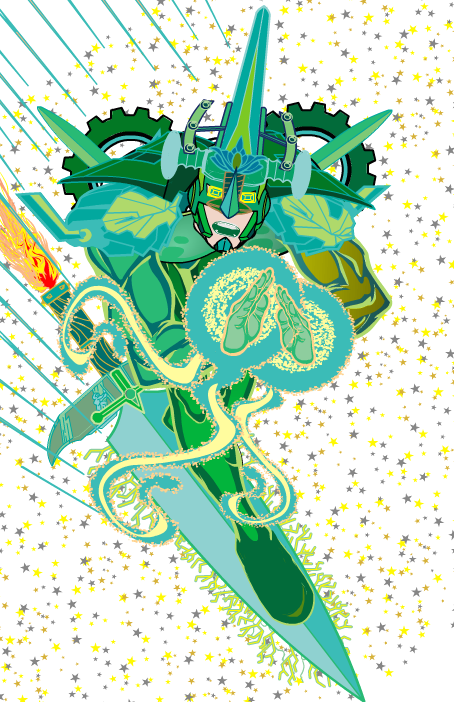
The First Runner Up -- and believe me, I agonized over which one of these two to pick -- is Kingslaughter's "Emerald Sword". I love, love, love the top-down perspective, the color choices, the out of control gear shoulders, the hand effects, the expression, the helmet, the background, and just the general idea that there's a guy racing around the cosmos on a giant green sword. That's at least four kinds of awesome and exactly the kind of random yet cool thing Kirby used to do. Just an all-around fantastic image.
Which brings us to your overall winner for the week. I went back and forth with "Emerald Sword" and this one, because I think both absolutely nailed the concept I was going for. Ultimately what tipped the balance was actually the description, which I think is a first. The bit that got me was "Hear the bleat of his little squeezehorn, puny mortals, and tremble!", which is still making me chortle even as I type this.
Ladies and gentlemen, I present the winner of Character Contest 45, "The Vermillion Vespanaut" by Spidercow2010!
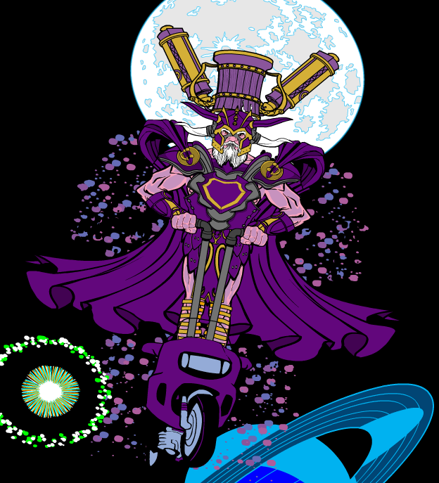
The colors, the absolutely ridiculously over-the-top helmet, the krackle, the setting, and the humor all are perfect. Fantastic job, Spidercow, this is one of my all-time favorite images I've seen from the HeroMachine. Well done! Let me know what you'd like as your prize -- a portrait or item for HM3, or a custom "Sketch of the Day", and I'll put it on the List of Doom.
Congratulations again to our Finalists, our Winner, and everyone who took the time to share a creation with the rest of us. Well done, all!

