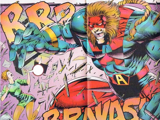
I think it's time we had a full-throated, two-page-spread, Image super-sized caption contest, complete with flying ponytails, ridiculous facial hair, unhinged jaws, incomprehensible female anatomy, outsized onomontoPOWia, no backgrounds, and all the rest of the high quality you've come to expect from the Nineties. Only one thing is missing -- bad dialog! That's where you come in. Whoever comes up for the best or funniest or most appropriate replacement dialog for this vintage Image Nineties panel wins either a portrait or any item of their choosing to be included with HeroMachine 3!

The rules are simple:
- Keep it clean, appropriate for late-night broadcast television;
- No more than three entries per person;
- All entries must be left as a comment (or comments) to this post.
- I'll make the balloon as big as needed to fit the winner.
That's it! Good luck everyone, and as usual I'll announce the winner next Tuesday.
Of course, I can't just let this go without a little gratuitous Image-Nineties-bashing. So skip this bit if you are sick of that kind of thing.
First, the guilty parties here do not include Rob Liefeld directly. The issue was laid out by EricStephenson, penciled by Anthony Winn, and inked by Marlo Alquiza.
Let me start with the big fellow. I've rarely seen such a disastrous combination of costume elements outside either an Disney "Beauty and the Beast" Ice Capades show or a professional wrestling bout, what with the lion mane hair and the gigantic pony tail that seems to be coming from the middle of his back. Add to that his need to put a giant "A" on his costume TWICE -- right on top of each other -- and I can only conclude we're dealing with someone deeply divided by his dual loyalties to crappy haircuts and worse fashion.
Strangely his pony tail is not the only thing askew in his design, as someone has surgically planted an addition index finger where his pinky would be, if pinkys grew out of the palm of your hand. That's just weird. But maybe it goes with all those extra shoulder muscles and rib cage whatzits going on down there in the thorax region. I will be tactful and not go into his plane-flat groin area. Maybe that's why he's so angry.
What really bugs me about this whole composition, though, is that in typical Image Nineties fashion they haven't a clue what to do even with the great tools they've been provided. Here we've got the holy grail of the comics industry, a whole two-page spread. Those used to be rarer than hot chicks at Star Trek conventions. Image, to its credit, introduced a much higher rate of these big action-oriented layouts, but they've completely botched it in this case.
Look, part of what's great about this kind of spread is that you can show much more detail and dynamic action than trying to jam it all into a little panel. But they've left out the background, shrunk one of the two figures down to an afterthought who's severed by the bottom border, and crammed the most interesting and dynamic guy into a forced crouch. He looks squished and cramped and yet it's a WHOLE PAGE! Plus they orient the whole thing side-scroll fashion, further flattening the action instead of making it burst out of the page.
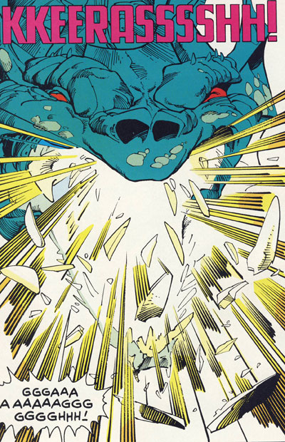
That about sums up the Image Nineties for me. Complete failure even at the stuff they were supposed to be good at. Utter lack of comprehension about what to do with page layouts and what makes comics interesting. If you ever get the chance, find a copy of the Walt Simonson "Thor" issue where every single page was a full-page splash to see how it should be done! For instance, here is Thor bashing his way out of the mouth of the Midgard Serpent through its teeth:

Now there's a panel that explodes right off the page and into your laps, folks.
OK, rant over. Return to your regularly scheduled caption contest now.
(First image from "Brigade" number 10, ©1994, Rob Liefeld. Second image from "The Mighty Thor", © Marvel Comics, Inc.)

