Lots of great entries this week, thanks to everyone who entered! I've selected a few after the jump to feature as Honorable Mentions before getting to the overall winner, but I think the level of performance this week across the board was very high. Just to recap, this was the contest where you had to produce an illustration based on a randomly generated character name.
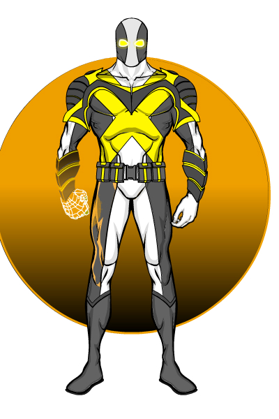
I like the overall design here a lot, but the clincher for "Power Fist" by Zyp was the nice reflected glow light effect on his right thigh from the titular power fist:
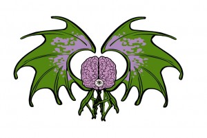
Mr. Vampire always has fun and innovative takes on these contests, and while I thank him for the nostalgia engendered by his Asteroids composition, I had to profile this winged brain, which I think is both fun and cool:
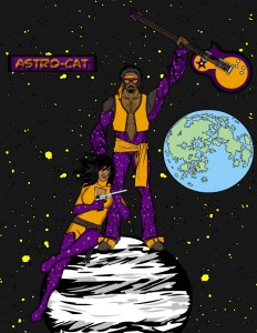
Martian Blue somehow managed to put together this very convincing electric guitar from spare parts, which was most impressive:
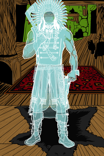
Kyle had a host of entries again this week, but I thought "Ghost Chief" was particularly well done. Although maybe I have a thing for see-through characters, I don't know ...
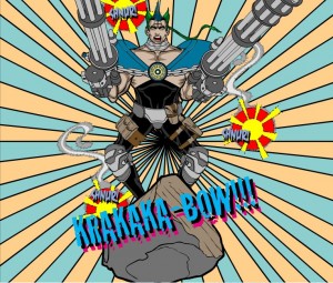
If this had been Image Week, Kingmonkey would have walked away with the win for sure. As it is, this is a great illustration that literally made me laugh out loud:
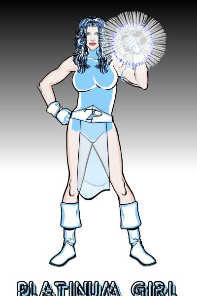
On a more serious note, Kingmonkey also delivered "Platinum Girl", which in addition to being a nice illustration also has my favorite use ever of that satellite dish icon insignia, used as a belt buckle:
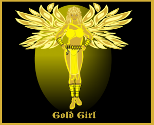
Kaldath had two excellent female entries this week, but I think Gold Girl has the edge for overall design:
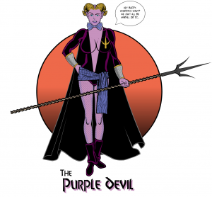
Imp has a fantastic entry this week of "Purple Devil", with a great bit of dialog about what it must be like starring in B-List publisher's lineup:
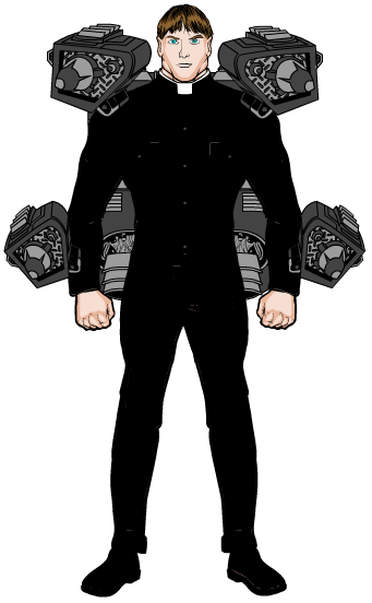
Hakoon also had multiple excellent entries this week, but while "Brother Torpedo" isn't the flashiest of them, he is the coolest. The idea of a robot priest packing massive nuclear weapons tickles my imagination just the right way.
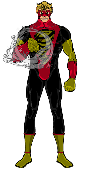
Although it's a simple design, I think Blue Blazer's "Doctor Tornado" has a great expression and the wind effect is just perfect:
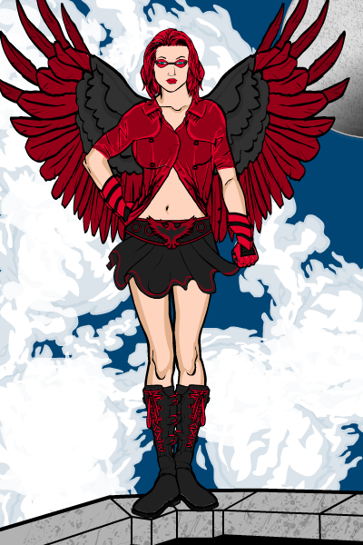
Anarchangel's "Crimson Falcon" has some excellent features. I love the overall character design, with the consistent black and red color scheme. The wings fit, too, and the pose is great. But the best technical feature (besides those awesome clouds) I think is that shirt. I can't quite figure out how it was done, but it's really cool. Just a very good character, top to bottom.
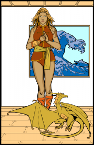
Finally, although Anarchangel and Imp made it really tough, I finally went with Brons' "Bronze Dragon":
I like the design and the colors and the pose, it all works well. I think what really sealed the deal for me, though, was the framed Japanese print on the wall. It's a simple touch, but really added to the whole effect.
Congratulations to Brons, who wins either a portrait or any item he likes to be included with the final version of HeroMachine 3, and to the other Honorable Mentions!
Thanks again to everyone who entered!

