Goodness knows I don't have any room to talk on this subject since I can't draw women to save my life, but no one ever said you have to be able to "do" in order to "criticize". With that out of the way, let me say that reason number seven I hate Rob Liefeld's art is that he can't draw women to save my life, either.
We all know by now that he can't draw feet. So when it comes to drawing women's feet, well, it's like a perfect storm of suckage:
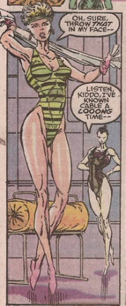
When all of your reference photos come from magazine pages you have to open sideways, perforce all of your models will be in high heels. Which is a problem when you suddenly have to draw women who are shoeless, because then everyone looks like they're standing on their tiptoes. Assuming you bothered to draw their toes. Go ahead and wish for the Moon while you're at it, kid. I particularly love the back foot of the woman at the back of the panel. It's like he got that far and just gave up. "Screw it, throw a squiggly lump in there, who the hell ever looks at their feet anyway?" Awesome.
Moving up the body, you quickly realize that the rest of the leg is no better. Combine that with the laziness factor we've discussed before, and if you make millions of dollars turning out page after turgid page of comics illustration, you come up with a brilliant solution: Just draw one leg instead of two!
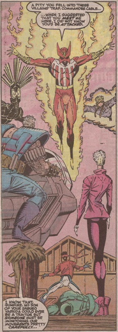
Look at the woman in purple and count her lower extremities. Remove your shoes and socks if that helps and please, show your work.
Continuing upwards, we come to the worst problem area of all, the waist. I have to wonder if Rob Liefeld studied anatomy at the Marquis de Sade School of Art and Torture, because the female body just doesn't work the way he thinks it does if the woman in question is still alive:
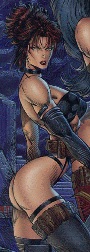
Seriously, what the hell? That woman's torso has been severed, crushed in a vise, and then reattached at a Pythagoreanly impossible angle. Which is an insult not just to me, who hardly counts, but to Pythagoras, and you don't want to mess with that dude. He invented the hypotenuse, Jack, that crap will mess you up! My only theory is that this thong-abusing leather-busted woman with a deranged attachment to pouch belts is some bastard child of The Wasp, inheriting both her waist and (sadly) her fashion sense.
But the problems, sadly, don't stop with the waist. Oh no. Once you get past that, you've got your torsos to deal with. If you can't simply pinch them off, and your reference photo for the torso is from a different angle from your butt-shot photo, just rip off her top half and slap it on any old way because hey, we've got product to produce here, chumps, we don't have time for your fancy-schmancy ivory tower liberal notions of vectors and muscles and crap:

I don't blame her for going "Unh", you would too if you were getting torn in two.
Finally I've selected one illustration that I think pretty much sums up Reason Number Seven. Mind you, this is not some carefully cherry-picked and cropped image I took from early in his career, before the millions of dollars and the smoldering wreckage of the comics industry were part of his past. Oh no, this is a cover drawing, which you would think would be right in Liefeld's wheelhouse, seeing as how you don't have to mess with backgrounds or perspective or any of that annoying crap. Just pure, undiluted drawitude here, people, and see what you get:
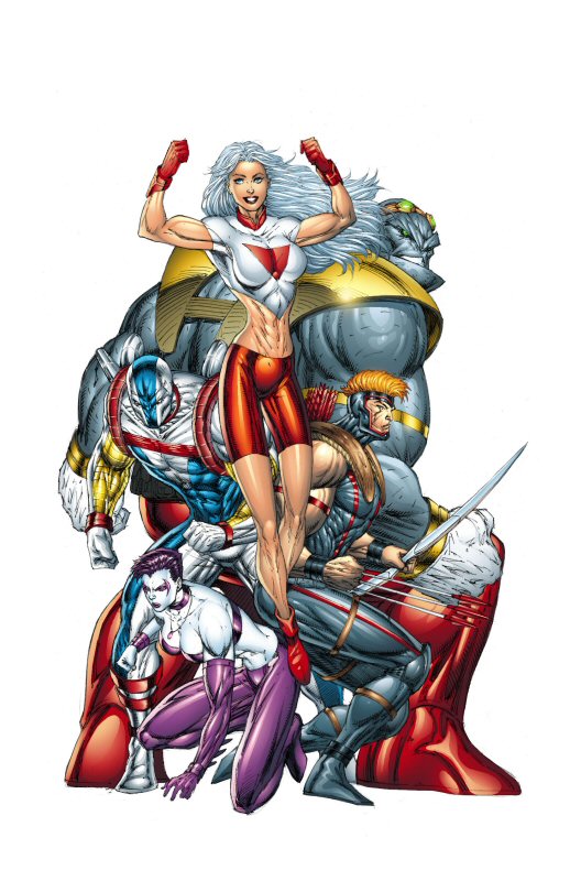
Look at that Tom Strong rip-off woman floating in front there. Start with her pointed toeless foot (because naturally the other one's hidden), past the elongated tubular legs and thighs, past the shapeless curve of a hip, past the truly bizarre belly bowl, over the purely made-up "musculature" of the abdomen, over the obnoxiously large breasts, and their magic super-cling shirt fabric, and say it with me:
"This is reason number seven I hate Rob Liefeld's artwork."

