Great work again this week guys, so let's break this down.
For me the key word was elegant. Some of you went for a warrior look which I get, but they lacked in the elegance department.
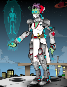
Honourable mention goes to ForgivenMonster.
Great attention to detail, just a bit "nursey" for a character named Madame Ambassador. Awesome background as well.
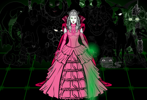
Runner up this week is Thundersong.
Nice idea having her draw energy from the earth to speed healing. I think that a colour other than pink might have read as somewhat more elegant.
And the win this week goes to...
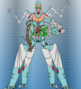
Xinmodic!
First of all I hate the "healing herself" thing. )Hate is a strong word...I greatly dislike...) It is messy and does not add to the idea. But I love the four legs robotic arms and the beautiful shape of the head. There is a lot of beauty and elegance here. Cannot wait to take a crack at this one!
Thanks to all who entered.


