Heromachine 3: Design choices, starring Apatite
This is a little piece on how I personally make choices in character design, using my latest Heromachine thing, Apatite, as an example. I’m not a professional and these are only my uneducated opinions, but maybe they can help you as well?
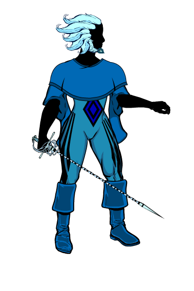
Apatite is a very balanced design. I tried to use many different kinds of elements in her design so she didn’t feel overwhelmingly tied to one character archetype or design style. I will go over the different intended effects of the design and explain my reasoning for using them, as well as point out some examples of them in other character designs. Finally, I will make small adjustments to Apatite’s design to show I could further emphasize that particular effect. Here is Apatite again, with her body in silhouette to emphasize the outfit and such.
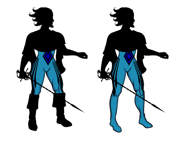
Smooth, skintight elements
Effect: Implies overall mobility. Easier to animate and adjust. Additional elements will add complexity, in both good and bad.
Other examples: Spider-Man, super heroes in general, pro wrestlers, etc
Apatite examples: Her bodysuit shows that she can move when she needs to. If we wanted to further emphasize her mobility, we could simply take off all the other elements (e.g. boots) on top of the suit.
Elements pointing forward
Effect: Implies aggressiveness and stubbornness.
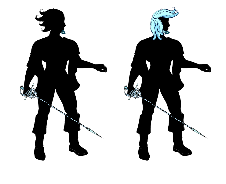
Other examples: Swords and guns, animal horns, some hairstyles (in anime, the delinquent’s pompadour), etc
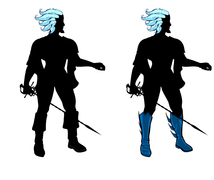
Apatite examples: Her sword and ger gem are pointing forward, giving a slightly threatening impression. We can increase that by giving her an outrageous hairstyle.
Elements pointing backward
Effect: Implies forward motion, aerodynamics and speed.
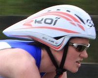
Other examples: The Flash’s lightning bolts, Quicksilver’s hair, this bicycle helmet, etc
Apatite examples: Her hair is hella aerodynamic, which should help if she needs to lunge forward with that rapier. Some gratuitous fins on her boots might help the speedy impression even more. Or look ridiculous.
Elements flowing freely and/or hanging off the body
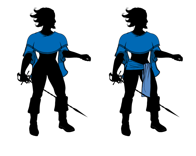
Effect: Implies circular or changing motions and theatricality. Changes direction slightly more slowly than the rest of the body, very useful for emphasizing motion and showing the character’s previous direction.
Other examples: The flowing robes in wuxia and kabuki, Doctor Strange, etc
Apatite examples: Her sleeves and poncho flow and look pretty dramatic. We can futher emphasize this effect by giving her a sash.
Elements that increase width
Effect: Implies weight and sturdiness.
Other examples: Most kinds of armor. In superhero comics: Juggernaut, Superman’s cape, etc
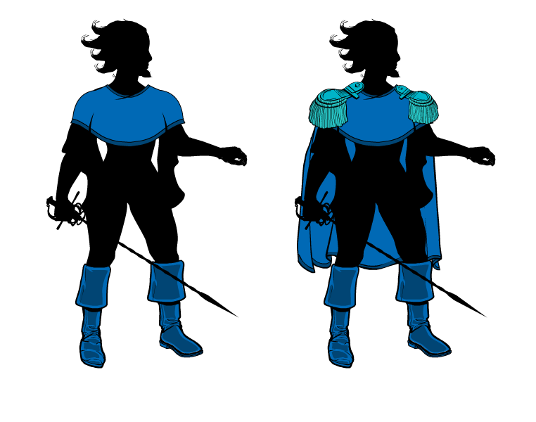
Apatite example: Arguably her beard. Her swashbuckling boots give her legs a little bit of weight, which emphasizes her grounding. Solid grounding is important for a fencer! Her poncho also emphasizes her shoulders, which gives an impression of physical strength. We can just go overboard with that and give her big epaulets and a cape, which also work with the swashbuckling style.
Elements that conceal the character’s body
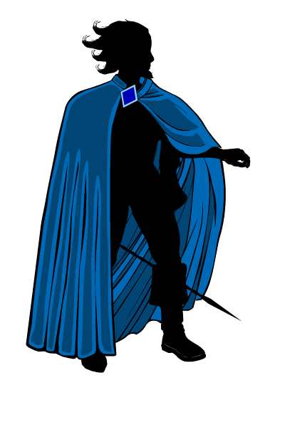
Effect: Implies mystery, otherworldliness and focus the viewer on what little they see.
Other examples: Batman’s cape, all kinds of robes, wings, etc
Apatite examples: Maybe her poncho? Honestly, I didn’t use this much when designing her. However, we can introduce a large cloak, which she can throw off dramatically when she reveals herself.
There you have it! I hope this was entertaining and useful to you!

