Ok guys, this week I'm actually struggling to pick a top 3. I've managed to get it down to a top 5, which was hard enough, so I'll do this Jeff style and run down my top 5 from this week and then announce the winner at the end.
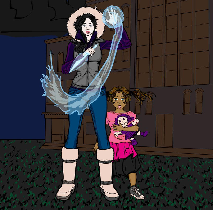
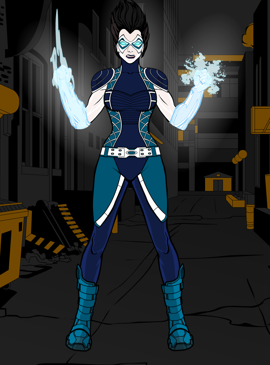
The pictures will be in order of Original then Redesign for each person.


First up we have Demigod's "Morningstar". This one shows the greatest improvement upon the original design in my opinion, simplifying the original costume whilst also making it more visually appealing with both the colours and some of the design choices (mainly in the lower half). Then there are the other factors, being more creative with the hair and pose, as well as adding the glowing eyes, makes the redesign so much better than the original. And it's all topped of with a background that really makes the character stand out.


Next up we have Kicktar's "Sarah", which is almost a complete overhaul rather than a redesign. Only the face really remains from the original and even that is covered with a mask now. New clothes, new hair, shading, a background, it's really not hard to see the improvement here.


With Suleman's "Emerald Power Armour" there isn't really much to say. It's just making the original design more realistic and much bulkier, so you could actually imagine a person being able to fit inside. Going all green was a good choice, it made the character look much less drab than the original. And the redesign has much more attitude than the original, thanks to being able to see the characters face beneath the armour, as well as the pose. And to add a nice finishing touch, Suleman has the character interacting with the background in such a way that we can see how much the armour weighs, further adding a sense of realism to the redesign.


Madjack's "Stinger" certainly has the best costume out of any of the entries this week. The original's design was pretty good, but the redesign just looks cooler. The hair, the goggles, hand on hip, it just works. Again, black and yellow seems to make for an interesting costume, and again it doesn't need shading or highlighting to stand out.


And finally we have Melmo44's "Polara". As Melmo said herself, it's more of an ageing up of the character, but that technically still counts. In terms of the character we go from civilian clothes to a full blown superhero costume. I like both, there are a few bits on the redesign that a would have looked a bit further into, such as the fact that on the top the vertical grey lines match up with the lines on the bustier above the chest, but below the chest the don't. But it's still a more interesting costume that the original. But the real thing that makes this redesign work for me is the new representation of the characters powers. In the original it was just a few energy items and a weapon, but in the redesign it's body parts and a whole other raft of things and it looks really good (I avoided making a cool joke there, be proud of me).
So, who is the winner. Well, it's really hard to decide. It's actually a case of, I feel like if I pick one of these I'm not giving the others their fair dues. I really like Demigod's entry, but MadJack's has a better costume and Melmo44 and Suleman's are better pictures, plus I like Kicktar's just as much. But there's one that my brain is just saying is the right choice, so I'm going with that one. And that one is MadJack. So congrats MJ, and well done to our other entrants, especially the final 5.

