Once again we're dipping into the world of DeviantArt for our character of the week, this time for a pic by Kicktar, who some people may be familiar with already. Either way, just take a look at this picture before I start talking about it.

Ok, so what we have here is a top down perspective of someone lying down on their back, which is a very nice and very simple way of changing the perspective without having to make a painfully complicated custom pose. The main posing has gone into the arms and the legs are slightly rotated as well, which is really all that was needed to give a very relaxed feel. The shading is very subtle but really sets off the picture, especially the hair and the face. Then we have the face in general. I personally love using the slightly smiling mouths with a small rotation as shown in this picture, it is a great way of adding that extra bit of personality to a character. Personally, I would have moved the eyes and nose down a bit in relation to the ears, but that's not really a complaint, more an observation. Costume wise, it's very simple, but it leads on to two interesting points. Firstly, I have to point out the necklace. I didn't really notice it first time I looked at the picture, but I saw it second time out and for some inexplicable reason I just really like it. I like how the cord doesn't seem to have an outline except for the shadow it casts on the characters skin beneath it, that's really cool. Secondly, the colour contrast between the foreground and the background. Tip for any novice 'machiners out there who are thinking of trying backgrounds, make sure the foreground character stands out from the background. The best way to do that is to use different colours, especially different types of colour. Here we have a dull grey set against magenta and it really stands out, or orange against black. It makes the picture pop as much as shading. And finally on this picture, I would like to point out that Kicktar thought to put creases into the blanket to show that the character is actually applying pressure on it by laying there. Details like this are everything and will definitely get you at least an Also Awesome nod from me, but the fact that it just makes the picture look so natural just makes me very happy. You'll probably see more impressive pictures below the jump, but this is my pick for the best of the week because of those details.
Gallery- Kicktar on DeviantArt
Also Awesome This Week
More Kicktar- Makenzie

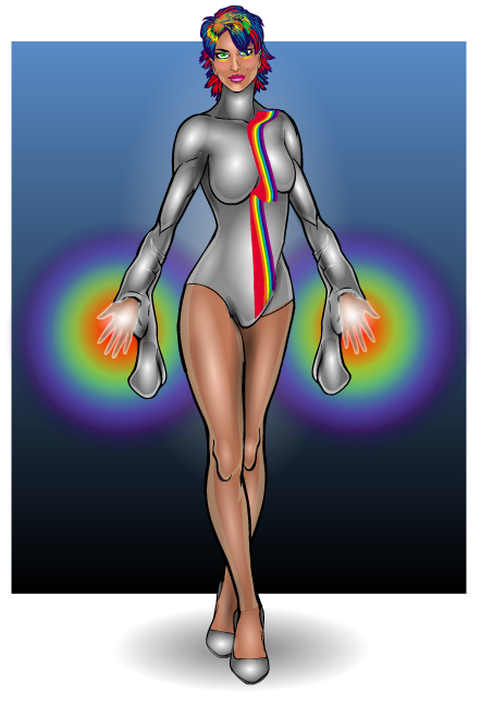
AMS- Stellar & Prism


Gallery- Planet AMS
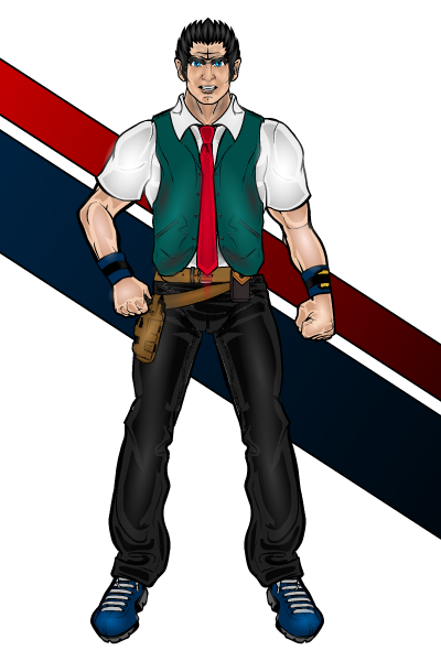
HermanSmellville- Troglodyte Bunker

Gallery- HermanSmellville (Ken Weaver) on DeviantArt
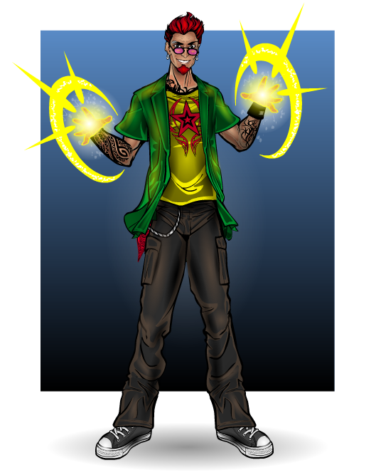
Skoul- Ethan Dark

Gallery- Skoul's Mind
Suleman- Lady Phoenix

Gallery- Suleman's Creations

