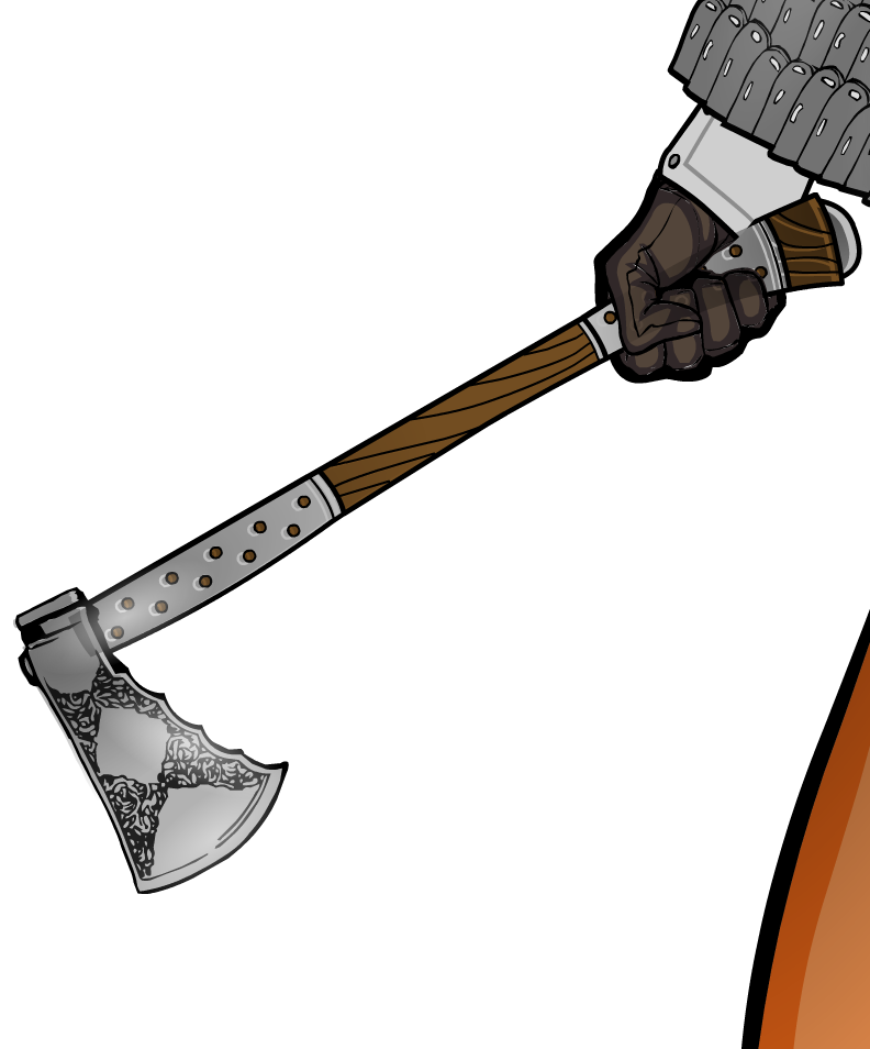
Here is the 3rd installment of Sulman's tutorials once more after the jump!
The shading is mostly similar to the previous one. What's a bit different are the highlights.
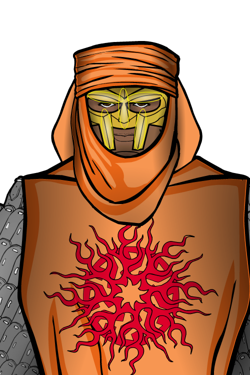
I tried to find the long, narrow shapes in the helm. I then added a metallic gleam effect along those lines. This really helps set apart metal as a material in your design. If you actually bother to put highlights on other materials in your design, good for you! I'm lazy.
...I know that might sound a little weird coming from someone who's currently telling you how to spend an ungodly amount of time on stupid details in your Heromachine images, but it's true.
See how it shines?
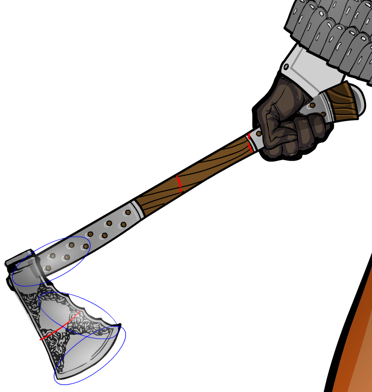
I've got bad news for you: Sometimes you will mess up. See that hand gripping the handle? See how the shading on the handle overlaps the hand? I noticed that too late. It's an unfortunate side effect of how masking hand items works in Heromachine 3: Though the hand looks like it's on top of the axe, it's actually *below* the axe in the layers.
Also note how shading caused those weird white rings around the studs to appear. Masking in Heromachine 3 is WEIRD. This is why I told you to avoid it when you can.
This time the shadows serve an additional purpose: They can be used to further emphasize the highlights and gleam. The dark part of the blade contrasts the highlighted edges. The gleaming edge evokes sharpness, which is a good attribute for a blade!
Let's look at her shield, now!
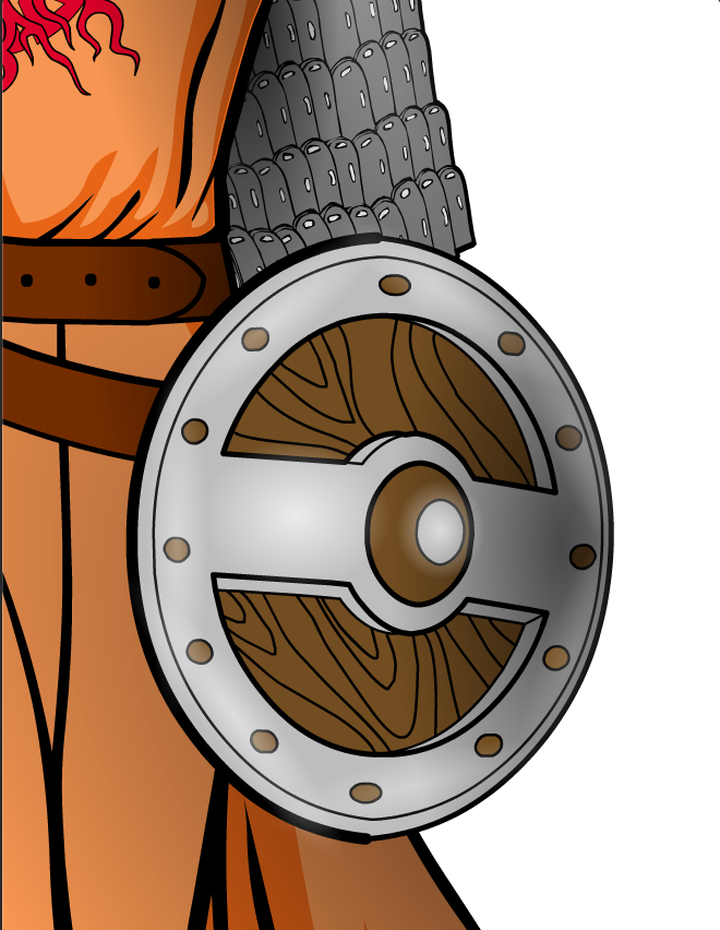
See how it looks like one edge is closer to you?
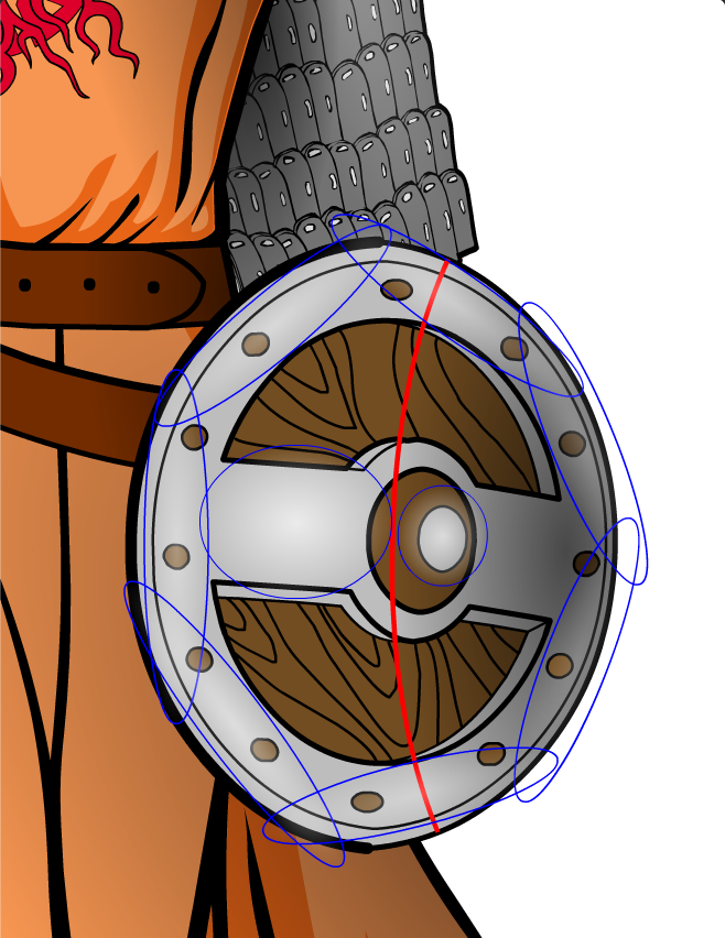
The reason why it looks that way is because of the shading! That shadow really gives off a sense of depth. Use the shadows, love the shadows!
Those highlights looks a bit scary, but it's actually fairly quick to do. The central stud should shine, since it protrudes from the shield. The edges should gleam a bit, since they're the narrowest part of the shield. The strip of metal from the central stud to the edge is technically a long and narrow part of the shield, so it should be highlighted. It's just compressed because of the angle of the shield!


