Ok, so, after covering Iscarioto last week, now I'm going to follow up on the suggestions that everyone made two weeks ago. And we're gonna take a look a Nug to kick off.
One thing I have noticed in looking through peoples galleries for this series is how peoples styles change over time. It's really interesting to just spend a bit of time and go from start to most recent in someones gallery and see how much it changes, though obviously make sure you have a spare hour or two if you plan to look at any galleries with over 50 pages.
Anyway, on with the show.
Cyber Chronicles- Amber
One thing that really characterises Nug's early work is his willingness to experiment with unusual poses. Case in point here. Love the hunched posture, the arm wrapped across the stomach indicating some sort of pain, which is complemented by the expression on the face. The costume is a nice use of masking, but it's not anything like some of the more impressive costumes that have been applied to custom poses. However, we are only on page 1 here, so nice start, and there's still more to come.
Cyber Chronicles Game
I guess this one's a follow up to our previous one and again, cool posing. But the background is what impresses me most about this pic. The walkway is stunning, the pillars fantastic and I love the health bar in the top corner. It genuinely looks like it could be from a video game, which is the idea, so mission completed, proceed to next level.
The Demon Maharet
Now Nug has a few awesomely posed demon characters early on in his gallery. All of them are worth checking out, but this is my favourite. The pose just gives the character so much, err, character… yeah. She just seems so wild and free and that contrasts really nicely against the background behind her, which is a graveyard, a place most known for being sombre and sad, yet here we have this character grinning and pretty much dancing around in one. Really nice concept.
Invisible
Now this one is utterly fantastic. Just the depth and imagination of this image are astounding. The shading is fantastic and the pose work must have taken hours on end. Truly breath-taking.
The Archer
Ok, being sensible again. Another great pose, but this time we're getting more creative with the costuming. The top is superb, if a bit risky to wear and move around vigorously in, and it works really nicely with the custom pose, the belts matching the non-standard body's side, whilst insignias are used for the chest of the costume, leaving the main part as a corset part. Very simple but very creative.
Y-Robot
And that kids is how you make a side facing pose. Great item usage here, I can't actually see a body part used in this pic. Some shoulder-pads, gloves, foot-wear, but nothing remotely body-like. For example, there are shoulder mounted guns used here for parts of the arm, rather than an item from tops-maletech or body-mech. So, lesson for today, don't just look at an item and think "ok, that is meant to go there so that's where I'll use it." Think, "ok, that's meant to go there, so I'm gonna put it here instead."
Triple D
OK, every week I ask if I really need to explain why I've chosen a certain picture and then proceed to not explain. See this weeks. It's up there above this text.
The Violinist
One of THE finest contest entries (and winners) we've had in my tenure running the CDC's. You've got the costume, the background, the shading on the goggles, but you know what the best thing about this pic is? It's the pinkie finger on the left hand. She's actually holding the bow properly. THAT ladies and gentlemen, THAT is attention to detail. Who here would actually have thought of that being honest (Nug you're not to answer that). I certainly wouldn't.
Merrick
I love the personality on this character. She's got such sass and attitude. I also love the little details on her costume, the beads for her bracelets and necklace (love the crows foot on the first one, nice touch), the dropped shoulder on her top (which is a cape shoulder btw, I had ask Nug how he did it because I couldn't figure it). I included both versions, because the atmosphere on the first one is really cool, very murky and mysterious and the atmospheric effects work really nicely, but the effect on the smoke (which I'm surprised I haven't mentioned yet actually, love the smoke face) is better on the second, plus you have more going on in the background, which tells more of a story (but that story is not suitable for the blog obviously).
Hair
More sass, better hair, which is understandable as it was an entrant for the Hair Style CDC. Not much to say here, just great expression and great hair.

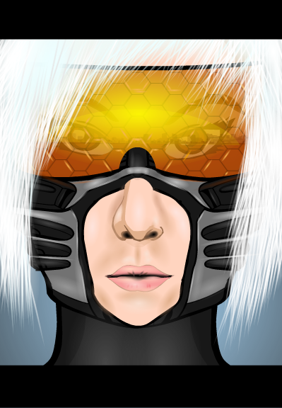
Cyber Mask (Redux)
THIS. IS. GAAAAAAWJOUS!!!!!
Just look at the colours in the reflection on the visor.
*at this point I do actually spend a good I don't know how long just staring at the visor.*
Anyway, where was I? Oh yeah, and the hair ain't half bad either. But that visor...
*cue more staring*
I did do a COTW on this one, so if you want actual commentary on the pic, go look for that post.

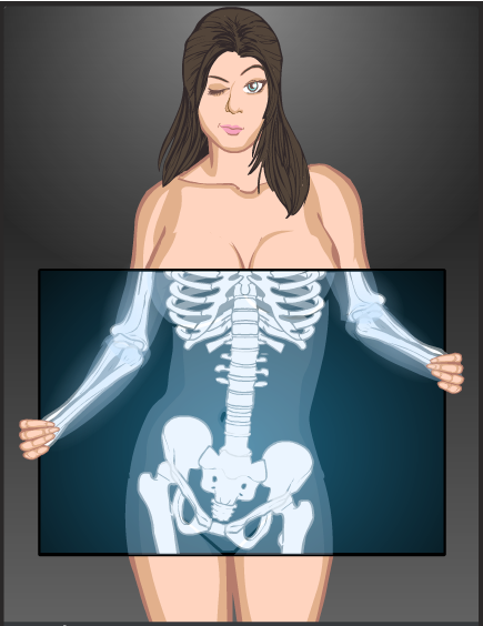
X-Ray
Cheeky, funny, clever. The three words I'd use to describe this picture. Censorship by X-Ray. I just love the idea behind this. In fact, I loved it so much I did my own version. But that's a whole other story.

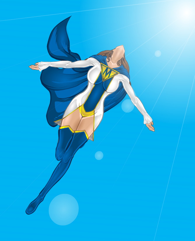
Super-Mon Takes Flight
Ok, ok. If I think about it, I have to give best picture in gallery to this right here. The pose isn't as intricate as others in Nug's gallery, in fact it's pretty simple, but that isn't the point, so I'm not actually sure why I even mentioned it. Probably being nit-picky I suppose. But the costume is wonderful, absolutely perfect in every way. Feminine and sexy without being hugely impractical or revealing, well designed without being pretentious and understated without being boring. The colour scheme rocks, I adore the combination of white and blue with gold trim, beautiful. And then you have the lighting and shading. The lens flair alone just makes this picture worth it, but then you have the body shading. The shadow on the neck, the sublet accentuation of the gold on the costume, the darkened patches on the fly away sections at the bottom of the main costume. And to finish off, we come to the feeling this picture gives off. It just exudes wonder. The character feels so free and it taps right into that part of you that always wanted to be like Superman and soar into the sky. Magnificent.

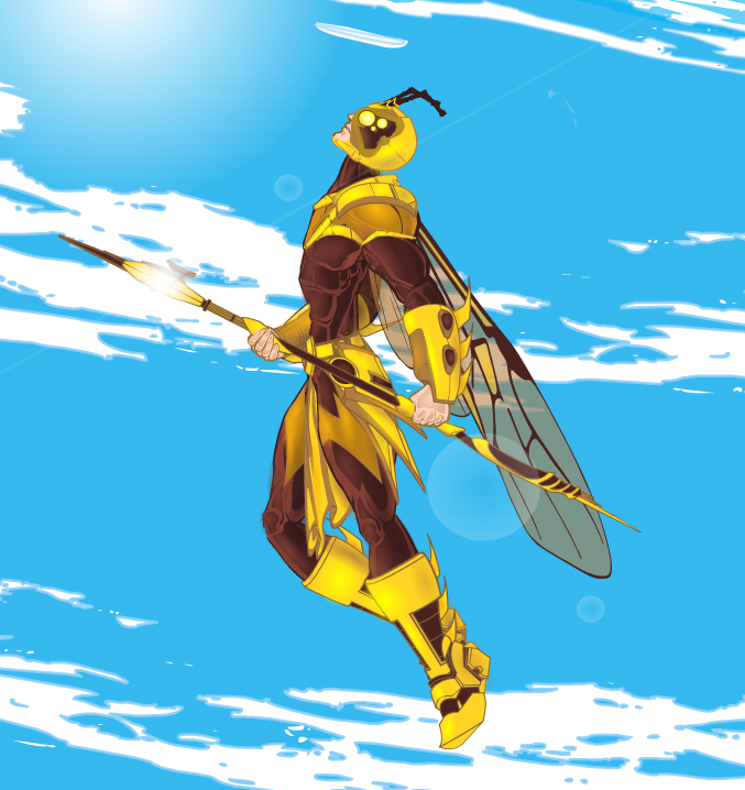
Vespidae
Once again, you have the same elements that made the last picture so fantastic, well except for all the costume bits because obviously different costume. But it's a great costume and it's coupled with a fully side on pose, made using an arm item with a torso masked on to it (nice). Again, great work, just give the guy a decent meal please. He's a bit on the skinny side.

Frog King
*grins*
This one is Toad-ally awesome. Un-frog-gettable. I couldn't even pond-er going through Nug's gallery without including it.
Sorry.
Anyway, this was last weeks COTW so go there for more of what I thought (and more bad puns).
Anyway. Gallery. Go here. Nug's Creations


