So, last week I asked everyone who I should cover this week on Gallery Grabs and there were some great suggestions, so naturally I've ignored them all (for the time being anyway), because one of my favourite creators just decided to show up again after being M.I.A for around a year. So you really think I'm gonna pass up this opportunity to revisit his gallery?
Warning, I go all odd half way through this. Sorry.
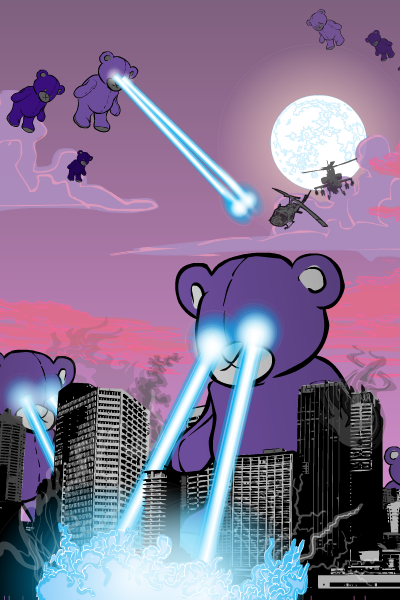
Batteries Not Included
GIANT DEADLY LASER TEDDY BEARS!!!!
Do I need to say anything else? Ok then. Apart from the amazing concept, you have that stunning background and then the energy effects are superb. Oh and did I mention that there are Giant Freakin' Laser Teddy Bears?
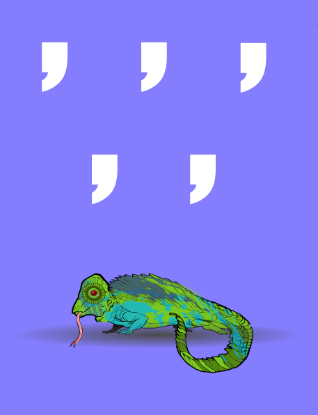
You Come And Go
Comma Comma Comma Chameleon…. I literally died laughing when I first saw this. It still brings tears to my eyes. And that chameleon is put together beautifully.
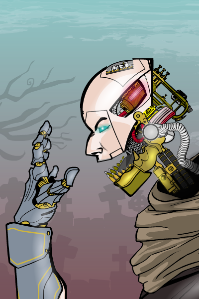
SoulLess Redux
You need reasoning here? You have eyes. Use them. *gesticulates wildly at the picture above* That's all the reasoning you need.
Mod Note: At this point in his gallery, Iscarioto has a picture which I would dearly love to feature here, but it's currently in a CDC poll and I don't want to sway the vote, so… moving on.
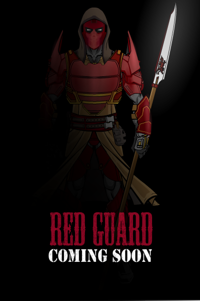
Red Guardian
The effect of a character appearing out of the darkness is alway an effective one, but when the character in question is as well put together as this one is, it's even more spectacular. Look at those shoulder pads, they're the best bit of a pretty damn nice costume. And the lighting is perfect too.
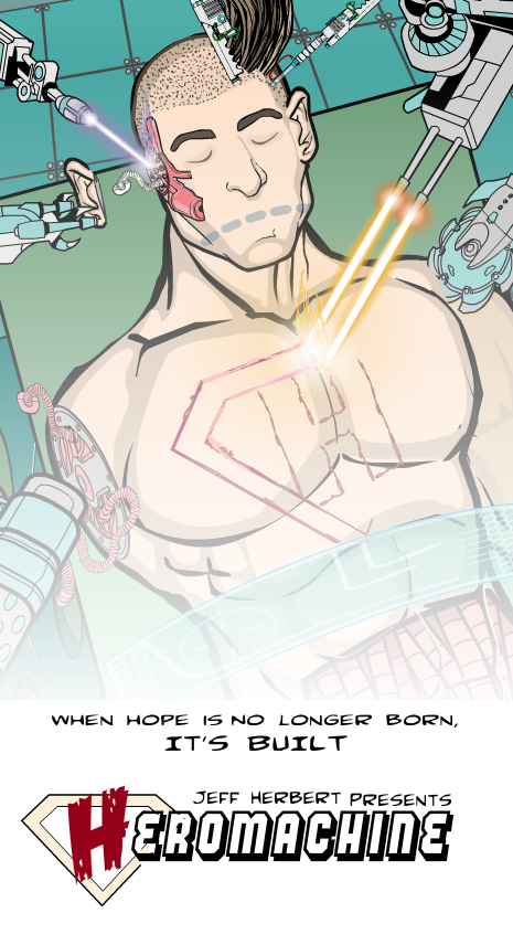
Heromachine Film Poster
Laser effects again. And the concept. Well it had to get a nod for the later didn't it, it just makes the whole idea seem so badass when you put it in an action movie setting. Could you imagine if the characters you were making on the program were actually being built by the machines that live in Jeff's secret underground laboratory? Hey, wait….
Falling Skies
Loooooook at the lighting…… *many strange noises made* Is that not the most gorgeous colour collage you've seen on HM, and the glare effects…. I feel funny. And that's without mentioning the flying bullets and broken glass or the character pose.
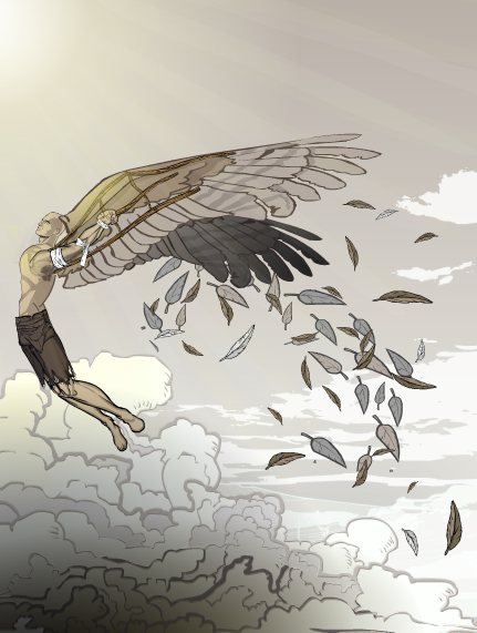
WaxenWings
Just… just everything here. It\s perfect. The faded colours, the pose, the wing support structures, the use of leaf insignias as feathers, the light effect at the top. It's just perfect. No other word for it.
Blood Money
Wolverine has gone sci-fi guys. And it's freaking AWESOME!!!! *fanspazzes* (hang on, haven't I been doing that this whole time?)The armour is something special here. I believe it's a mech body turned upside down, but the effect is so good. And then there's the face… and the hair… and the colours… and the everything else.
Whispers Waster In the Sand
Ok, I chose this one for one reason and one reason alone. Even though Iscarioto explained how he did it to me at the time, I still can't wrap my head around that whale. Just how? And this is someone who has spent the last month or so making characters exclusively out of insignia's. I don't understand how he did it.
Oh and this picture kick started a series of pictures by Weilyn that have to be some of my favourites of any posted on the forums, so that's another reason to love this pic.
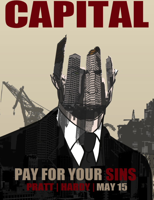
Capital
Sorry dude, you didn't get it entered into the last CDC on time and I can't make exceptions to the rule, so it doesn't get entered. But bloody hell, this is how you make a comeback. Note to any of our members who for what ever reason take a hiatus. If/ when you make a come back, this is the level I'm expecting from now on. You have to literally make someones face fall off and replace it with skyscrapers. This is genius.
Gallery: Iscarioto's Bits (Go Here Now)

