Ok, so after covering two underrated (I.M.O) members of the community in the last two Gallery Grabs, this week we're going to cover someone who is rated just the right amount (i.e. everyone agrees he's a freaking genius). Just so we're clear here, AMS' gallery has 83 pages to it at time of writing, and this is AMS we're talking about, so each and every one of those pages has something brilliant on it, so some stuff is going to be left out. Best thing you can do is go and look though for yourself, because it's worth it. Even if it does take an unreasonable amount of time to look through (my gallery is even longer, so I can't talk).
Warning: This post will contain the word shading many many many times.
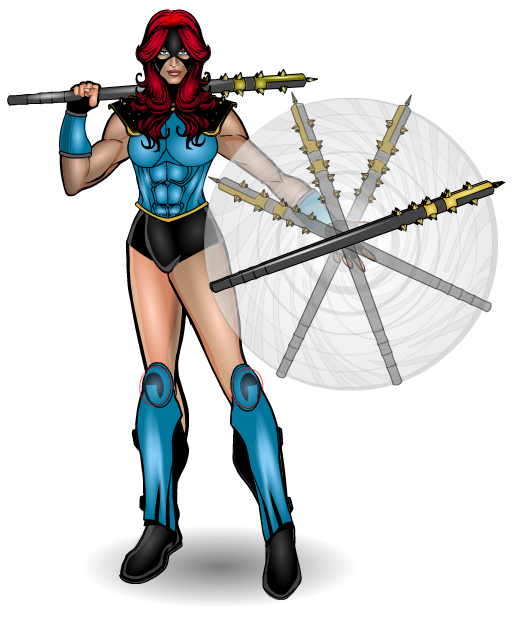
Majorette
That baton twirl effect is brilliant. Of course we have all of the classic AMS elements here. 3/4 turned body, with costume masked to fit (the costume of course being excellent), great expression in the face and great creativity and inventiveness. However, something I've literally just noticed, someone forgot to hide their masking. Knees…. *insert Homer Simpson here*
Sorry dude, but I had to point it out, just to show everyone that even you aren't perfect at this stuff. Almost though.
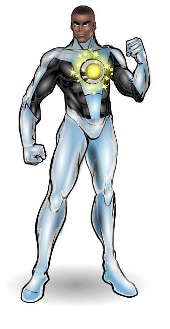
Starheart
I love the silver and blue part of this costume. It looks so slick. Ok some of the joins look a bit odd (left shoulder and crotch), but apart from those it's a great costume, great use of masking to mix together costume items to create something different. And again, expression is spot on for the face as well.
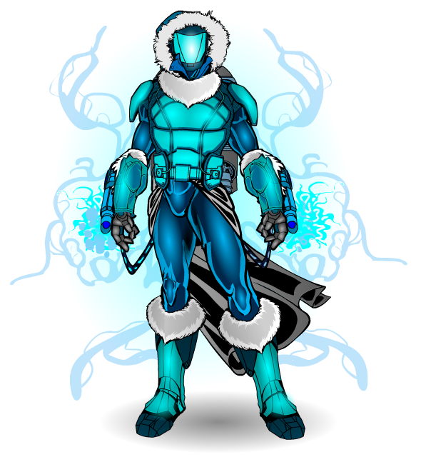
Blizzard
There's so much here to love on this guy. The use of coolers as boot and glove tops. The hood. The custom gauntlets (this was back before we got a load of mech hand items that everyone is so used to using nowadays). The pose that just screams badass. And the colours, which give of a cold aura even on screen. I would only be half joking if I were to say this guy gives me chills.
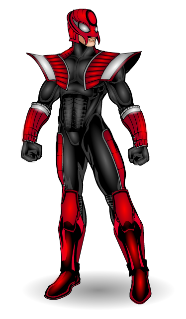
The Elite
Serious shading? Check
Inventive Item Usage? Check (look at the knee pad abs. And the shoulder pad mask)
Bad Ass feel and attitude? *raises eyebrow in a sarcastically quizzical manner*
Awesome? Do you even need to ask?
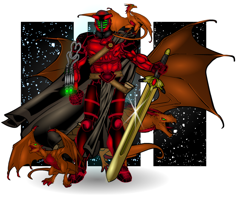
Dungeon with dragons
DUDE LOOK AT THOSE FLIPPIN' DRAGONS! AND THAT SWORD! AND THE BACKGROUND! AND THE ARMOUR! AND THE SHADING! AND THE.. oh just look at all of it.
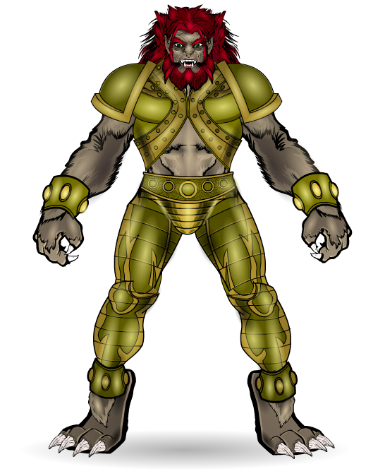
So, tip for any HM newbies out there. Using parts of companions as parts of a character is a really good way of getting some awesome looking pics. For example, the feet on this guy here are from the griffon in the companions standard set I believe and the claws are horns (the claws on the hands being teeth). Oh and obligatory comment about AMS shading with focus on the hair in particular.
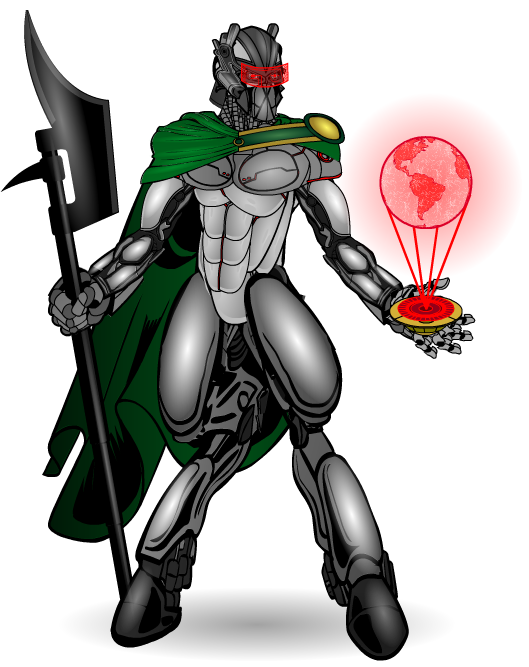
Ebony Spear
Ok, we're past the first 10 pages of the gallery boys and girls, only 70 more to go….
Ok so, back legs from an alternate body, body made from shoulder pads, hand and mask made from I-don't-know-what (unobtainium probably). Yeah.
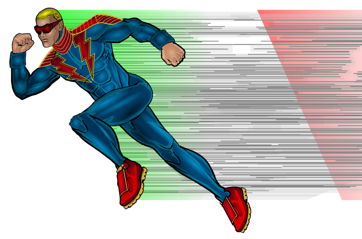
F1
I will say one thing about AMS, and that is he tends to stick with the same style of pose. This one is an exception and it's a great, action packed pose. The costume is simple and well done, but the stand out thing here is the Italian flag in the movement lines, which is brilliant.
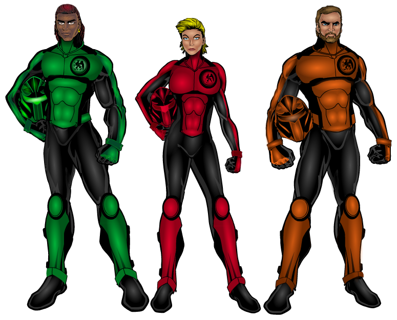
Griffin
These characters are a great example of just simple good design. The costume doesn't have any excess to it, it's just functional and well designed. The characters are identified by colours, whilst sharing common design themes, one of the best ways to show a team. And the fact that part of the costumes design is made from a non-standard male body just makes it even better.
Cupid
It's that silvery-blue colour again. Love that colour.
Cracking pose, love the look of concentration on her face. Again, simple, clean, good character design and costuming. Not much else to say, not much else needed to be said.
Leoxander
And to completely contradict everything I've just said, LOOK AT THIS FREAKIN' COSTUME!!! How long did that take? The design here is incredible, I half don't believe it's all heromachine. The face, again, is wonderful, menacing, pride filled and regal, all the things which a character like this should be.
Alpha
Ok, lets Face it, there's one part of this picture that sets it apart. It just proves the AMS is Head and shoulders above most other people when it comes to shading. Eye don't think you really need me to tell you which bit I'm talking about, I'm sure everyone already Nose. But of course everything else Ear is pretty awesome as well. The vein effect when put again the highlighted blue skin is Jaw dropping.
*not sorry at all*
Ultimate-grads (1 & 2)
So you think you can shade a character, eh?
Look above.
Still think you can shade a character?
Unless your name is AMS, I didn't think so.
Slash
Anyone else ever so slightly terrified by that mask?
Plus the guy has a hockey stick that might as well double as Deaths scythe, a metal arm and that slight head tilt that gives the impression that he's just sizing you up before he takes you out, completely. Oh, and of course, this wouldn't be a trip through AMS' gallery without the maple leaf making an appearance. (If I weren't being hyper-selective it would have appeared many many many times already).
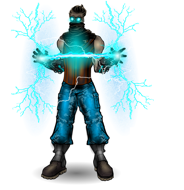
Manic Electric
Look at the lightning lighting! It's quite literally electric, dominating the picture to such an extent that it doesn't really matter that the costume is fairly simple, nor that the face is covered by goggles and a scarf. Out of all the energy effects in AMS' gallery, this is my favourite.
Stonebourne
And finally we get to AMS' signature character, in one of his more recent and best costume redesigns. Whilst the earlier Red, blue and yellow costumes were all good in their own right, this costume looks so much sleeker and more modern, trading out the blue and yellow for black and gold and adding some detailing that really takes it to another level (the insignia ending at the zip, the belts on the boots, the knuckles added to the gloves).This looks like the costume that would be used if anyone ever made a movie for the character.
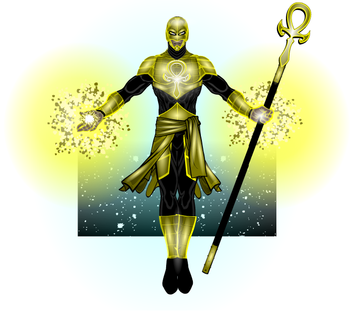
The Ankh
Ok, not gonna talk about this one much, because I already did a COTW post about it, but what I will say is the yellow outlining on the armour really makes this pic. And the background is classy.
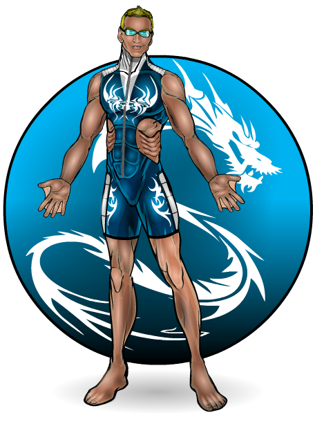
Waterdragon
So, what do I say about this that I haven't already said for the rest of the pics in this post. The shading is…. the face…. costume…..attitude… oh wait, gills and webs! Dude, the idea of using anime noses as eyes is something I already knew about, but making gills from them??? Dude that's a whole new level. And I don't even know how you did the webs for the hands.
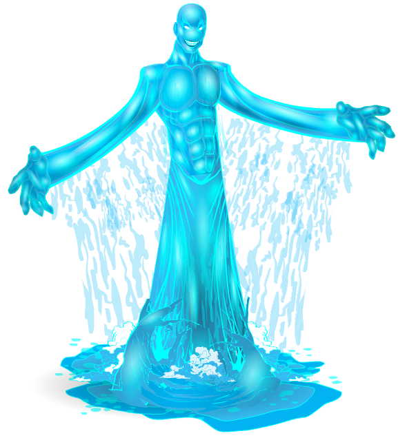
Flood
These last two guys should team up.
Anyway, the water effect at the base of the character is what makes it for me. The use of the dead tree pathway item as waves really gives a sense of motion to the piece, like the drops from the upper body of the character are having an effect on the ground they fall on. Brilliant.

The Reaper
And to finish…. do I need to say anything? Yes it's an old one, but it's perfect in every way. The pose, the background, the muted colours, the shading.
My only problem is, WHY IS THIS NOT ON THE FORUMS??????? I had to get it off Deviantart where you'd watermarked it so there's a mark over the main body of the picture! *double face-palm* Rectify this now, that is an order. This must be on the forums by the end of the week or I'm gonna accidentally delete your gallery again. 😉 (Jokes obvs, but it had better be uploaded)
As I said earlier, there's a metric (or imperial) ton of AMSing art that I haven't featured here. If you want to see it (I don't know why you wouldn't) go here: Planet AMS

