So, as promised Gallery Grabs has returned after skipping a week. And me being a complete contrarian, actually was planning to cover someone else this week, but changed my mind because it would have been too predictable. So instead I decided to go with Vectorman, who, like CantDraw previously, is one of those 'machiners whose work is always consistently awesome, but who for some reason doesn't always get the plaudits afforded to some of his peers. So lets rectify that by taking a stroll through the best of the best of his art.
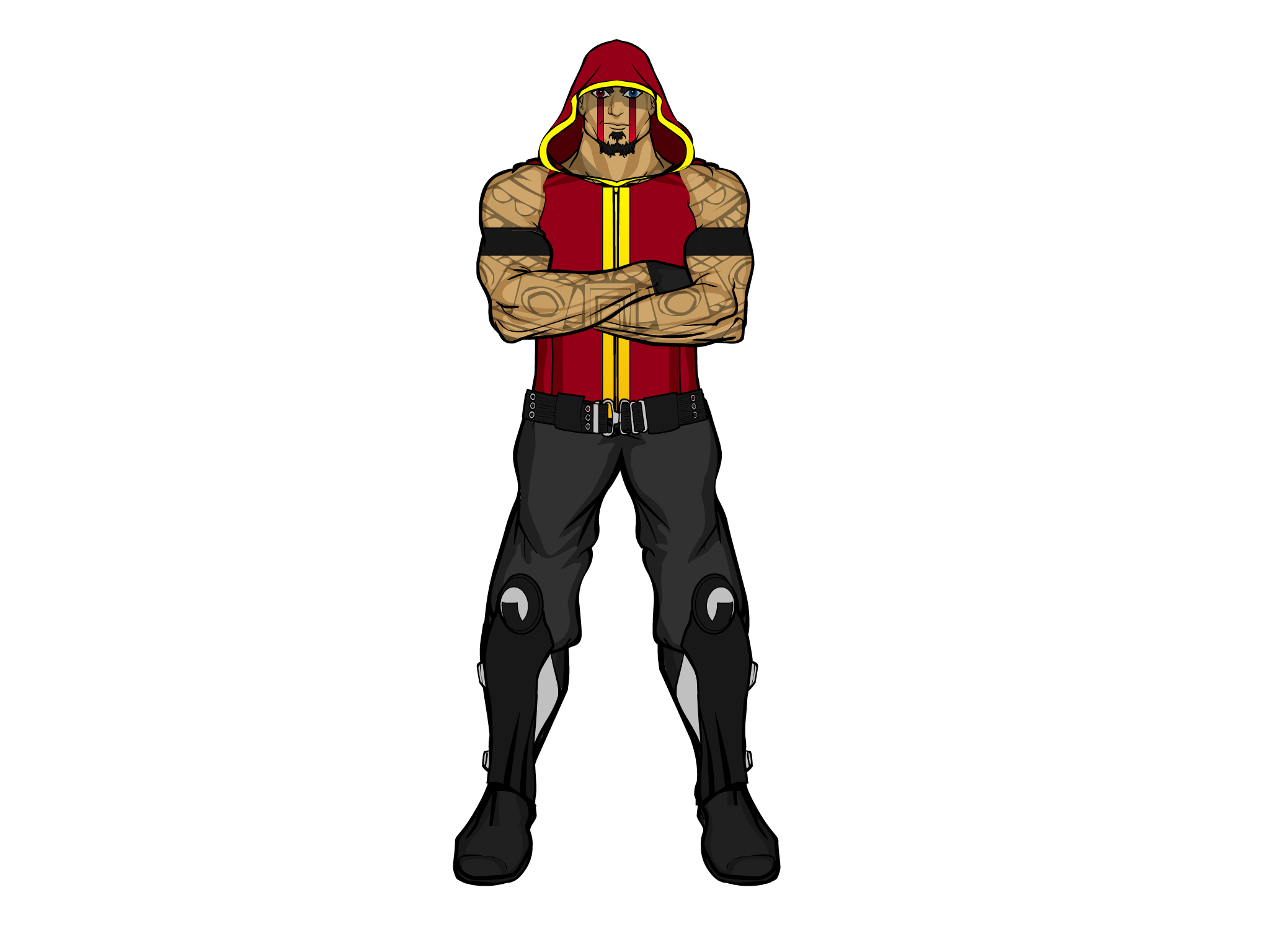
Overkill
Kicking off with the first post in his gallery and his signature character, Overkill. As a way to introduce yourself to the community, you have to say it's pretty good. Awesome costuming, masking work on the face, arms and jacket (in fact, double masking on the arms, with both tattoos and arm bands) and a total badass attitude. Very cool.
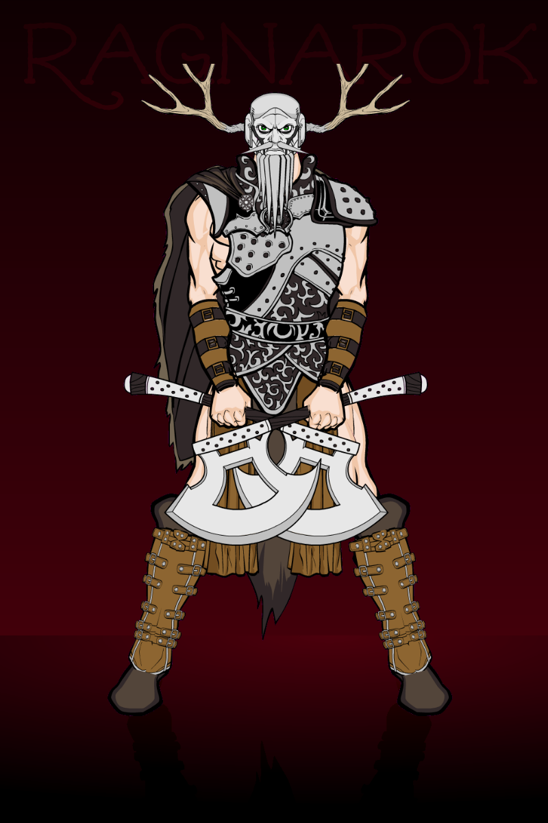
Ragnarok
Again, this is an example of the attitude VM imbues his characters with. God this guy looks pissed off. It's also a good example of Vectorman becoming more adventurous with items, the beard is made from pole arm ends and the boots have been made by flipping the same set of boots and masking them so they match to create a brand new item (a technique which I believe was pioneered by AMS, but that's by the by). I also like the very simple background, because it really makes the character stand out, which is the idea.
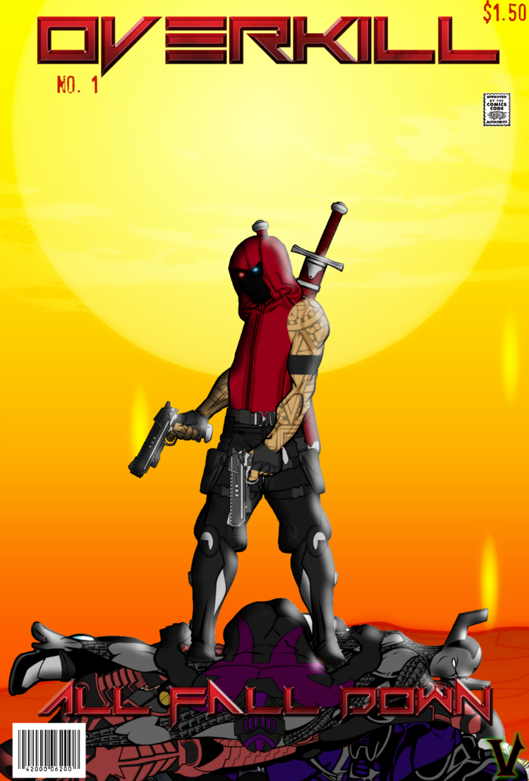
All Fall Down Overkill No 1
I believe this must have been an entry for the comic book covers challenge, but it was so long ago I don't really remember and it would take too long to go back and find it, but either way it's definitely imposing. Again, simple background, badass attitude and an interesting pose, plus more unusual and clever item placing (using a sleeve to create part of the hood). This must have been in the poll if it was in the contest. Oh, and it's good value too, only $1.50 which is dirt cheap compared to most other comics these days.

Scene From Overkill No 1
Ok, so, this one was actually posted on VM's gallery as an unfinished piece so I went to Deviantart to get it, but being honest, this is my favourite of his works so I'm not leaving it out.I can't really explain why I like it so much, but it always impresses me when ever I look at it. I love haw the serpent is wrapped around the mountain in such a convincing way, none of the items look unnatural in the pose and the shading and lighting work really well. I also like the scale. That serpent is bigger than a mountain, that's freaking scary. And then the colours all compliment each other so well, the orange of the sky, the brown of the mountain and ground and the green of the serpent all work perfectly together.
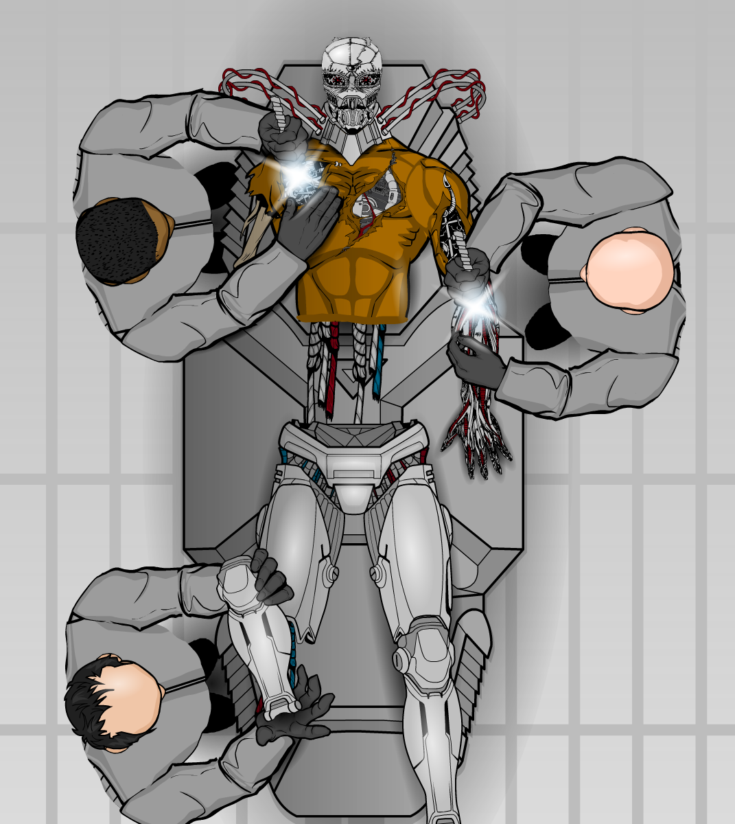
Assembly Required
Who would have got mad at me if I'd left this out? Be honest. Yes, I could talk for days about this picture, being objective, this is the best thing VM has ever done. The item usage is brilliant, the concept/ execution is mind blowing and the perspective is sensational, especially on the scientists. Doing a human from above on heromachine is insane, but it's pulled off here to perfection.
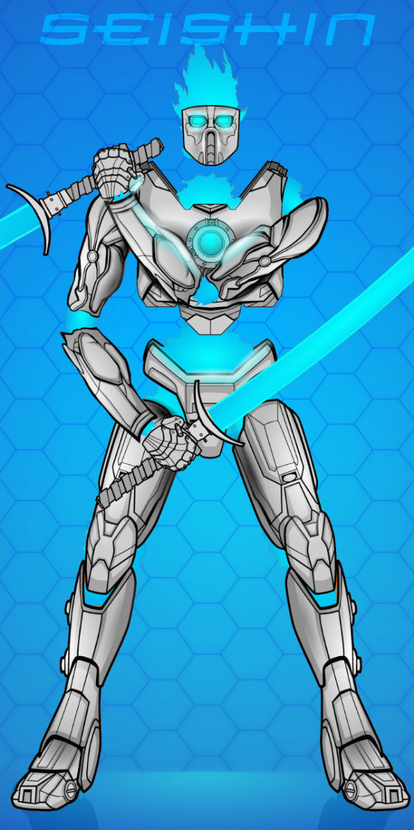
Seishin
The beauty of this one is that it's so simple. No need to fiddle around trying to get body parts to be anatomically correct for a pose, why not just leave them out and pose the armour instead and fill the gaps with blue flames and nothingness. However, if you are going to try that, make sure you shade it this well as well.
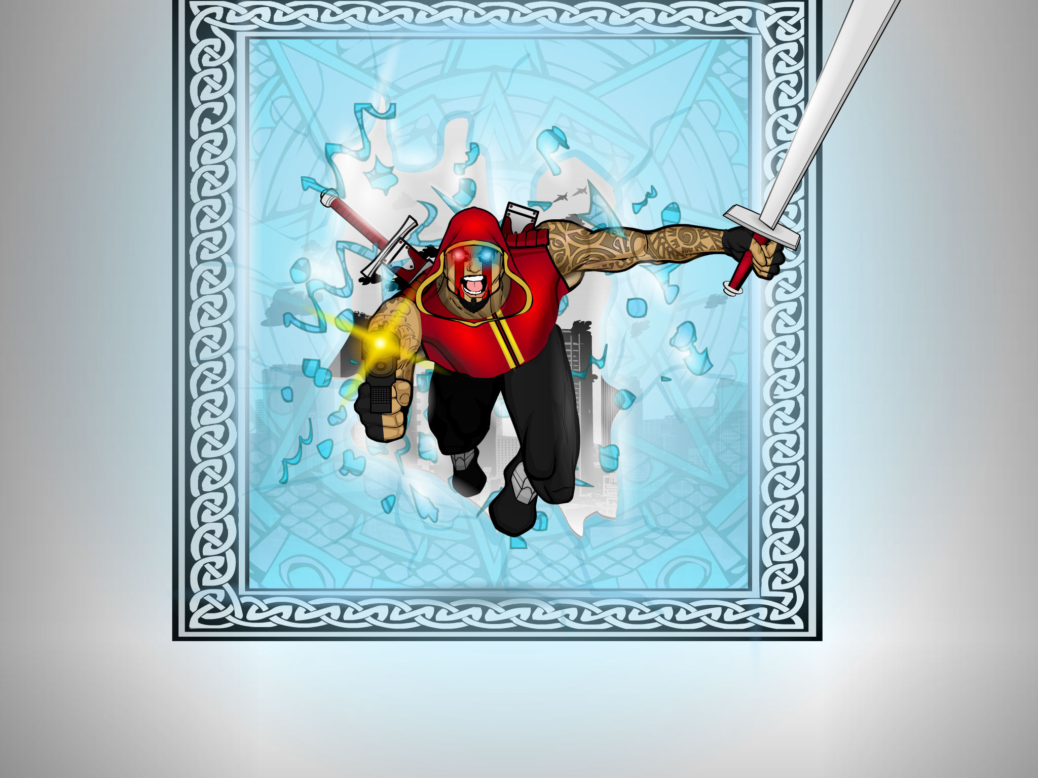
Overkill Action Pose
This! Picture! Is! Powerful!
What else am I meant to say. It's a badass guy bursting through glass with guns blazing and wielding a sword, whilst screaming his head off and coming right for the viewer. Though I have to give a nod to the neat blurry shading around the shattered edges of the glass, which give the impression of light bursting through with the character. Awesome.

Aircrash Attacks
For some reason VM never posted this one to his forum gallery, so it's a deviantart pull again (why didn't you dude?). But again, the action is what sells this one. The motion lines draw you into the picture and towards those energy wielding hands. The fact the character is leaning forward, towards the viewer, suggests the force he is putting into the blow, and again the colours are on point, two colours for the costume, two for the background and two for the foreground, one of which is used in both of the other components of the picture, giving a nice packaged feel, everything is together in this picture, nothing out of place.
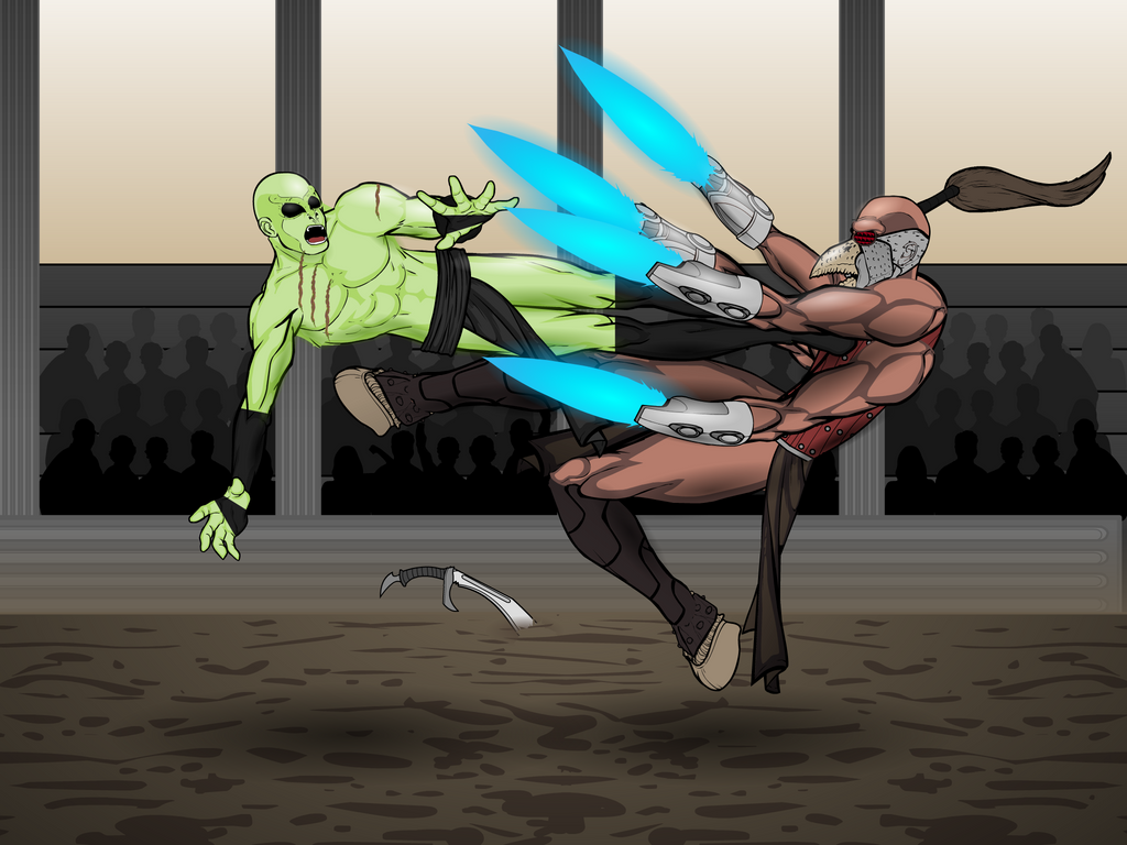
The Only Sport On Sanctum
Another contest entry/ winner and another one that was only posted on deviantart. This one is all about the posing, the action and the inventive design of the fighter getting drop kicked in the chest (I love the use of a hand item for the face). A really cool scene.

Samurai Battle Scene ii
Dude you really neglect your forum gallery don't you. Wow I never realised because you are so active on deviantart. But anyway, to finish off we'll go with a classic that completely bodied the competition in its contest poll (still the highest win margin we've ever had on a poll). As a whole, this picture works. It works perfectly. The greyscale colour scheme, the poses (especially on the left hand character), the implied story behind the visuals. It's one of those pieces that doesn't need to say a whole lot to grab you attention and hold it.
For everyone looking to check out Vectorman's art, I'd suggest going to his deviantart page. Which is here. I know I forgot to link CantDraws gallery last time out, but hopefully I'll remember from now on.
Also, depending on whether or not I get any PUP replies this week, this could be made a weekly post, in which case any guesses as to who next week is going to focus on?

