While I'm waiting for a few people to get back to me on the PUP: Redux front, I thought I'd do something new. The idea is, I'm gonna randomly go through somebody's gallery on the forums and pick out my favourite pictures of theirs and talk about them, sort of like Character Of The Week, but for a whole gallery. This week, I'm picking on CantDraw.
Tell me what you think of the idea in the comments and, if you guys like the idea, I'll bring more. Not telling who I'll pick though. That ruins the fun.
Awesome Art After The Jump
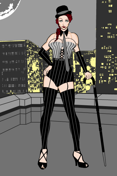
Pinstripes
This was the first thing CD uploaded on the forums and, whilst it doesn't showcase his amazing shading style, you can see the start of what would become his signature style, especially with costuming. Forgive me if I'm wrong, but I don't actually recall that many CantDraw characters where he uses the pre-made clothing items (well, I struggle to recall that many CantDraw characters that actually uses clothing, but that's another matter). He seems to make all of his own costumes out of whatever he feels like, and that's clear here. I mean just look at the bustier. No! The bustier, the clothes not the… really...
Moving on.
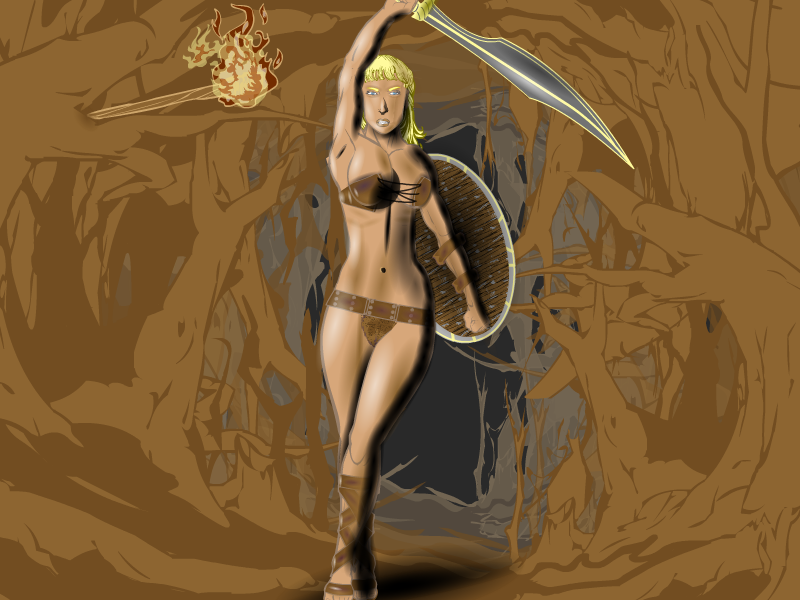
Hero Nimu
CD very quickly got the hang of shading. I mean there were numerous pictures from the first 4- 5 pages of his gallery that I could use to showcase this, but I had to go with this one. At the time I said it looked like he'd shaded with charcoal. Still does. This is really where the style came together. The lighting is gorgeous, the pose is dynamic and the character is mostly devoid of clothing. This will be a pattern as we go through here, blame CantDraw not me.
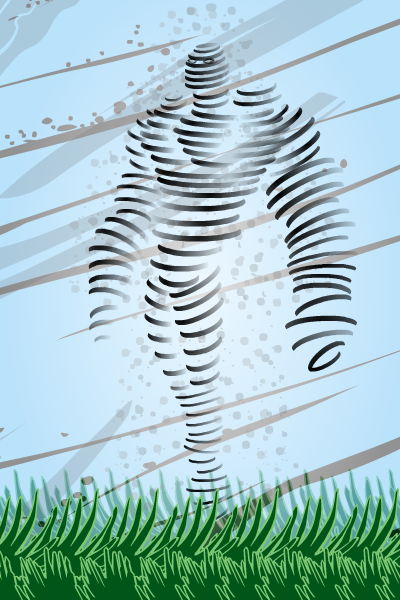
Aeolus Whirlwind
One of CD's earliest contest entries. It didn't win. I have no idea how. The idea is so stupidly simple; get some crescent insignia's, position them to make a vague body shape, mask a shading circle to each to get a faded effect, remove all colour from insignias to leave only the shading circle, done. But it looks so good. And the eyebrows as grass...
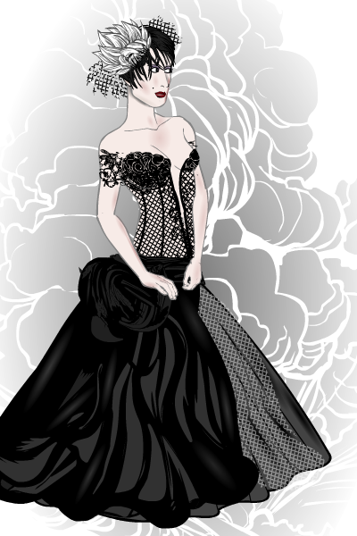
Dark Queen
I have to give this one a shout out for the lace effect on the corset, the custom sideways looking face and the fact that CD managed to get the super-saiyen hair to look good. There's something about this picture that I can't quite put my finger on, it's just very…. stylish? I mean (say that a lot I've just noticed), I've seen djuby do costume designs that are similar, but I've never seen a picture that looks quite like this one, not even from CD. I can see why he said it was his favourite in his PUP.
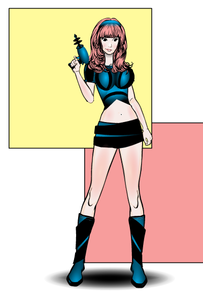
Femora
She's cute. I love the retro look on this one. The thin body style is also very unique. The custom hair, the laser gun and the really funky clothing all combine to make this sparkling gem in CantDraws considerable treasury. Also, loving the simple, two square background.
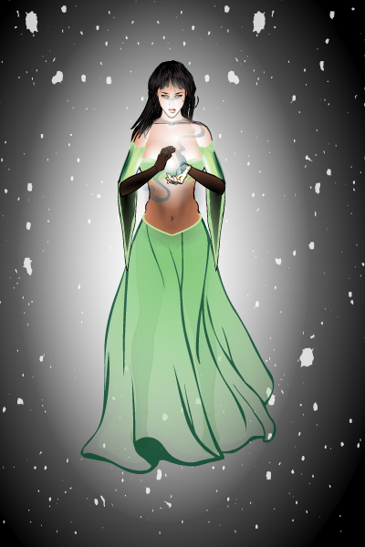
Druidess
LIGHTING!!!!!! Look at the lighting. Look at the colours on the stomach. The face. The costume. This picture just screams mystery, especially if you spend too long looking at her face.
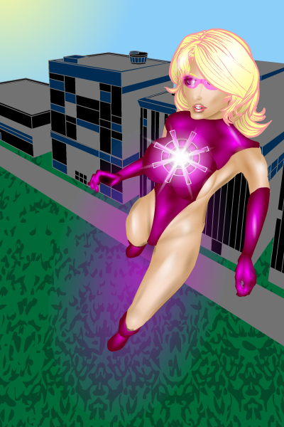
Stellar
So… any guesses as to what I'm gonna talk about? Well, I'll give you a clue, it starts with S and ends in hading. CD is very good at it you know. He has a way of getting sort of latex effect by adding an extra small white shading circle on top of somewhere he's already highlighted. He is also one of the few people who can shading skin convincingly. But that isn't the only reason I like this one. The pose is great (and borrowed from a Warren Louw Power Girl picture), the hair is pretty neat (the blonde with pink outline really rocks) and the sunglasses are a cool addition. I'm still not buying the "comic book physics" argument as to how she's staying in that costume though CD.
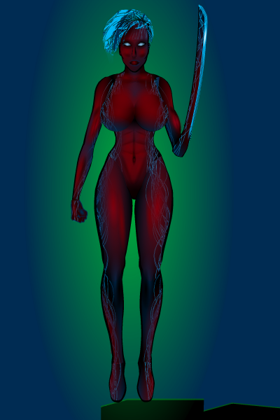
MetalStreak 2.0
Do you really need me to run you through this one? Shading. Menacing looks. The fact the blue "veins" fade in and out of the shading. General awesomeness. Done.
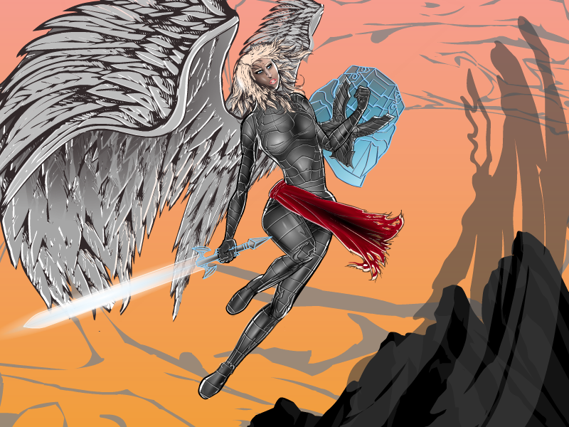
SciFiAngel
...
…..
……...
Wings. Pose. Colouring. Shading. Item usage. Expression. Background.
This is one of those few times on a heromachine picture where I could only nit-pick if I was being incredibly cruel. You know earlier I was talking about CantDraw having a considerable treasury for a gallery. Here's the crown jewels.
I was going to leave that one there, but I can't. Can anyone tell me what the best part of this picture actually is? At the moment I start off with the wings, then I look at the shading on the armour, the I see the shield arm and the pose. By the time I've got to deciding, I've given up and just say all of it.
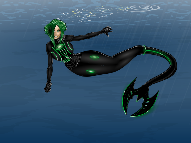
Headcase- Mermaid
...
…..
…….
DAMMIT!
Ok, question. Which is better, this one or the SciFi Angel? My brain gave out before I could logically come up with an answer.
But I can talk about it. Funny story, when CD originally posted this on his thread, I saw it and started typing a comment about how COTW was decided for that week. However, whilst I'm typing he enters it into that weeks contest, so I edit the comment saying how I would have liked to have featured it. And then CD offers to remove it from the contest so I could…. guy's mad. Anyway, long story short, it stays in the contest and annihilates everyone else. And is it any wonder why. Lets leave the obvious aside for a second, firstly the hair is really nicely masked together, you'd swear it was all one item. The green detailing all over the costume is just magnificent and is made even more beautiful by the fact that there are tiny white highlights along each green line. If that was intentional and not just a side-effect of some aspect of the design process, it is such an amazing attention to detail that I find myself struggling to words. And then we have the background. It's simple, but again, the little things really make a difference. The lighting and the aura/ energy effects to make the background less static. It shows that there is more going on beyond the picture, interacting with the environment and affecting what we see and are shown. But of course, the best bit is none of these things. They may be good (and they are very very good). But the tail...

