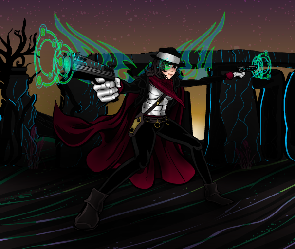
You know, sometimes my own rules do kinda get in the way in terms of this post. The rule about not including entries for current CDC's was included because I didn't want to sway the votes at all, but this week the one image I wanted to feature was an entry for the current contest. But, I don't want to remove it from the contest (despite the creator giving me their permission to do so) because it will probably win. So instead let's have a look at another piece which, while I don't have as much to say about it, is just as good.

Last week, I mentioned about how certain 'machiners have their own styles that make them stand out. Well this is another case in point. All of Al's signatures are present and correct, dynamic pose, moody background with gradient effect sky and awesome energy effect. I will say, the bottom of the character is rather hard to make out against the background, but it doesn't make the pose any less striking.
The colour coordination really works as well and is a good example of defining layers in a picture. You have the dark colours of the character, which comprise the first layer, which merge with the colours of the third layer, being the background. Now if it were just those two layers, the picture would be very dark, dreary and dull, despite the posing prowess. But then you have the vibrant greens and blues of the energy effect, the second layer, that sits in-between these two layers and spaces them out, adding depth to the image and breaking up the dark hues. And then it's tops off with the back-most layer, the sky, which has a light colour at its lowest point, the point where it meets the layer in front and then becomes darker at its highest point, the point where it diverges from the forward layer. I must also say, I love the neon lines that Al has included in the background layer to break up the black. I love how on the floor they change from purple to green at random points and are then blue for the background . Apart from breaking up the black, they also provide a really interesting eye-catch, and complement the energy effects quite nicely as well.
Mod Note: Quick question you guys. When it comes to this post, are you actually interested in what I have to say about the art? Because sometimes it's quite hard to write these posts because I feel like I'm just repeating myself. I always talk about the same things. And the intros are horrible to write. So do you guys want me to keep the text part of the post, or would you mind if I just showcased the pictures instead?

