This poll will be open from now until Christmas Eve, so make sure you vote for your favourite lots during that time, because remember, whoever wins is going in the HOF.
Note: Poll 4 ended in a draw (nice and rhyme), so I have included both of the winners from that poll here for the sake of fairness (plus we usually have 5 entries in a poll, so it makes sense really).
Anyway, pop below the break for my run down of this years finalists.
Candruth- Priestess

Well, what do I really say about this one? It's all about the shading. If you read my Character Of The Week section on the blog usually, you'll know my stance of Candruth's shading ability (i.e. it's something special), but this one takes the biscuit, pie, cake and desert isle of your local supermarket. Just look at the shading on the fabric sections of both the dress and sash, the look almost tangible. And then you have the fact that the picture has such a wonderful sense of lighting. Half the picture interacts with the light source, in this case the magical glow in her right hand, whilst the other is cloaked in shadow, as it is turned away from the light source (the best example here being the hood, where we see the bottom and top of the hood dissolve into darkness around its middle). Wonderful art.
Carmen- The Strange Case Of Hannah Jekyll And Edith Hyde

How to explain what makes this one so special? I guess it has to be in the little things, the little details that separate the two focuses of the picture. On the one hand we have to shy, sensible, slightly demure looking Jekyll, with her glasses, freckles and longer sleeves and skirt, supporting an unsure expression as she looks over her shoulder at her reflection. Whilst on the other side we have the wild, blonde, party girl looking Hyde, with her shorter skirt and sleeves and mischievous grin, the contrast between the same character works so well. I also love the fact that it's in black and white, with the only other colour being the red of the skirts, flowers, lipstick and needle, it's all very noir film poster. And I love how Carmen used one of the female alternate bodies, it makes the piece stand out more against the standard bodies.
Stulte- Angler

The challenge for the contest this was originally entered into was to create something non-humanoid, so something that didn't stand on two legs and have two arms and a head in the same way we do, and Stulte managed to take the concept to an excellent and hugely inventive climax. As far as I can see, there aren't actually any body parts in this picture, apart from the tail, it's all made from head items, a few ears and some shoulder pads, plus a skirt for the fins. Add that all together and you come up with an exceptionally toothy and really quite creepy angler fish that you really don't want to be running into when out swimming.
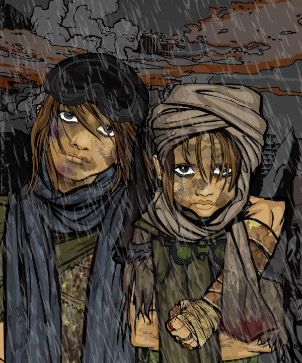
Valyndril- Post- Apocalyptic Children

Ah, the fore-gone conclusion. This one completely decimated its poll, both in its original CDC and in the COTY preliminary poll. And it's not hard to see why. You can always tell that a picture stands a good chance of winning a contest when I actually find myself asking the creator if it is all done in Heromachine, which I did for this one, due to the fact I've only ever seen effects like these done in photoshopped Heromachine pictures. So yeah, good luck everyone, I get the feeling this is the one you have to beat.
Zyp- Phaeya

And finally, the old master returns to give the younger pretenders a run for their money. One of the highlights of the Heromachine year was Zyps return and when he finally managed to enter a Heromachine 3 based contest what happens, he goes and wins it. Much surprise (*said in a completely deadpan tone*). But of course, it's Zyp, soooo I guess it was a bit too easy to see it coming. I mean he's the guy after whom the technique of shading in heromachine is named after, and we gave him free reign with someone else's character to go away and pose and shade to his hearts content and we end up with this. As I said with Candruth earlier, the interaction between the character and the light source is what really makes this character. The glow from the blue flame in her left hand permeates the rest of the left side of the picture, especially on the armour, which are left with this beautiful ethereal blue glow that is quite stunning. And there's also a very nice hint of that blue on the face, which just really sets it off. I would say good job, but as I've said; it's Zyp, what would you expect. Oh and yes, there have been legends.

