Monthly Archives: October 2014

Character Design Contest ♯92 (Public Domain Redesigns) Poll

[polldaddy poll="8352546"]

Check out our finalists after the jump.

Continue reading

Character Design Contest ♯91 (7 Deadly Sins) Winner

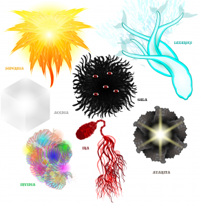
I can honestly say I'm completely unsurprised by the result of this weeks poll. As I've said before, there are just some times when you can tell which entry is going to win and this was one of those times. It probably helped that our winner was the only person brave enough to try out not only doing all 7 sins in one picture, but making them abstracts as well. So I'm happy to say that our winner is Stulte for his The Seven. Congrats man, that'd be your second I believe, and well done to everyone else who entered.

91 Stulte- The Seven

JReviews: Doctor Who Series 8 Episode 7- Kill The Moon

Wow, that was quite something.

Continue reading

Don’t Ask

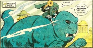
Doom

HM3: Mech Chicken Legs (Reward for CDC#71: Scenery)

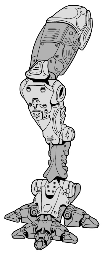
These mech legs were a prize request from Extremely Epic for winning Character Design Contest #71: Scenery. They come in three separate pieces and can be found stomping around the Body/Mech category.


MechLeg_ExtremelyEpic

Character Of The Week: Therianthrope- Giovanni

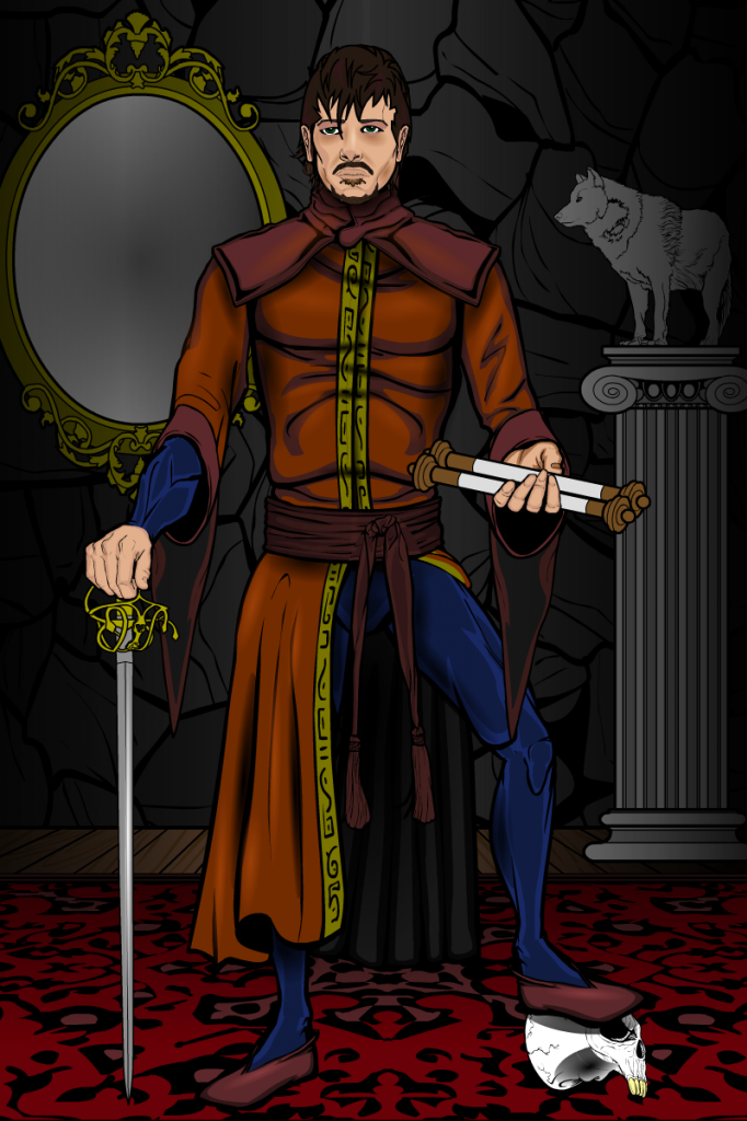
This weeks COTW I had to feature not only because of the fact it's a great image, but for all of the symbolism included and the thought that went into it.

Ok, we'll kick off with the usual stuff. The shading is excellent. There is a chance that when you do shading with near full alpha settings, you can end up with shading that looks messy and horrible, which is why I tend to prefer using at most 75% alpha on the shading circle, but Therianthrope has a knack of actually making it work. The shading on the face is a very good example of this, as well as a good example of adding depth without using the standard black. The face looks incredibly realistic and the expression just draws you in. However, while we're on the shading, I do think he missed a trick by not putting a shadow underfoot of the character and the skull beneath the left foot, it makes the character look slightly divorced from the background at the point they meet.

My favourite part of the image is not the shading though, it's actually the left hand. It's so stupidly simple, but I haven't actually seen those two hands used together in that way before. It's impossible to mask to the palm up hand that is used as the back part of the hand here, or at least impossible to mask in a way that looks good, so using the grasping fingers makes sense. But I haven't seen it before. Maybe it's just no-one has had need to use those items in that way, but I had to make mention of it because it just works so well and I will be borrowing that idea at some point in the future.

Finally we get on to all of the symbolism and for that I'm going to let Therianthrope speak for himself. As he posted on his forum thread:

"The rapier standing for his clans strength – wielded with finesse, the scroll standing for his learned status, the mirror in the back indicating his wealth, the statue of the wolf indicating he is Cainite, and the skull under his left foot is for his clans mastery over death (they’re necromancers)."

I love all of the thought that was put into all of the little details and inclusions in here. Everything has a place and a meaning, nothing is out of place or needlessly included. It just works.

Kaldath’s Caption Contest #45

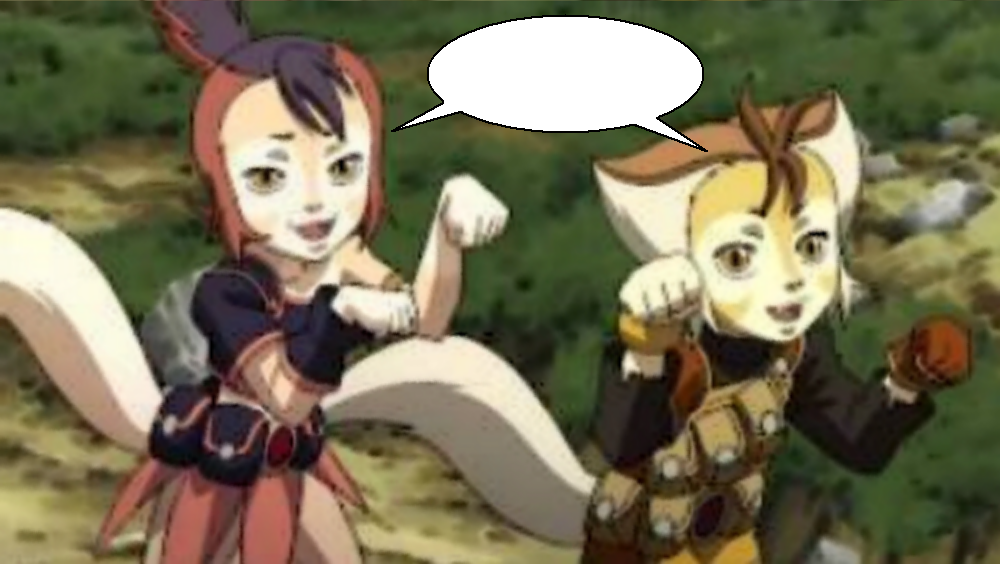
It is again time for our weekly caption contest and this week your challenge is to give your best dialogue for this image:

Thundercats 1


The normal rules apply, which are: You are limited to Three (3) entries which are due by 11:59 PM Eastern Time on Tuesday October 7th.  Of course I as always expect you to keep your entries no worse then PG-13 in nature and that you follow all the normal rules of the forum when writing your caption for the above image. That being said I wish you all Good luck!

Kaldath’s Caption Contest #44 – Results

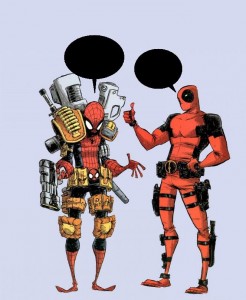
Last week I asked you all to give me your best dialogue for the following image:

SM and DP

After a bit of a delay in the judging here are my top five entries.

JR19759

1. Spider-Man: What the hell is all of this?
Deadpool: Hey, I was created by Rob Liefeld.

*****

Mr. Q

Deadpool: I call it the Liefeld look.
Spider-Man: I call it gaudy and unnecessary.

*****

Skybandit

S: What’s with the belt-buckle that looks like my face?

D: It looks like you’re sticking your tongue out when you pee!

*****

Phatchick

SM- Don’t you think this is overkill for a kid’s show appearance?
DP- Those 8 year olds can be a tough crowd.

*****

Ubiquitous Pixel

Spider-man: Can’t tell if all this makes me feel heavier or if it’s the ego attached to it…

Deadpool: Defiantly a little a heavy since it flattened your spidey feet!

*****

And our winner is ...................................................


Continue reading

Community Submissions: Superhero Movies You’ve Never Seen (And Why You’ve Never Seen Them) with Skybandit

Ok guys, time for the first of our Community Submissions, this week brought to you courtesy of Skybandit. Submissions next Thursday are now open. You can find the rules and other submission information here: Link

Anyway, I will now go away and leave you with Skybandit.

Continue reading

Caption Results and New Contest Delayed

Well machiners I need to apologize. today was a busy hectic day for me, so much so that I plum forgot it was Wednesday and that I needed to Judge last weeks Caption contest and put up a new one today. I will have that done tonight if possible, but more likely I won't be able to get to it until tomorrow afternoon. Once again I apologize for the delay.