Ok, I feel some people may not be happy with some of the choices I've made for this weeks poll, or rather some of my choices of entries to leave out. So after the jump I'll explain why I chose these five out of all the entries.
I'd like to kick off by saying this wasn't an easy contest to judge. At one point when I was compiling the poll list, I had 8 or so possibles. But anyway, lets look at our finalists individually.
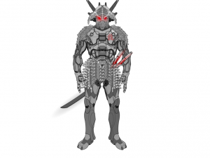
Achillies228- Hattori
This one I chose because of the item usage. There are a number of Samurai armour items in Heromachine, none of which are used here. Instead Achillies used headgear items for the skirt and shoulder pads (which gets him major bonus points from me, because it looks amazing and must have taken a bit to do) and mech-heads for the helmet, to create a cool looking cyborg samurai style composition. And of course theres the name, which I'm gonna assume was inspired by Hattori Hanzo, a famous 16th century Samurai and one of the people credited with unifying Japan. So yeah, like this one.
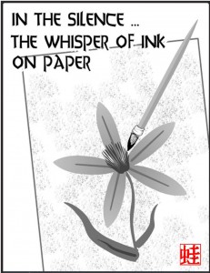
Cliff- Haiku: In The Silence
I love the fact Cliff decided to enter some haiku's, it was unique and not something I would have expected anyone to do, even though they are so intrinsically Japanese. I was half tempted to compile all of Cliffs Haiku's into one picture, but as he entered them all separately, I chose my favourite. I love how simple these pictures look, the only colour is the red writing in the bottom right corner (which I'm gonna guess is a signature?). Also great use of items to create something that none of the original parts are meant to be, in this case a flower and a paintbrush out of hair, tails, gloves and insignias.
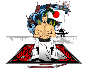
Demoninthenight- Life Of A Samurai
This one I chose for the imagery. The foreground is a samurai committing Sepuku (a ritual form of suicide committed by samurai who wish to die in honour rather than be captured by their enemies), whilst the background is just plain white, with the japanese background scene in black to give scenery. But then somewhere in between that we have a mid-range part to the image, showing the samurai's life in numerous objects (including a samurai helmet, a dragon and a lotus tree), which is coloured to contrast against the clean and stark foreground and background. Now usually I don't tend to go for pictures that have a main focus that uses more than 3 or 4 colours, but this is so restrained, the main focus has only 3 colours if we're talking about the foreground, whilst the mid-range has numerous colours all confined into one section of the image. It doesn't draw your eye away from the main focus, instead you are led around the picture, so you have enough time to take it all in. Plus, with a subject matter such as Sepuku, it could be very easy to go over the top, but, as with the colours, the action is very restrained, almost peaceful, giving the impression that the samurai is resigned to his fate and is having his life flash before his eyes as he takes his final breaths. Just goes to show you don't need to do any flashy shading or outlandish poses to make a picture good.
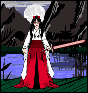
Kaldath- Shrine Maiden Kimiko Sachimoro
Another simple and clean execution. Two colour costume, with a third colour for the hair, and a three colour background. The foreground focus colours are bright and eye catching, which draw in your eyes and contrast against the dull and darker background colours. I also like the juxtaposition Kaldath worked into this picture. You have the traditional robes the character is wearing, plus the traditional background scene, but then the character is wearing modern sunglasses (which look amazing, I love the effect used to make them two toned). It makes her face stand out and the face is always the thing we identify with the most as it is our main source of interaction with other people, how we tell emotions and make connections.
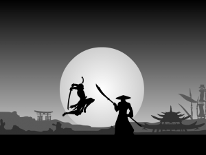
Vectorman316- Samurai Fight Scene
Now, I'm sure no-one has any questions as to why this entry is here, so I don't think I need to talk about it all that much. It's just a great artwork, simple, stark colours, background/ foreground contrast, action and a suggested story (why are they fighting, what happened?).

