As I mentioned earlier, I have to redesign the way the site is laid out to avoid getting the Google Hammer dropped on me. Basically the ads are too close to the content in the current layout.
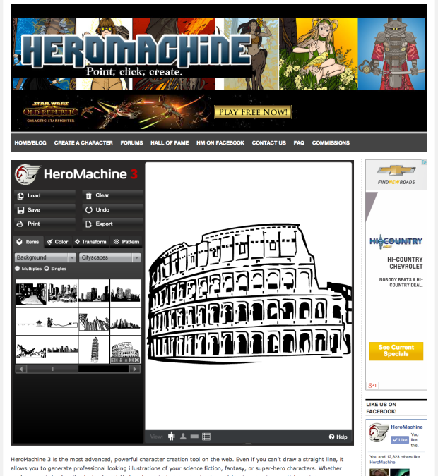
The good news is, the app itself has also gone under the knife, and I think there are a few good bits in there for you, the intrepid HeroMachine creator. Here's a screen capture of what I'm proposing:
And the stuff I hope you'll like about it?
- The Google ad will no longer be present in widescreen mode, so you can once again do screen captures without having to crop. Hooray!
- The character canvas is larger than in the current layout letting you see more of your creation.
- I'm proposing to swap the tool buttons over to the left side, which always felt more natural to me.
None of this is set in stone, of course. I'll be continuing to make tweaks to the design over the weekend, so please let me know any thoughts you have on the new layout.


