I recently completed another commissioned illustration for an awesome guy currently serving the US overseas. Here is the description we started with:
I want an illustration of an intense battle between Titan and his arch nemesis Demora in color.
Titan's Powers: Superhuman strength, can generate force fields, and shoot energy from his hands. He has almost impenetrable skin and the power of flight. Under the suit Titan is a white male with military cut blonde hair and blue eyes a ripped and cut body style he is about 6ft 220lbs of lean superhuman muscle.
Demora's Powers: The power of teleportation, the ability to read minds, superhuman strength impenetrable skin. breaths molting hot lava that can be shot as a projectile to melt through almost anything including metal. and razor sharp teeth, claws and tail that can rip and cut through anything including himself. his claws and tail are the only things that can penetrate his skin. Demora stands at 6'5 and 265lbs of pure demonic superhuman muscle.
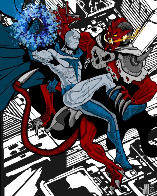
I want the battle to be in the air as titan is flying and Demora teleports up to him have the ppl look like it could go either way you don't know who the winner could be but since demora is the only person strong enough to defeat titan give Demora a slight upper hand but not enough for a clear victory in the background and beneath them have ruins of a city or something to show the battle has been going on for quite sometime and give them both battle damaged attire that they are wearing, maybe put Demora about to breath his lava and strike at titan with his tail while titan generates a forcefield with one hand and about to throw an energy projectile at Demora with the other.
He was kind enough to provide a couple of HeroMachine drawings to help:
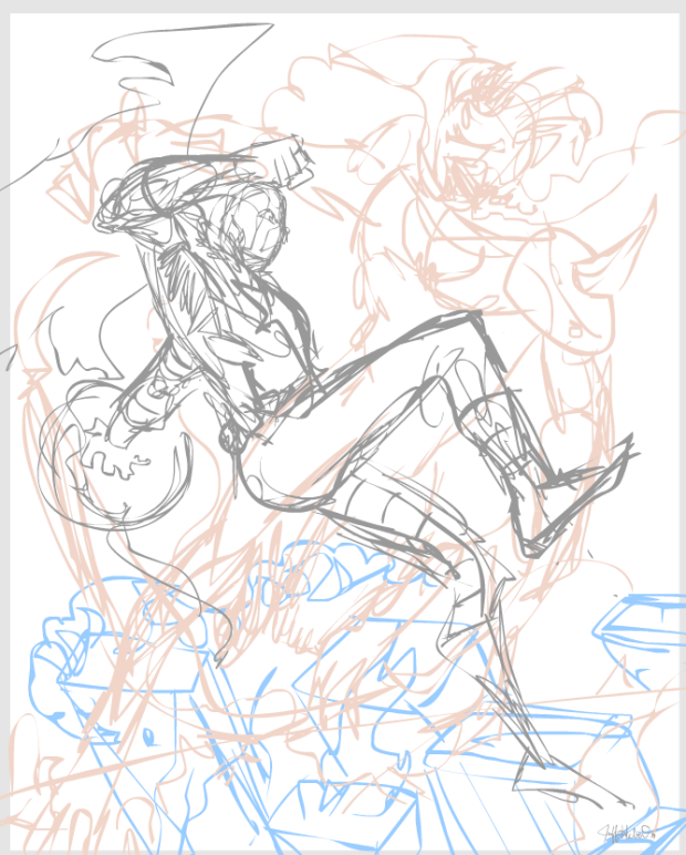
We tried out a few rough pose sketches and ended up with this one:
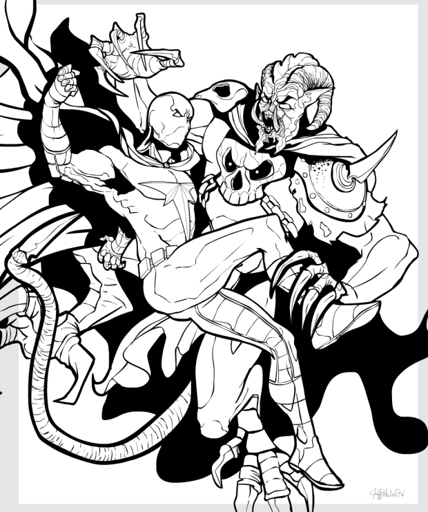
With that as the layout drawing, I moved on to the black and white line drawing. I took a few liberties with the first try, particularly on Demora's legs:
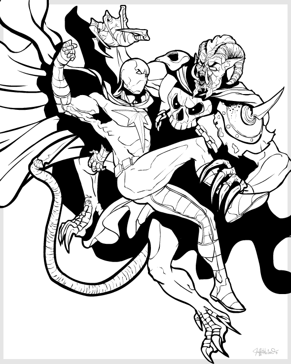
The client preferred the original version, and the "T" on Titan's chest needed to be moved up some. That resulted in this:
With that we had a winner! Once the line art is set, it's time to move on to color and special effects. After a few rounds of tweaking, the final illustration came out pretty well:
It was a fun project to work on; I hope you enjoyed a peek behind the curtain of how these things are done. My thanks to the client for his vision and creativity, and of course it goes without saying that the characters presented herein and the image itself are entirely his.


