Ok, the votes are in for each poll and we have our 5 finalists, ready to battle it out for the title of Character Of The Year. And by the looks of things, this one's going to be a good 'un.
[polldaddy poll="7649568"]Click continue reading to hear my thoughts on each of the finalists, or just vote. Either way, good luck to our finalists. You'll find out the winner on Christmas Eve.
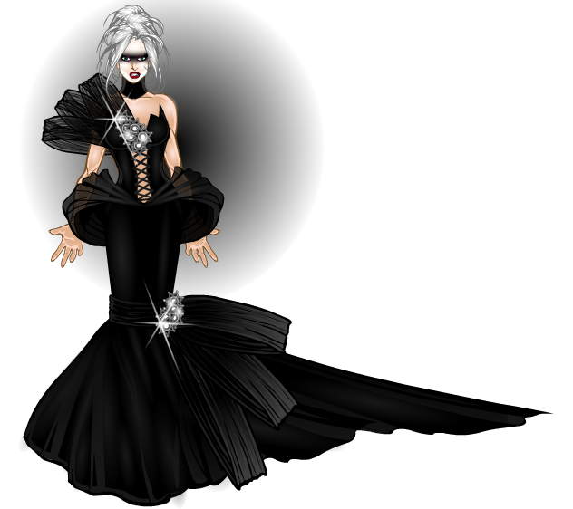
djuby- haute couture (CDC 41- Fashion Show)
Ok, so lets kick off with djuby shall we. Some people may not have thought it fair that djuby was even allowed to enter the fashion contest considering that he makes costumes professionally, but when you end up with work of this calibre entered into a contest, that point sort of doesn't matter any more. This is one of djuby's finest works (although the same could be said for his other entry into this specific contest as well). The costume its self is superb, considering that much of it is pitch black, the shading really makes it interesting and the accessories just look gorgeous. And to top it all off, he's got it being modelled by Pris from Blade Runner. Loving the make up choice there.
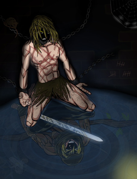
Kytana- Born Free (CDC 37- Opposites)
Sometimes in a contest, there are entries that make you go "if that doesn't win, there's something wrong!" Yeah, sorry to everyone else who entered that contest, but this was one of those times. The colour choices were perfect, though I have to single out two specifics for praise here, the scars, which look so natural, and the armour being worn by the reflection. It's also nice that there isn't much of a background, the encroaching black making the primary figure of the piece look and feel very isolated and alone, whilst also drawing our attention to the other main source of colour, the water on the floor and, with that, the reflection so we can see what the primary figure could and would be if it wasn't for the darkness holding him.
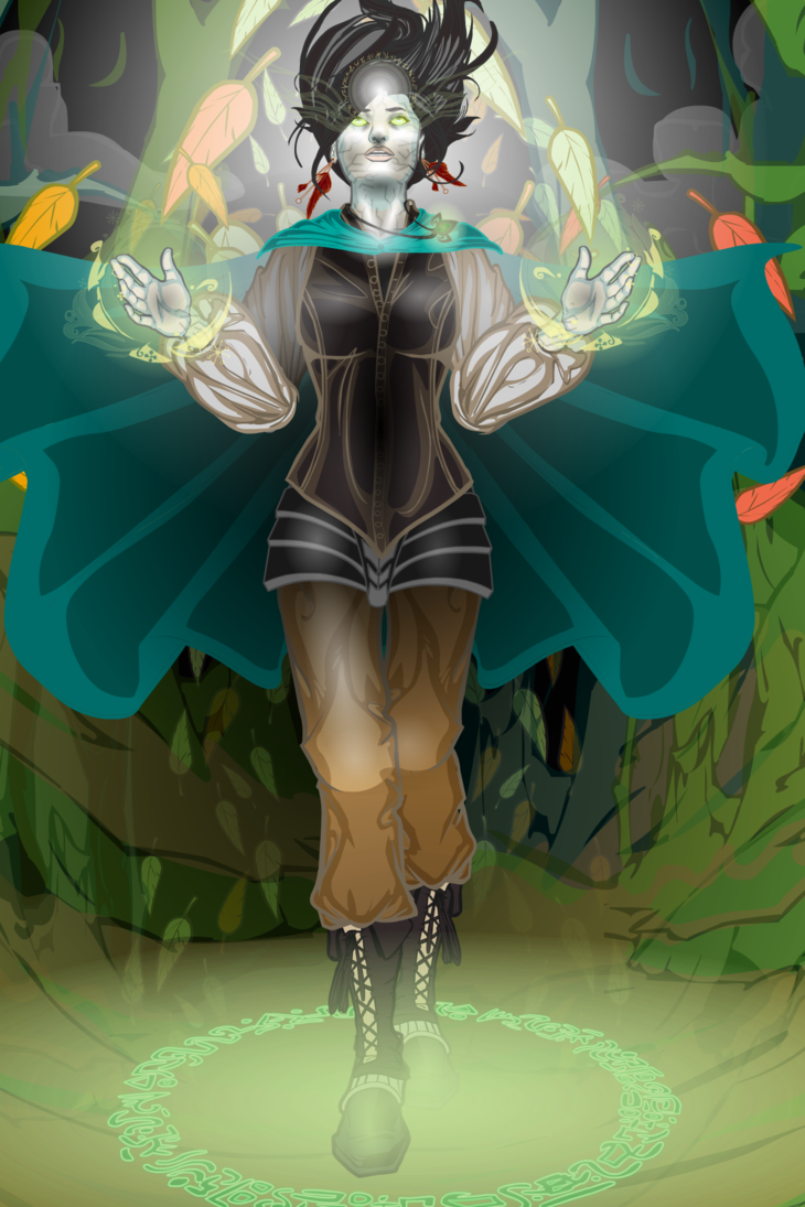
OnionBeam- Witch Of the Forest (CDC 45- Naturalism)
I think, at the time of this contest, it was said that this picture was one of those pictures that doesn't actually look like heromachine at first glance, until you start noticing items that you recognise. I would completely agree with that statement. The otherworldly glow given by the shading and the translucent background layer give this piece a definite mystique that just works so well. But the real genius in this picture is the head area. I can honestly say I never seen anything like it. Colour, shading, the sense of movement implied by the positioning of the necklace, earrings and hair, the subtle energy effect on the eyes, the expression its self. Need I say more.
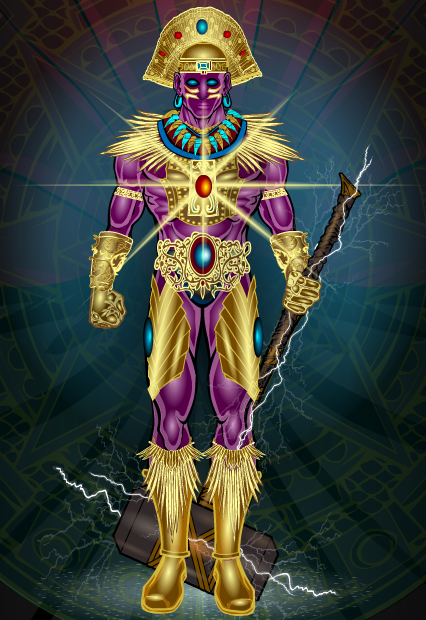
Scatman- Catequil (CDC 29- Gods)
I'm trying to think of how to write this one without going overboard on how awesome that highlighting is. Well, the costume is great, love the gold effect Scatman managed to get here, awesome highlighting on that. Then of course you have the contrast between the gold clothes and the purple skin, accented by the amazing highlighting that really makes both aspects pop. The jewellery is exquisitely done, the jewels really shine, thanks to some pretty damn fine highlighting, especially the jewel on the belt. And then we come to the background. The use of contrasting colours here is perfect, playing off against the brightness of the central character, the background is mostly dark gloomy colours, with a faded Mezo-American symbol layered over it to add that misty atmosphere that really makes the central character leap out of the page and catch the eye. Plus of course you have the wonderful highlighting around the area of the hammer.
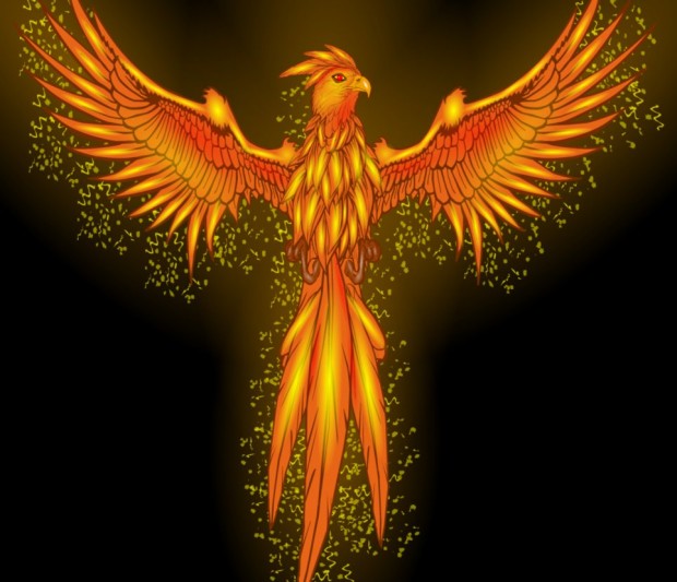
Toxicdiopside- The Last Phoenix (CDC 19- Great Balls Of Fire)
Well, what do I say about this one. The composition is great, I love how the actual bird has been constructed, none of the pieces look out of place or unnatural. But the real killer here for me is that shading. The yellow highlights against the orange really gives of a sense of great power and you also have the nice mixture of red at certain points (such as the wings and tail feathers) to contrast against the light on dark of the yellow and orange. The fact that there is no background also really helps this picture, as it means there is nothing else to draw away the eye. Plus having the orange glow on the black background makes the image really pop.
So, those are my thoughts, what are yours. Which of our finalists is your favourite?

