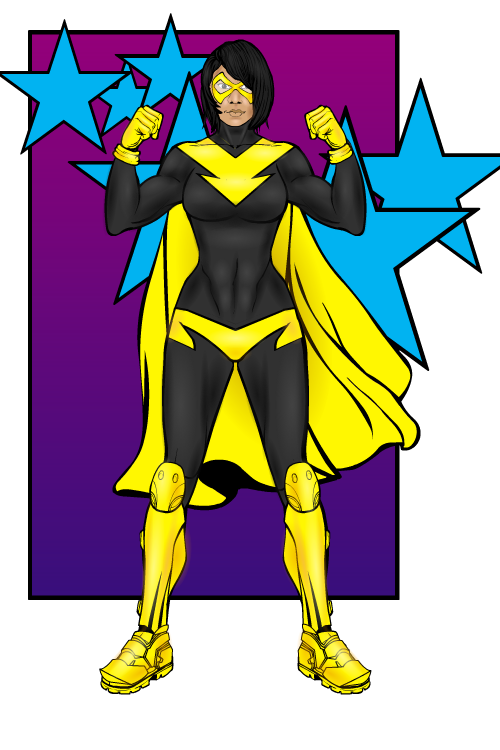
This week, I'm going to look at one of Trekkie's newest creations, Bolt.
The main reason I chose this is the colouring. It is simple but very effective, especially when combined with the shading. By combining the orange for the shading and the white for highlighting, Trekkie has achieved an unusual effect which half reminds me of highlighter colour. The best example of this on the mask, where it is accentuated by the excellent shading on the face, however the shading done on the black areas of the costume also illustrate this well (see the abdominal area).
Another great thing about this piece is the costume design. To start with we have the excellent detailing on the abdomen with the two yellow areas, made, I believe (but Trekkie will have to confirm this) with insignias and on the lower one, possibly, a piece of leg wear (but this is only a guess, judging by how I would do the same thing). We also have the boots and the dress item cape, which you get the impression links up to the back of the shoulder design of the costume.
The final part that makes this design work so well is the background. Firstly there is the contrast between the bright yellows and dark blacks on the costume against the duller purples of the background square and mid-range blues of the stars, which help the character stand out. Then you have the fact that the stars overlap the square, going onto the plain white default background, which breaks up the boarders and gives the viewer a more interesting visual than just a clean straight line.


