Google Sponsored Content
The Nerdmudgeon Podcast
 Three middle-aged nerds (including yours truly!) review all of the MCU movies in chronological order. Short, funny, and full of good vibes, check it out and let us know what you think!
Nerdmudgeon.com
Three middle-aged nerds (including yours truly!) review all of the MCU movies in chronological order. Short, funny, and full of good vibes, check it out and let us know what you think!
Nerdmudgeon.com-
Recent Blog Posts
- HeroMachine 2 is back! December 12, 2023
- The Death of the CDCs February 18, 2023
- Character Design Challenge #– 540 – Home Sweet Home February 13, 2023
- CDC #539 – Alter Egos ( Hosted by Cody Merrill) February 5, 2023
- CDC #538 – Fantastic creatures..! (hosted by Scott Weyers) January 29, 2023
Archives
Categories
Useful Links
The Secret Lair
Monthly Archives: August 2013
Just when I’d got the innuendo-metre fixed…..
Comments Off on Just when I’d got the innuendo-metre fixed…..
Posted in Daily Random Panel
Character Design Contest ♯35- Public Domain Literature

This week I want you guys to have a look through the numerous literary characters that have fallen into public domain as listed on this site http://pdsh.wikia.com/wiki/Category:Literary_Characters, and do your own take on them. You can do modern versions, contemporary versions or futuristic versions I don't care, just be mindful of one thing; as these characters have been in the public domain they are not copyrighted, but adaptations of them made since are copyrighted (such as the Frankenstein movies, the Phantom of the Opera's mask form the musical, or the many Sherlock Holmes movies/ tv series), so make sure these are YOUR OWN VERSIONS.
Please make sure you have read the rules before entering. As usual, no limit on entries, so have fun and good luck.
Rules for posts, contests, and challenges that I am hosting: Original characters only, no copyrighted characters, no characters based on copyrighted characters, no characters based on RPG’s or other games. The characters must be your own design and not based on any character that might be copyrighted in any way. I have the right to delete any post that I believe crosses this line without warnings. Only post characters that you have either created for this contest specifically or you know for certain have never been entered to a contest before. If you aren’t certain, don’t enter it, because I’m not going to go back through all of the contests and check.
Comments Off on Character Design Contest ♯35- Public Domain Literature
Posted in Character Design Challenges
Sci-Fi Corner- Fandom: Conventions & Collections
This week I just want you guys to share your experiences on the subject of being a fan.
Do you consider yourself a fan of any particular film, series or comic and if so how big a fan? Have you ever gone to a convention? Do you cosplay? What is the most memorable moment from a convention that you've been to? Do you collect memorabilia and if so, what and is there any dream purchase you wish you could make?
Comments Off on Sci-Fi Corner- Fandom: Conventions & Collections
Posted in Fantasy & Sci-fi, Sharing Day
Character Design Contest ♯34 Poll
[polldaddy poll="7297305"]
Comments Off on Character Design Contest ♯34 Poll
Posted in Challenge Favorites
Character Design Contest ♯33 Winner
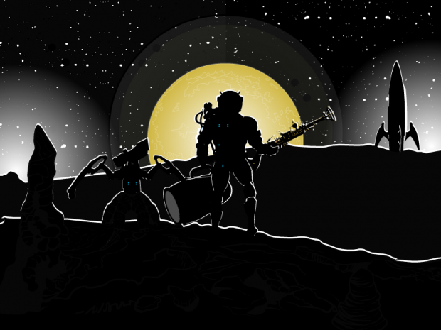
It can be no surprise that this weeks winner was RobM for this wonderful Moonrise picture. Well done Rob, and well done to everyone else who entered.
Comments Off on Character Design Contest ♯33 Winner
Posted in Challenge Favorites
Character Of The Week- 3rd August
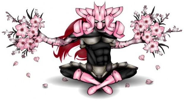
Finally, for the first time since the second Character of the Week, we're going to look at a character. And what a character it is. Sakura Master by Jeimuzu
Now, Jeimuzu has been causing quite a stir on the forums since his first post two weeks ago, and I could have put any of the characters he posted this week up for COTW, but I felt drawn towards this one.
We'll start of with the headgear, which looks like it belongs on a space villain from an anime kids show (and I do not mean that in a bad way, I grew up on 'em). I've no idea how he'd move his head left or right, but it looks badass, even in pink. Plus it's a good use of an item in a way it wasn't designed for, in this case shoulder pads for headgear, which always wins big points. I can see a samurai influence in the helmet design, which I'm sure isn't just because of the Japanese connotations of the character name.
If we now move on to the pose, the lotus position is a must do if you are doing an oriental character, but the fact the character has his arms outstretched, with a dark glare fixed on the viewer suggests to me that he's only a nano-second from some serious pain dealing.
Colour wise, there's nothing bad to note. It's hard to carry pink off well, especially on a male character, but it works here. I also like the shading, although the alpha on the neck- cape could come down a bit to the level of the torso shading (which works really well). The problem with choosing the lightest colours of the pallet and then doing highlighting with white is that the white can often over power the main colour leaving the picture looking swamped, but thankfully this hasn't happened here. Jeimuzu has found a happy medium, especially on the boots and flowers.
The last bit to talk about here is the attention to detail. And here I have to highlight the arms, or specifically the join between the arms and the flowers. It looks very natural and there are no lining up problems as far as I can see. And I also like the use of the leaf insignias as falling petals, something that is very associated with Japanese culture (usually seen in pictures of Geishas), another great touch in subliminally telling the viewer of the characters culture.
Comments Off on Character Of The Week- 3rd August
Posted in Character of the Week, Cool Characters
Open Critique Day/ Open Thread
As there isn't going to be a costume blog from djuby today, I thought we might as well have an open critique day instead, as we haven't had one for a while (does anyone know where Weilyn has got to?).
Same as it used to be, show us your art and we'll tell you what we think and how to improve it. Only real rule, no copyrighted characters or characters based on copyrighted characters.
You can also use this thread to discuss whatever you want as well.
Comments Off on Open Critique Day/ Open Thread
Posted in Open Critique Day
The Big Question ♯12
This week, I would like to look at the art of comics. Or to put it in a question, how much does the art affect the overall comic book experience?
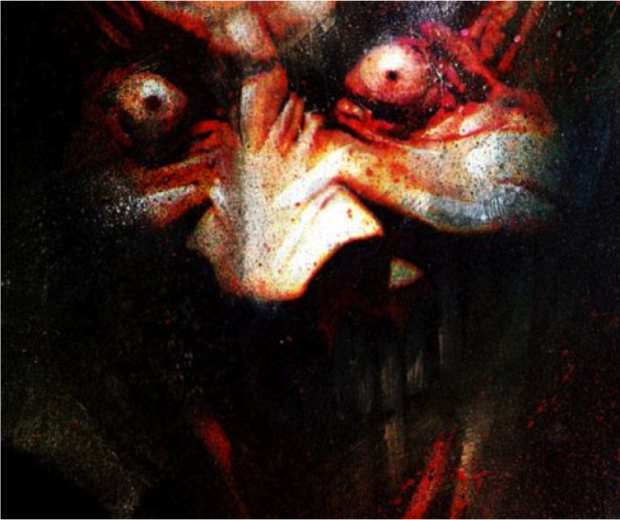
Now, obviously we can't ask which is more important, art or writing, because if either was more important than the other we wouldn't have had the awful style over substance '90's. But still, some stories are so intrinsically linked to a certain art style that it is very hard to imagine them any other way. Would Arkham Asylum or Sandman be considered as highly if they had been done in a style similar to say, The Killing Joke or maybe Dark Knight Returns, or does the quality of writing mean that the story would work no matter what the art? I'll leave that up to you to discuss.
Also, just out of interest, I'd like to know what/ who you guys like when it comes to comic book art and why.
Comments Off on The Big Question ♯12
Posted in Uncategorized


