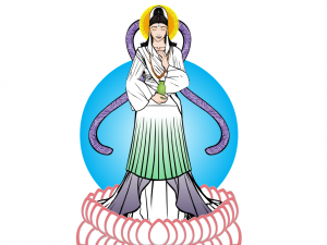
As promised, one of the new weekly blog posts. Now there idea here is not only to give praise, but to look at good design features and highlight techniques that make the composition work. So without further ado, this week we'll look at Renxin's Kwan Yin.
This was entered into this weeks CDC, but I had to disallow it due to it contravening the 'no current religions' rule, however, it is certainly worth looking at more closely.
First off, let's look at the colour. Being a representation of a Buddhist god, the colours are very light and natural, none look out of place or overly dominant. Using only three colours is one of the best techniques for getting a good costume, you can often smoother a good design by using too many colours, no matter how well chosen they are. By using only the green, purple and white, it allows the foreground figure to stand out more against the background. The fading effect used on the colours of the lower dress (HINT: which is done by using the rectangle or circles on the last page of the Background-Shapes page and setting the first colour's alpha setting to 0% and then masking to the desired object) is a really simple but effective technique that can be used in lots of different ways (such as shadow effects or highlighting).
The lotus petals around the feet is a really neat way of using that insignia and by using a lighter outline colour compared to much of the rest of the piece, it differentiates these foreground objects from the main composition in a highly effective way.
The choice of items for making the clothes, whilst not highly innovative, is very effective. The skirts for sleeves is a good example of going to other categories to find what you need.
My favourite part of this piece however, has to be the face. I'm still not quite sure what item was used for the eyes (maybe the manga style nose? Do you think you could clarify for us Renxin, I'd love to know) but it works perfectly. The expression definitely says 'peace', which is the point of a depiction of buddhism. The choice of items for the hair and hairpiece were very well chosen and certainly add to the whole head area without drawing attention away from the face, much like the background 'halo'.
Overall, a wonderfully executed piece that looks very simple, with no masses of shading, because it isn't needed. Shame it wasn't eligible for the contest really.


