Normally on Wednesdays I talk about Bad Super Hero Costumes, but today I want to take a break from negativity to show you what a top-notch redesign can do.
The artist in question is one of my absolute favorites, Chris Samnee. His use of blocks of shadow to give his compositions form calls to mind Mike Mignola, but with a cleaner and more hopeful take to it. I think that blend of stark contrasts and bright designs made him the perfect choice when Marvel decided to create a friendlier version of the classic hero in "The Mighty Thor" last year. They've since canceled the title, I believe, which is a real shame.
But let's take a look at how a truly gifted and thoughtful artist can update a classic look while maintaining the essence of the character.
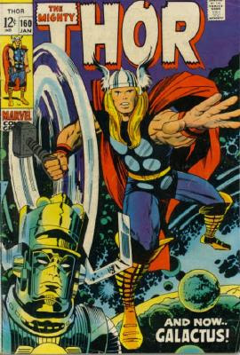
Jack "King" Kirby (whose 95th birthday would have been yesterday!) designed the original God of Thunder, and most elements of that iconic look have remained steady:
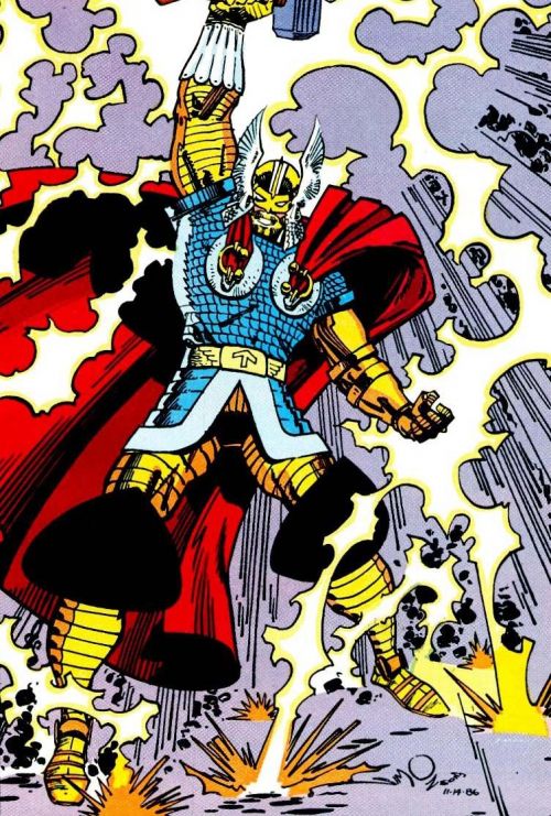
The winged silver helmet, the long hair, the red cape, the blackish blue tunic with discs, and the strapped boots are Thor staples, even when taken to extremes like in Walter Simonson's armor-clad variation:
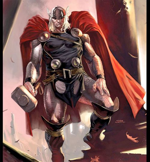
Just a few years ago, Marvel once again updated the Asgardian's outfit, going for a more modern, tougher approach:
The familiar elements remain, but changed to fit the concept. Darker, more somber colors throughout, a more classic tunic with loin cloth instead of briefs, actual chain mail armor, a more rugged face, and a realistically-sized helmet all contribute to the idea that this is a character who could conceivably walk off the page and into the real world.
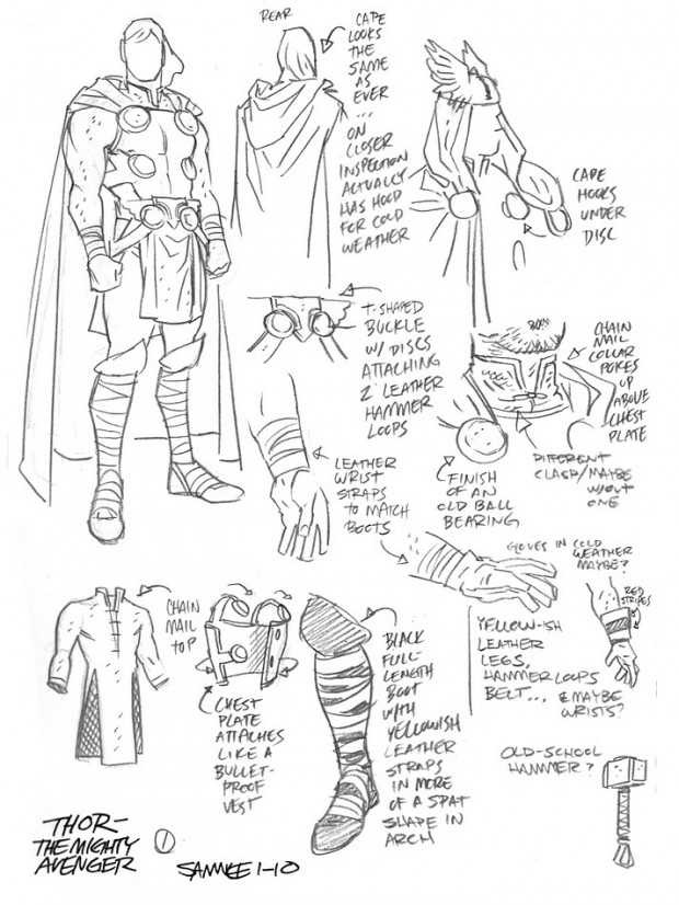
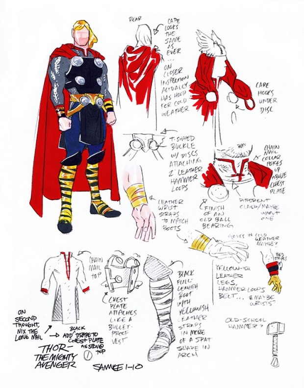
Samnee's charge was different, however. Marvel wanted "The Mighty Thor" to be a more casual, more accessible version of the hammer-wielding warrior, something that was less "dark" and more fun. In an interview with Newsrama, Chris provided some of his design sketches:
Note how carefully every element of the costume has been thought through. Details matter, and Samnee has a rich toolbox for finishing them. Take just one example, the hood on the cape. With one simple addition, he's transformed it from a nonfunctional bit of flare to something that feels relevant while giving the artist something new and fun to play with. It fits the era and aura of the character perfectly and takes a classic element from something purely for looks to something we can believe.
The chest discs also benefit from the same approach, going from a flat cloth design to something with heft and dimension.
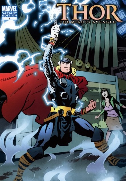
Samnee's style works perfectly with these elements, abstracting them a bit to provide the kind of clean impression the book was meant to deliver. Here's how it works in the actual end product:
I'd rank this redesign right up there with Darwyn Cook's "Catwoman" in terms of both overall effectiveness and just the outright cool factor. It's everything that's awesome about comics in one well-designed, well-conceived character design. Chris Samnee is one of the best in the business and I hope you pick up some of his books if you ever get the chance.
(All characters and images © Marvel Comics.)

