We had some great entries for Character Design Challenge 96, which tasked you with designing a "big bad" type of villain, something that could take on an entire team of super heroes. I want to take a moment right at the top to welcome the many new folks who chimed in for the first time this week, it's great to have you sharing your creativity with us!
And on a more unpleasant bookkeeping note, among others who submitted entries that were invalid for not being named properly were excellent ones by Alphaalpharomeo, Joel, Blaq Aries, the creator, and DC Lover. Please name your files properly next time so your great work has a chance to be considered.
I encourage you to go check out the entire submissions thread because while I'll choose my personal favorites in a moment, there are many more that are stellar that you might like better.
However, since all I have is my opinion, here are the ones that I personally enjoyed the most.
AMS is one of those creators who could win every week, and you can see why with "Lamprey". This is a genuinely spooky design.
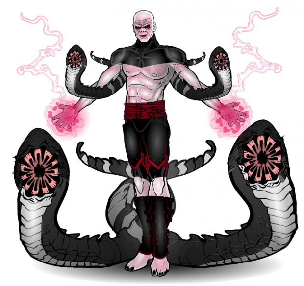
Ariana Iris' "Aborrhym" has a great body build, cohesive color scheme, and a mean vibe.
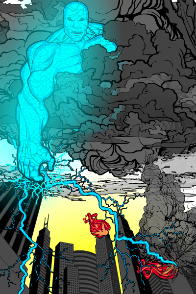
Several folks made use of this cityscape for looming menaces, but I thought Armour did a really nice job with it, from the clouds to the lightning striking the buildings.
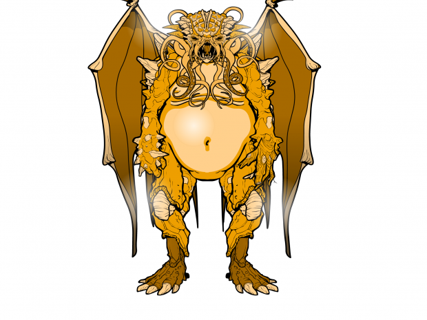
This is a potential winner titled "Cthulu", but unfortunately whoever created it didn't put their name on the file and it's therefore ineligible. Which is really a shame since it's a nice piece.
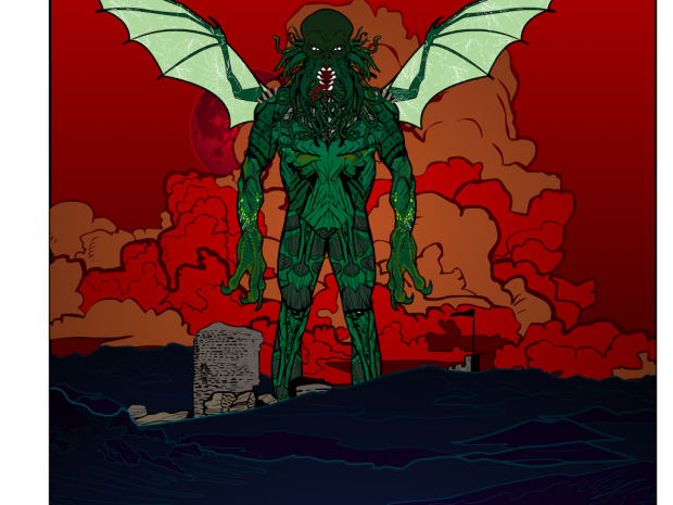
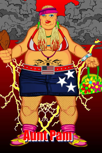
I got a chuckle out of djuby's "Aunt Pam".
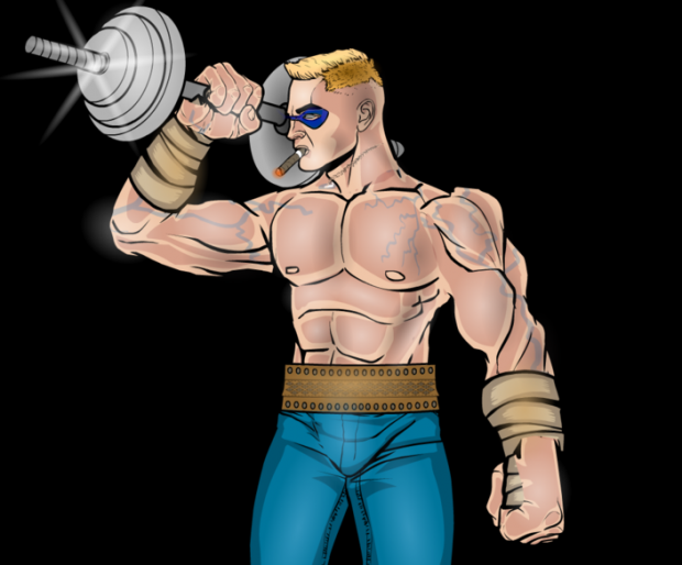
FRM's "Vitali" is just a really nice character study. I don't necessarily get "Big Bad" from it, but I think it's lovely.
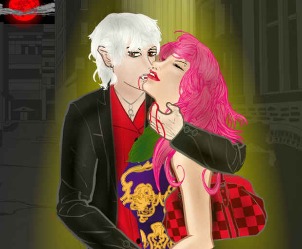
Harlequin always makes beautiful compositions, and his "Bloody Night" is no exception. I particularly like the way the vampire is looking at the viewer, I think that gives this an edge that works very well. That will not stop him from complaining about not winning if he doesn't, but I can't let that get in the way of my honest opinion that I like the illustration.
Haxx gives us "Xdjirax the Magnificent". I liked his use of the small figures below to give us a sense of scale.
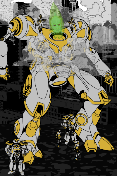
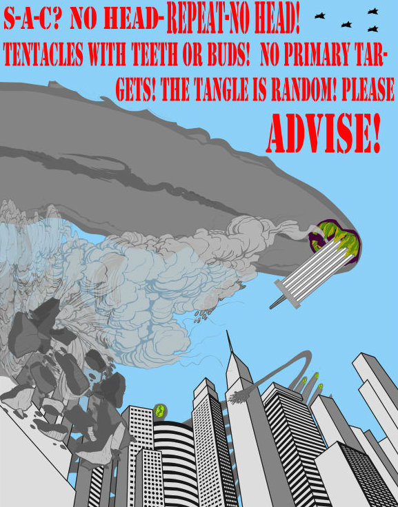
I like the name "The Tangle" from HerrD. The building top getting knocked over is a great effect, as well.
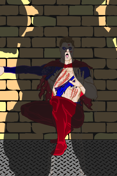
The looming shadow and terrified hero work great in Hyperanthropos' "Overshadow".
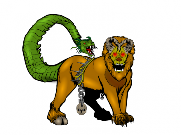
This is another fun piece that is ineligible due to a file name without the creator identified in it. Another shame.

If I'm remembering properly, I think this is Livewyre's first challenge entry. And a great start it is! The beast fits well together, and I particularly like the hooves on the rear leg, that's a nice touch.
Madpac's "Hell From Above" features a really nice use of a two-color (well, three technically) logo type of design that works great.
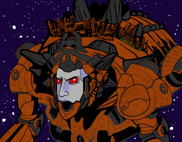
Marquis Samedi is another one who could win every week, the designs are just that good. The idea of a space-traveling giant robo-beastie with a city on its back in "Ixodidus" rocks. Granted, Bender sort of went there in "Futurama" but this is much more terrifying.
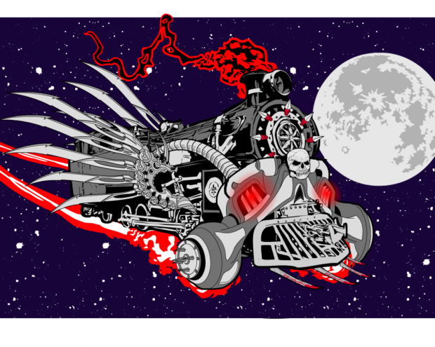
Marquis Samedi's second entry is "Locomortis", which is as awesome as its name sounds.
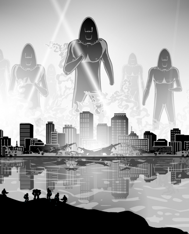
Meniukas' gray-scale looming monsters in "Project Kronos" shows that you don't have to go nuts with color when you have a good composition. I particularly love the water effects and the characters on the black foreground.
MisterDinoMan's "Hyperion" is one of the nicer "Big Chest" sorts of illustrations I've seen in a while.
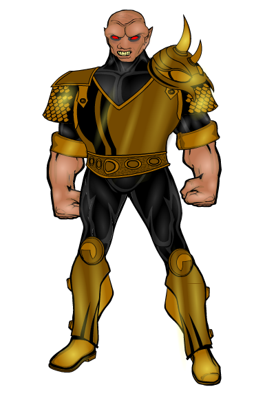
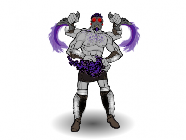
NHA247's "Shadow Conjurer" has a ton of great effects, from the veins in the upper chest to the slightly hunched pose to the energy daggers to the excellent posing of the multiple arms. Again, you don't have to go nuts with backgrounds to have an exceptional piece.
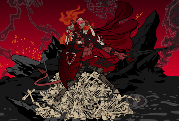
On the other hand, sometimes a fantastic background is ... well, fantastic! Ploughed Jester's "Asmodeus" is both an excellent character design and an awesome environment.
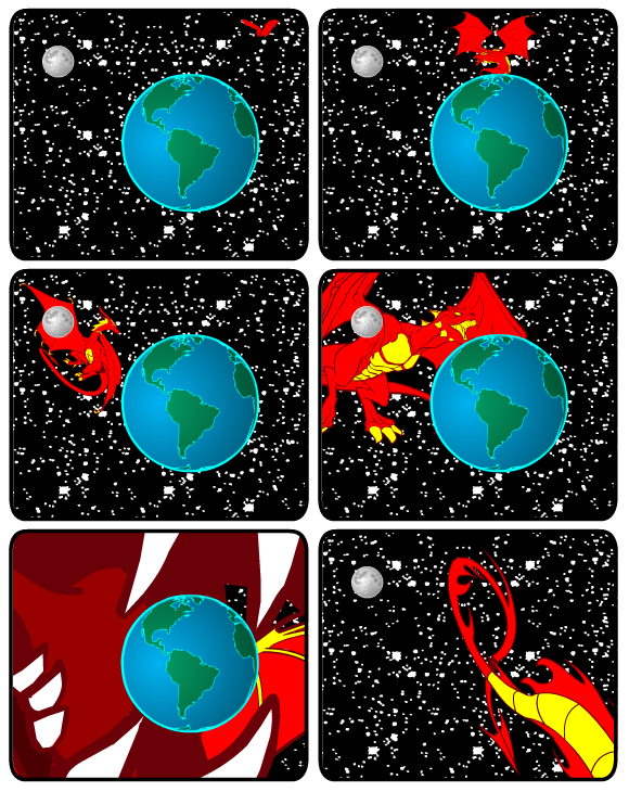
Skybandit's multi-panel Big Bad works wonderfully.
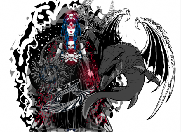
I could go on and on about the many exceptional parts of Thundersong's "Melinoe", but I think the use of the white space of the canvas to come into the design as energy, while also having the creature break the circle of the design to enter the whitespace itself is design at an extremely high level.
VectorMan316's "Squish" pretty much speaks for itself. Ouch!
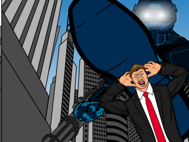
I believe this is Vesk's first challenge to enter as well, and I think he captured a great Kirby-esque sort of feel with "Vestrion".
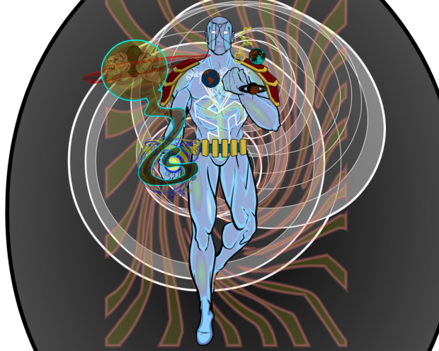
Webpulp's "Big Bad Baby" made me chuckle.
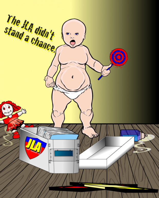
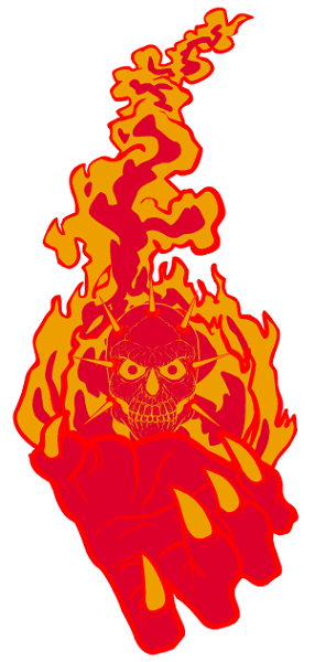
Finally, YouAlreadyKnowWhatIThink's "Massive Thret" was one of the best close-up sorts of entries. The colors and the glow, along with the trippy giant hand, all work well together.
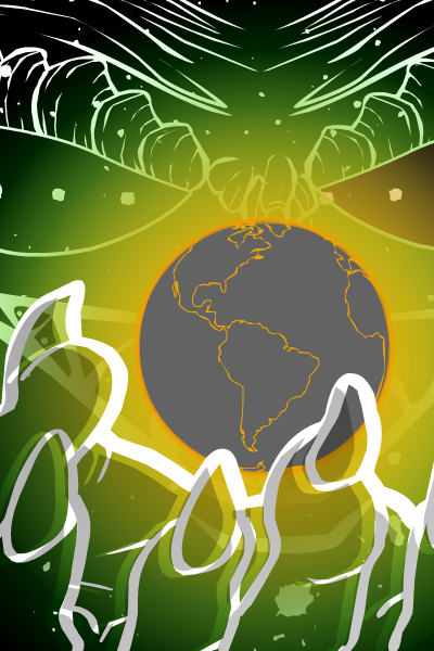
Out of all of those, if I were to pick the ones that were at my personal top of the list, I'd have to go with Thundersong, Ploughed Jester, NHA247, Meniukas, Marquis Samedi (Locomortis), Harlequin, and AMS. And out of those, going with just one I'd choose ... Ploughed Jester. But all of those, honestly, are about equal for me, they're all fantastic.
For what it's worth, though, congratulations to Ploughed Jester for creating my personal favorite!
Those are the ones I personally liked the most, but I'm very interested to hear which ones were yours.

