Many thanks to everyone who entered the Ruffles Pop Quiz! Since we only had 23 entries I'll say a little something about each.
Off we go!
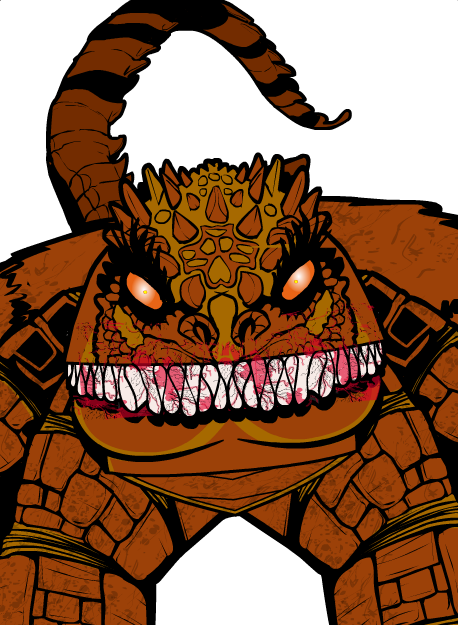
Albannach's demon used the item as teeth masked to the head, I believe. I had to go look it up as I couldn't tell. On the one hand, it's kind of cool that I couldn't figure it out by looking at the image, but on the other hand, I couldn't figure it out without looking at the image. It's a nice character design, though.
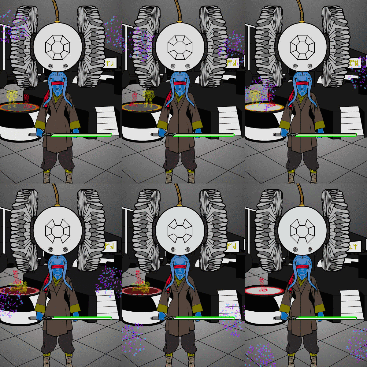
Atomic Punk made an animated gif! Sadly that removes it from contention since only direct output from the program qualifies, but it's still fun.
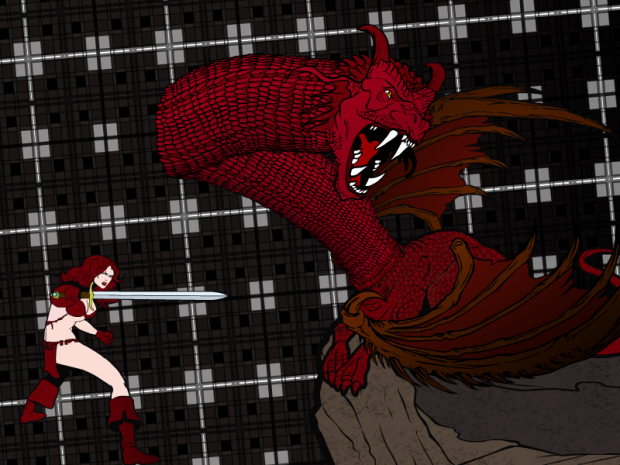
I love the way Drummergirl used the ruffles as the neck of the dragon. That's definitely one of the most creative uses of the item, which is what I judge by on these. I do wish the warrior figure were standing on something, though.
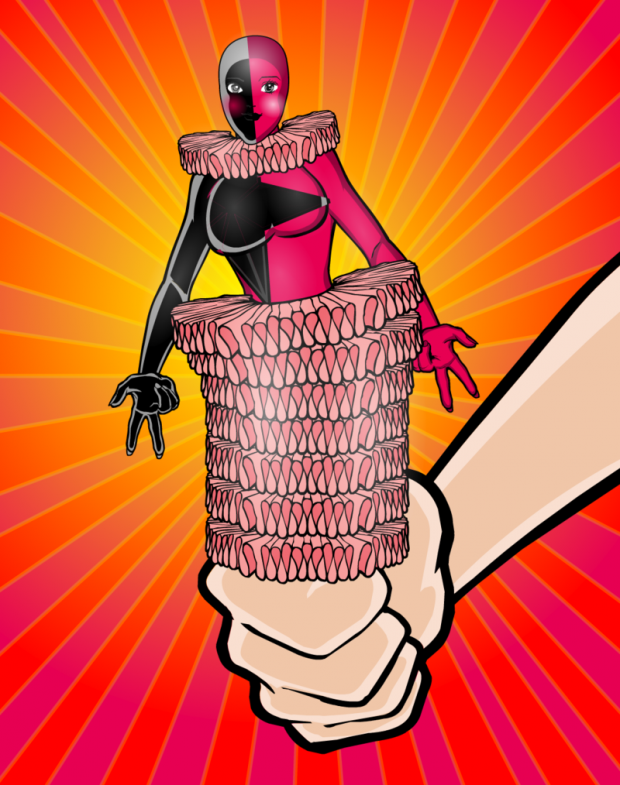
FRM made a very clever Jill-in-the-box. I like the vibrant colors and the overall composition a lot. And while the ruffle is used as a neck item, contrary to the rules, it is also used much more as the pop up parts, so that's ok. Nice illustration!
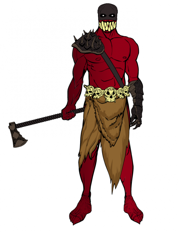
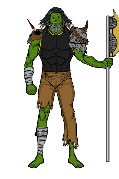
Fudgee placed the ruffles in the orc's weapon. I like the illustration but the item is so incidental I had to look up how it was used.
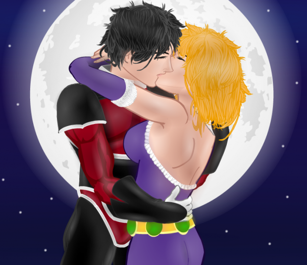
Harlequin produced the absolutely lovely "Love Is Always Win", one of his nicest pieces to date (which is really saying something). Beautifully framed, with great color design, and subtly used ruffles as trim on the clothing.
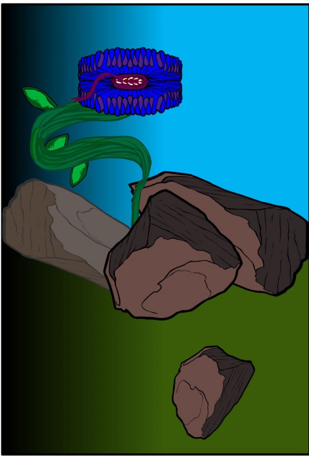
HerrD did not name his file appropriately so isn't in consideration for the win, but "Snapbloom" uses the ruffles in one of the most creative ways.
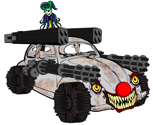
I love Jack's "Clown Car", featuring the ruffles as wheels of death. The dirty patterning on the car is fantastic, and I love the clown face on the front. Great job!
Like Albannach, Jack Zelger turned the ruffles into teeth on a monster. Pretty cool.
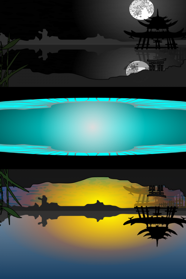
Johnny Gear's "Moon and Sun" is a very pretty illustration, but it took me a while to figure out the middle blue part was the challenge item. And then I couldn't figure out what it serves as in the image. Is it a lake, a representation of a world (so the same scene is mirrored)? I didn't quite "get" this one.
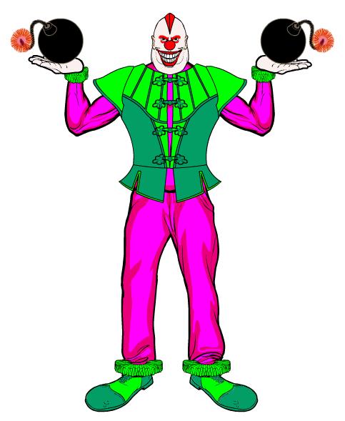
MadPac went with a pretty standard "killer clown", with the ruffles used as ruffles on the sleeves and pants. This is an example of using the item as what it actually is, which was a little disappointing.
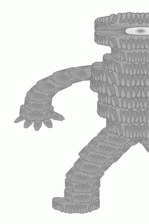
Maniacmick, on the other hand, went full maniac and built the bastard love child of the Michelin Man and Godzilla! It's really cool that almost everything in the image is the challenge item.
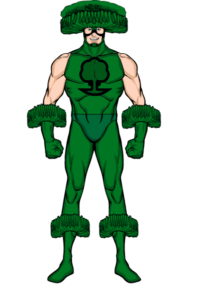
I love Nobody's "Broccoli Man". The head piece helps get it out of the "item used exactly as intended" trap.
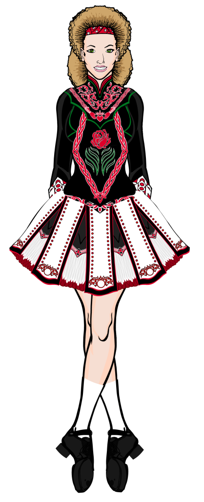
Ploughed Jester's "Irish Dance Outfit" is a lovely character sketch, but again I had to really search to find the challenge item. And then it was used as clothing. Plus, the feet are a little floppy. Still, a beautiful costume design!
NHA247 didn't name his file properly, and used the item as neckwear, so isn't in contention. But it's still a fun drawing!
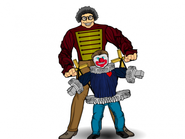
RobM's "antipasto" not only features a very creative usage, but also made me hungry.
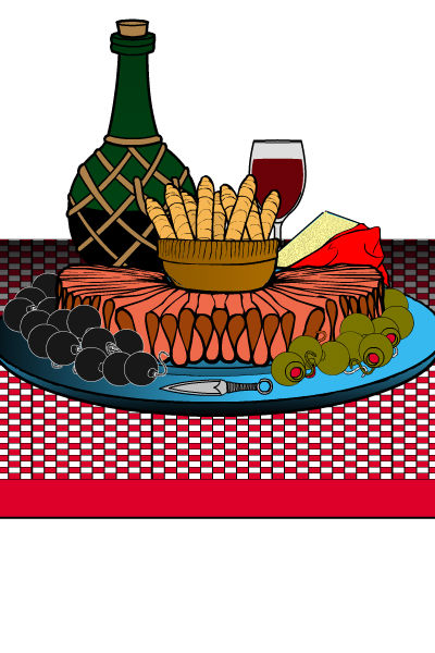
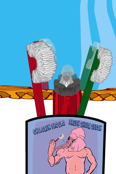
Rozenstal again did not name his file properly so isn't in contention. But I really liked the clever transformation of the ruffles into toothbrush bristles and such.
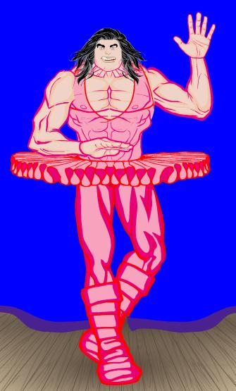
Skybandit's "Conan the Ballerina" gave me a good chuckle.
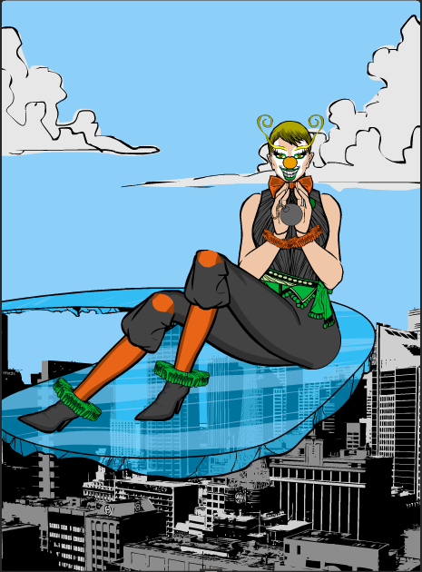
Superfan1's "Alisha the Clown", like several of the others, uses the ruffles purely as clothing at the end of the shirt and pants, while what I usually like to see on these is something more out of the box. It's a very nice illustration, though, as usual from this gifted creator.
Thundersong's "LadyMidori-San" is a stunning piece of work. I love all the patterning and color, she's just gorgeous. The ruffle is used as a hat, which is not the most innovative usage, but it's truly a lovely, lovely piece.
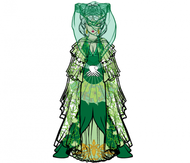
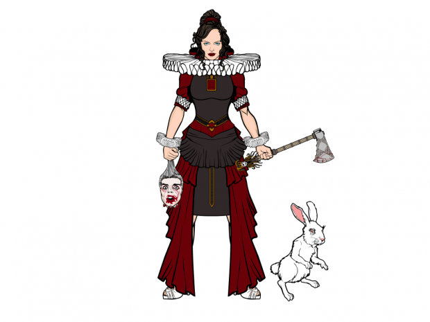
TOOL came with "The Red Queen", which is a fun illustration but which uses the ruffles as neckwear, which I asked you all not to do. So unfortunately it isn't in contention. Still a nice piece, though!
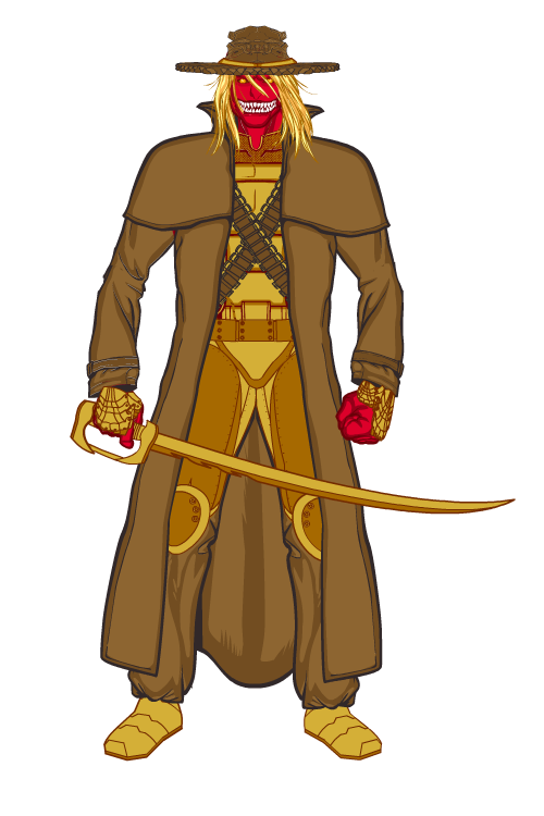
Vampyrist's "Jadek" is another excellent character design, but unfortunately for me, flattening the ruffles into the hat brim ends up looking a bit like corrugated cardboard edging. I really like the character itself, though.
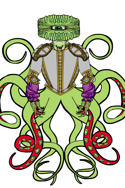
Finally, Wildcard gave us "Nightmare", with a head made entirely of the ruffle. Pretty neat.
Ultimately I narrowed the Finalists down to Harlequin, who a gorgeous image with a not terribly innovative usage of the item; Jack, with the most creative use of the challenge item but which has the clown theme heavily used by a lot of others; and Thundersong, with that stunning costume design, though it still uses the ruffles as a piece of clothing.
I was pretty stuck on which one of these three to choose as the winner as they're all outstanding. Ultimately I had to go with the one that I thought was not only a great illustration, but which also heavily featured the use of the challenge item in an innovative way. And since of the three, only Jack used it as something other than clothing, I went with him. Although I can't figure out how the "dirt" patterning on the car was done within HM so Jack, if you read this, fill me in!
Congratulations to our winner, Jack! But well done everyone, it was another fun and successful contest. I appreciate your creativity very much!

