First of all, I am seeing a lot more of you naming your files as I requested and posting direct links, so thank you very much for that. On a holiday weekend when I'm sitting here doing this instead of enjoying the weather, it makes things a lot easier.
Now, on to your Finalists!
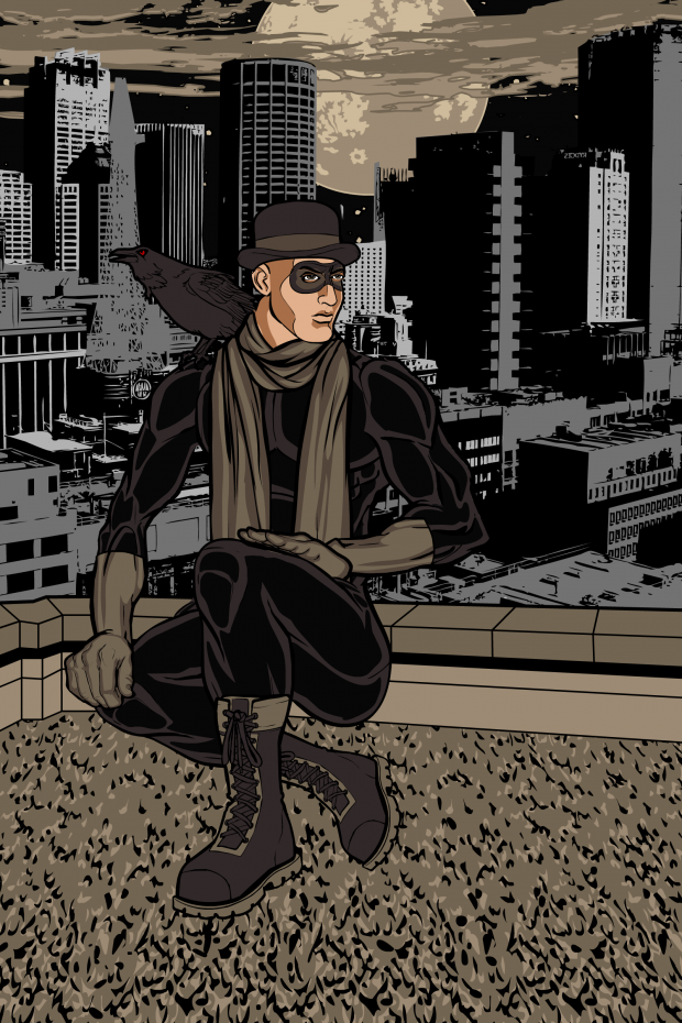
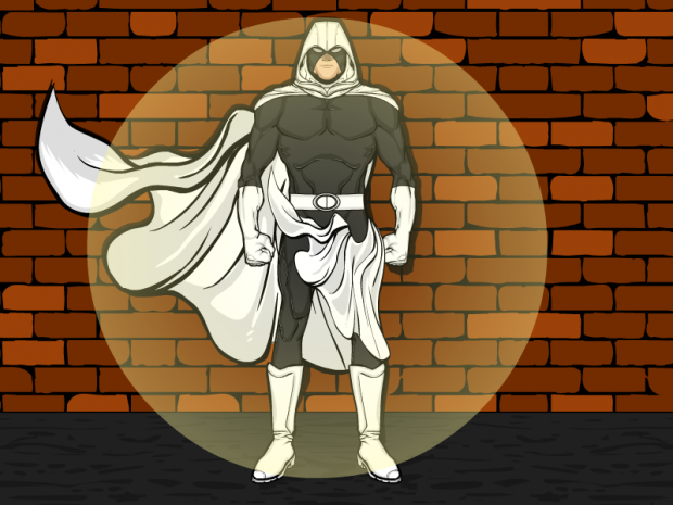
I thought Ariana Iris' "Shadow Raven" was just a really well done Golden Age style illustration.
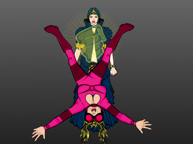
Atomic Punk's "Phantom Fist" made me laugh.
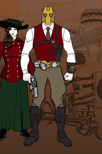
Apparently I was in a Golden Age mood ... I especially liked the mask on Captain Brass' "Phantom Genius".
Not too much to say about ManiacMick's "Phantom Protector" except that it's a nice character design.
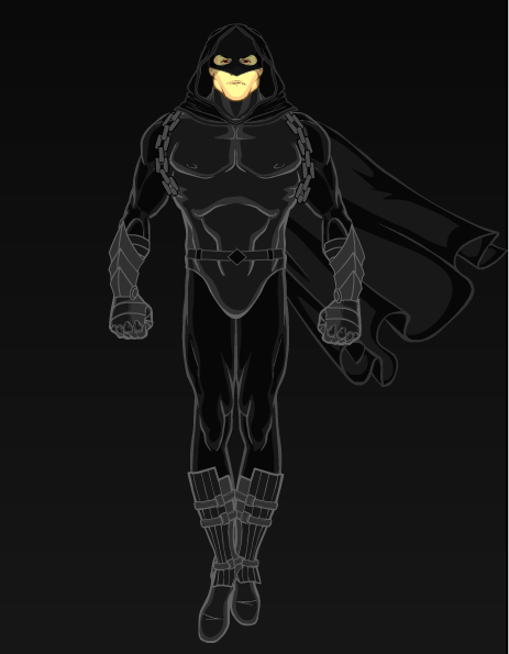
Ditto for MisterDinoMan's "Phantom Tiger".
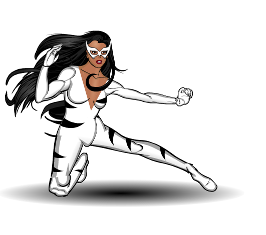
PapaKrok continues to inspire admiration and laughter in equal measures with "Phantom Heifer".
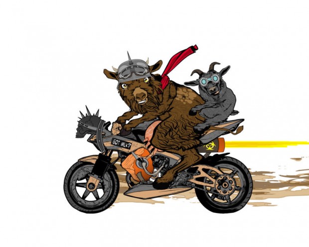
The whole illustration is outstanding but I particularly love the the flames, the smoke, and the "body" in dblade's "Phantom Reaper".
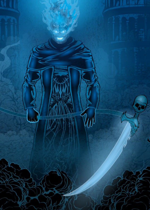
I really like the power gauntlet blades on Prowler Knight's "Phantom Assassin".
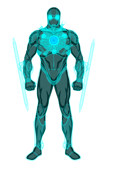
Again with the Golden Age vibe on Frevoli's "Phantom Strangler". The sidekick is awesome.
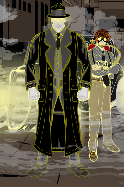
I ought to reject the "Phantom Biker" just because Sohier-Legrand refuses to name his or her images properly. But it's too neat.
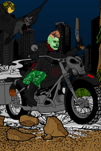
Rhinoman's "Phantom Fox" (or "Fantom Furry" as I think of it) is a good, clean, effective character design.
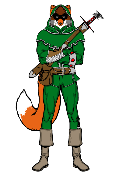
Shiboreth's "Phantom Thief" is a great scene.
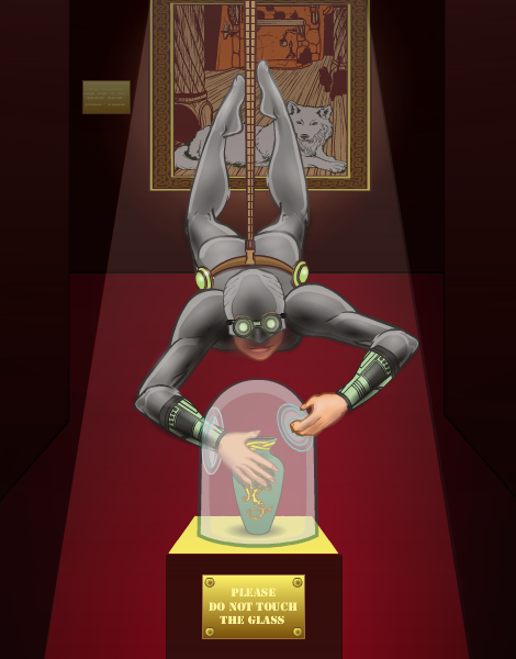
As is Skybandit's "Phantom Vigilante". The colors leap right off the page and strangle you! I love the combination of the car and the hero jumping into the back seat, though.
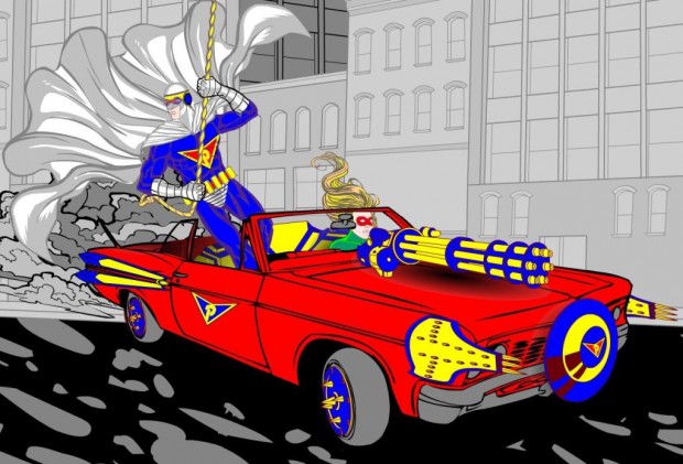
I liked the original Phantom feel I get from Sutter Kaine's "Phantom Fury".
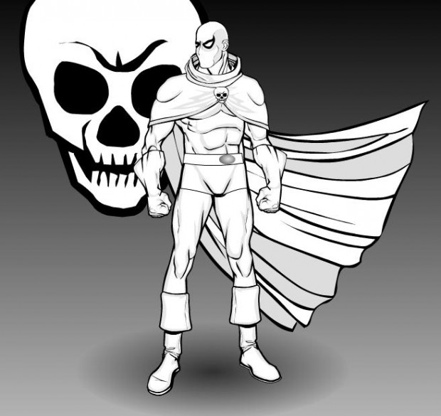
The ground drapery of Thundersong's "Phantom Empress" really impressed me, it's a great effect.
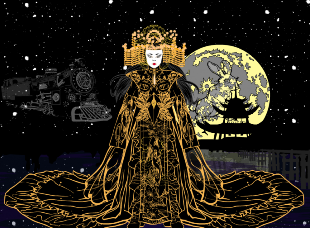
This sounds weird since I'm a foot-o-phobe, but I really like the way the feet look on Tool's "The Phantom Avenger". The whole look of the character works well together.
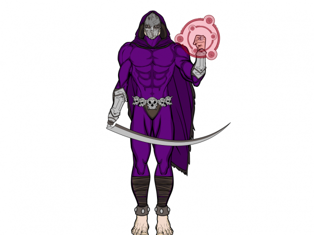
Trekkie's "Phantom Shadow" is another clean, simple design that just looks good together.
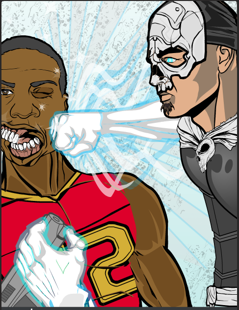
Watson Bradshaw also has something against putting his name on his images, but I like the visceral impact of his "Phantom Punch".
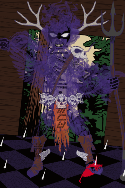
WolfMoon's "The Phantom Runic" doesn't look quite like anything else I've seen from HeroMachine, which is pretty remarkable on its own.
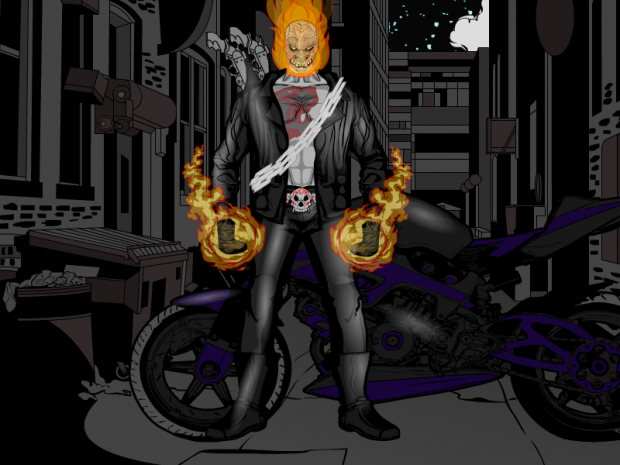
Finally, Xavier Kaine's "Phantom Rider" almost reminds me of someone ... regardless, it's a nice take on the concept.
Picking a winner is always tough, but this week I'm going with ... WolfMoon! I like the whole composition with the tilted doorway, the odd proportions on the figure, and the unusual method of building up the body. The colors work well together, too. I'm not as sold on the wings or the spikes in the floor, but otherwise I was impressed with the originality and impact of the piece.
Congratulations to WolfMoon and all the other Finalists! And thanks again to everyone for sharing your creativity with us, you're an inspiration.

