I was stunned to find 159 entries waiting for me from Character Contest 90 -- you all outdid yourselves. They were universally high in quality as well, which pleased me greatly.
Furthermore, we had quite a few first-time entrants. Welcome to you all! I'm humbled and grateful to anyone who is willing to share his or her creativity with the world.
I do want to say a quick word about the point of these contests in light of so many new folks joining us. The selection process is just one guy -- usually me -- and his opinion of what looks neat. If you're not among the finalists it doesn't mean your work is bad or unappreciated, it just means on that day it didn't happen to beat out a few other entries in my own personal opinion. If you see these weekly contests as a chance to flex your creative muscles and to have fun, you're already a winner before you even start. The rest is just for fun.
Since everyone did such a great job this week, though, I wanted to put up a gallery with one illustration from every person who entered. For those who had multiple entries, I picked the one that I thought was the best. And if you sent some in but don't see one here, please let me know and I'll correct the oversight.
Ladies and gentlemen, your Character Design Contest 90 entrants!
As you can see, I had a really tough choice facing me. I'm going to pull out a few that were sort of in my final cut and share with you why I went the way I did.
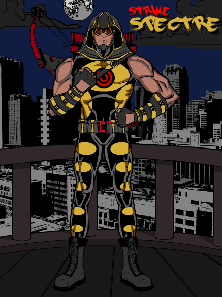
First up is AJ's "Strike Spectre". I just thought this was a very solid, visually interesting super-hero design. I can't say I get "spectre" from it but it's a great illustration.
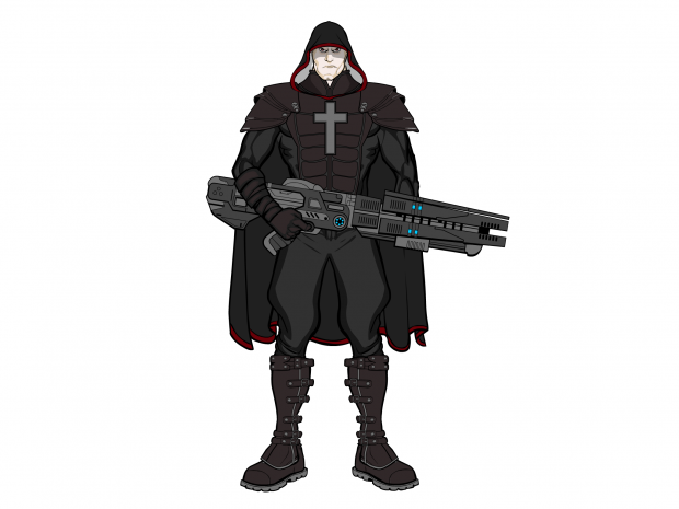
Next is Ariana Iris' "Cannon Priest". Again, a really solid character sketch where every piece fits and makes sense. I love the guy's expression and the gun is stellar.
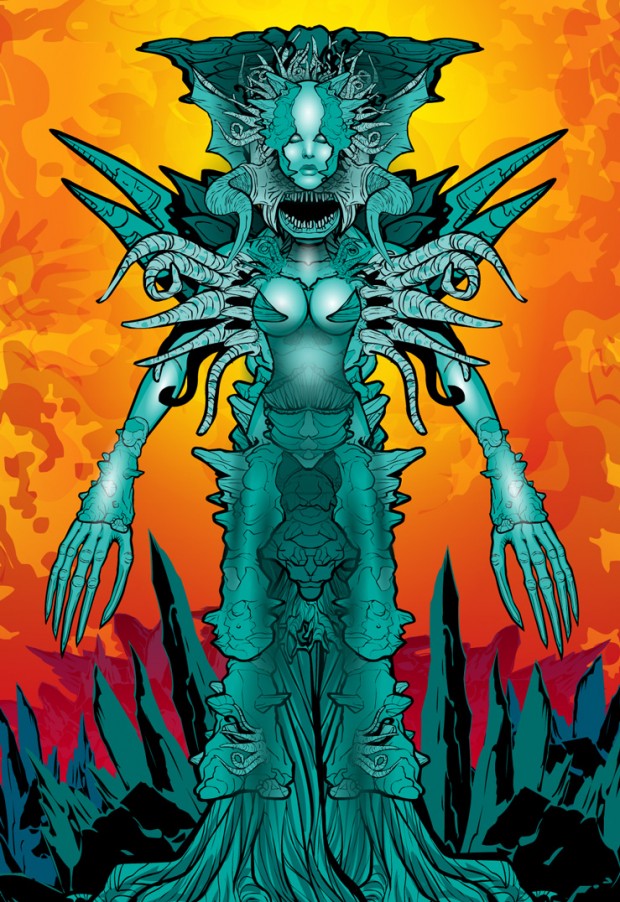
What can I say about dblade's "Xenoplague" besides "WOW"? If you look at his oeuvre, you'll notice how smart he is about the use of color. The foreground character and land are in cool colors while the sky and backplane are all warm oranges, yellows, and reds. That contrast really sets off the figure while giving the entire composition a lot of dynamism and depth. Plus the character herself is incredible, looking like she stepped right out of a Geiger drawing.
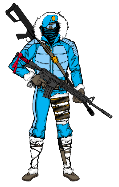
Guy Genesis' "Winter Stryke" again brings a clean, simple, solid elegance to the table with a cohesive color scheme, consistent item selection, and well-directed concept.
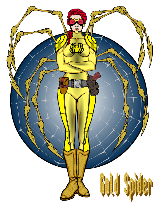
Long-time man-crush Imp is back with another outstanding Golden-Age type of design in "Gold Spider".
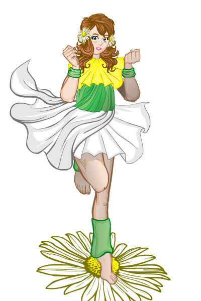
Kaylin88100's "Chance Bloom" gives us a wonderful moment of SQUEE along with an illustration that nails the random name she was given. I love the energy, vibrancy, and attention to detail in this one. Like dblade's, this is one of those I look at and think "I couldn't have drawn that". Which is pretty remarkable since in a way, I did! But no way I could come up with either of these freehand.
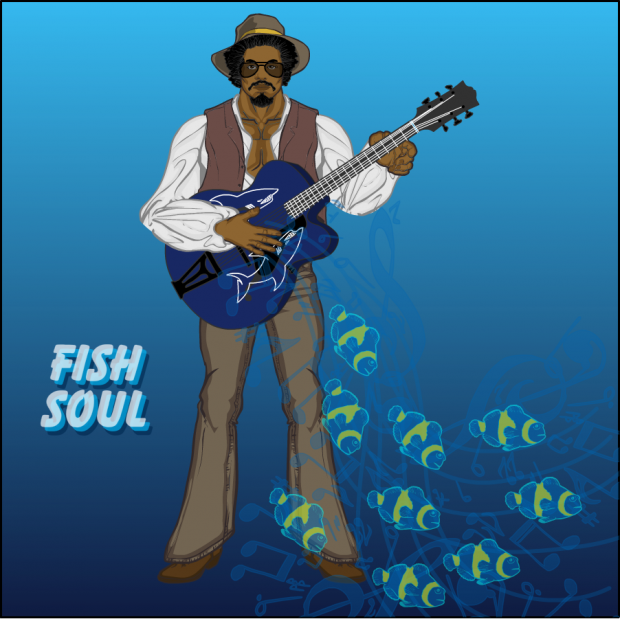
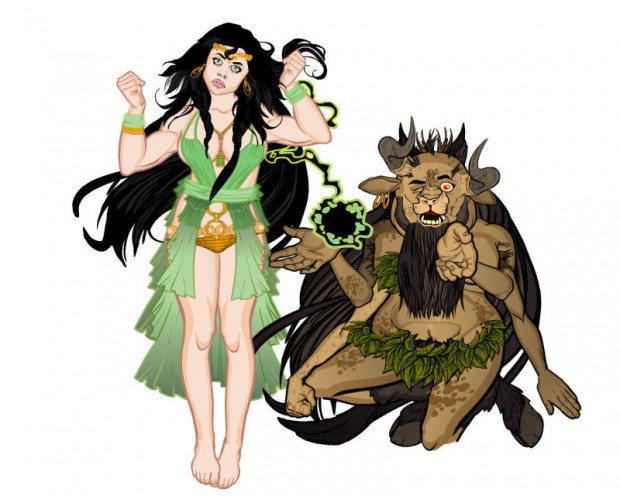
Lime is back! All of her illustrations manage to tell a story, which is truly remarkable. "Fish Soul" is no different, showcasing a great combination of the real and the fantastic. Plus, all of her characters tend to look like individuals. Here's the little write-up she posted with the submission:
He found the guitar in a pawn shop, with a label on it that read “Fish Soul.” He thought it was called that because there were sharks on it. He soon learned otherwise.
Like dblade, Papa Krok has a shot at winning every single week. "Mastera" is no exception. I mean, look at the expression on the creature! Most drawings of HUMANS don't get show kind of emotion!
Rhinoman's "Battle Cleric" is a classic, well-executed D&D style character illustration. I love the simplicity and focus in this one, where every item, position, and color reinforces the character concept.
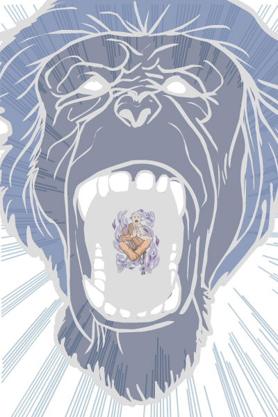
RobM only had one entry this week but it's a doozy. "Phantom Howler" is both a great concept and a great illustration. I could totally see this as the cover of a DC or Marvel book featuring the titular character, and I could totally see myself buying it.
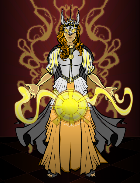
Shiboreth is, I think, a first-time entrant, and really knocked it out of the park with "Light Empress". The energy effects, the costume, and the glowing eyes all combine to make for a very powerful illustration. Well done and welcome!
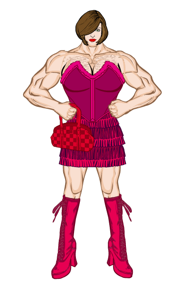
Admit it, Skullcraze made you laugh with "Girl Man".
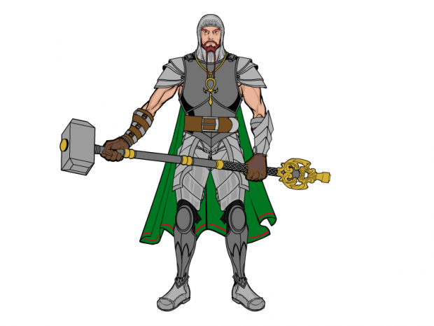
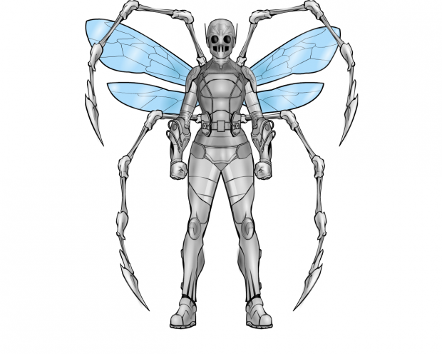
Finally, Trekkie brings her signature style to "Steel Bug", another vaguely Golden Age-ish character design that I'd love to see in a comic.
Those are all so great ... Looking back over them I'm having a really hard time narrowing it down to just one. dblade's clearly is a fantastic illustration, but Kaylin88100's is so much fun. All of the others are also fantastic ... ugh.
I can't choose. So guess what, YOU get to! Here's a quick poll, which I'll leave up till tonight. You can vote for your Top Three; the entry getting the most overall votes by tonight will win the prize. Good luck!

