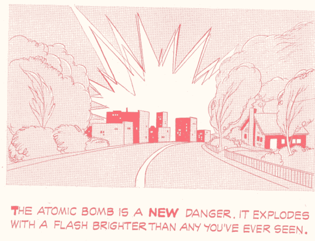
(From "Bert the Turtle" governmental a-bomb preparedness pamphlet for school kids, 1951.)
Sponsored Links (which Premium Members will never see):

(From "Bert the Turtle" governmental a-bomb preparedness pamphlet for school kids, 1951.)
Comments Off on Or anything you will ever see again for the rest of your very short life.
Posted in Daily Random Panel
With hearty thanks once again to Glenn3's "Say What? Pictures", your challenge this week is to come up with the best replacement dialog for this comics panel:
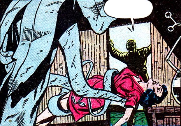
The best entry (as judged by yours truly) wins the author's choice of either any item they like or any portrait to be included in HeroMachine 3′s final release, or a custom black and white “Sketch of the Day” style illustration (you pick the subject, I draw it however I like).
All entries must be left as a comment (or comments) to this post. Keep ‘em clean (appropriate for a late-night broadcast TV show), but most importantly, keep ‘em funny! I anticipate a lot of plant puns this time around, so if you come with that, you better come strong.
This week we have a cap of no more than five (5) entries per person, so make 'em your best!
Comments Off on Caption Contest 96: Squeeze me, Seymour!
Posted in Caption Challenges, Challenges
For Character Contest 60, I challenged you all to take an existing character done in HeroMachine 2, and revamp it using HeroMachine 3. The response was overwhelming and awesome at the same time, featuring some truly inspired re-imaginings. I doff my hat to you, HeroMachine creators, because you truly put out some exceptional art this time around.
I could only pick a handful of examples that I thought were particularly inspiring, but I definitely commend everyone who entered. Please check out the entire set of entries on the original post, they're well worth your time.
Having said that, here are the two dozen or so I thought were the best of an already excellent group. I'm just going to put up the original and then the revamp right after, without comment, so the work can speak for itself.
Comments Off on Character Contest 60 Winners!
Posted in Challenge Favorites, Challenges, Character Design Challenges

(From the government pamphlet "If an A-Bomb Falls", 1951.)
Comments Off on Apparently paper was a LOT tougher in 1951
Posted in Daily Random Panel
Thoughts?
Comments Off on Green Lantern Wonder-Con trailer
Posted in Movies and TV
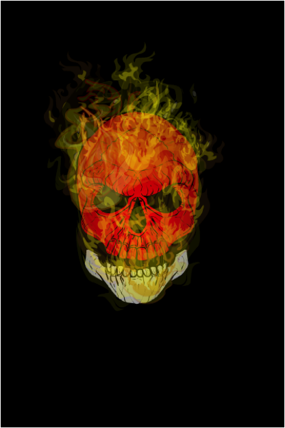
In response to Jeff’s (not so subtle ☺) suggestion that we could use a Recipe for making realistic fire with HeroMachine I have put this together.
There are a few things I consider when producing fire imagery;
The major challenge with making a recipe for fire is that it does not have a static form. Therefore this recipe will be kept very general with few specifics.
Step #1 – Background
I referred to contrast previously and a really dark background can make a bright subject really pop off the page. I just used a dark background rectangle and filled the entire screen with it.

Step #2 – Burning Object
What fire is complete without something to burn eh? (Yes I did just include “eh” at the end of my sentence. I’m Canadian so I figure I’m allowed☺). This time I chose a skull because it’s dark and sinister.
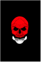
Step #3 – Shading
Certainly not necessary but I often like my objects to have some shading. I selected the last item in the Backgrounds > Shapes section and gave the Primary color an Alpha of 0%. The Secondary color has an Alpha of 75% and is black. Sized like the image here and centered over the skull makes the edges of the skull darker while the center remains lighter. This should give the skull some depth. The Line Color is left as white to illustrate here but will be subsequently changed to an Alpha of 0%.
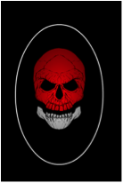
Step #4 – Flame Elements
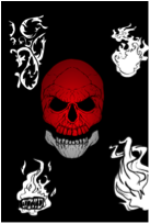
I like to use a few different objects to make flames. I do this so that the same shapes do not appear readily. As the image progresses I will add literally dozens of layers of just the flames and the will begin to overlap. There are a few elements available that work easily for flames and here are a few examples before I start to color and layer them.
Step #5 – Adding the Fire
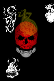
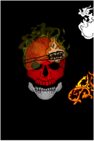
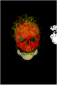
I will layer numerous layers of each of the flame objects. As mentioned previously, flames are not symmetrical so each object will be changed in size, shape and rotation to reduce the same shapes showing up repeatedly. Furthermore, the level of transparency changes as well so the Alpha levels will be changed for each object as well. The torch and glove may seem like unlikely additions but the flames on the torch are really good if the Line Color and the Primary Color Alpha 0 ratings. Some of these objects will be in front of the burning object and some will be behind. The torches in particular are placed behind the object so that the lines aren’t so obtrusive. The glove works quite well for small wisps of flame if the Primary Color and Line Color are made to have Alpha values of 0.
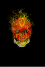
Step #6 – Review
Because the fire covers the burning objects the underlying items often look different than anticipated. I usually find it is good to review the burning object to make sure the coloring and clarity is still what was desired. Feel free to experiment with other objects or coloring to decide what meets your desired objective. In the end it is the methodology or strategy and experimentation that is important and produces results; not any one detail.
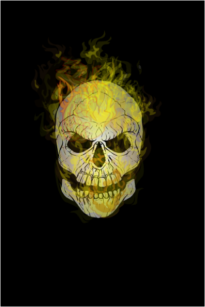
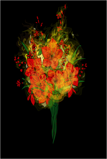
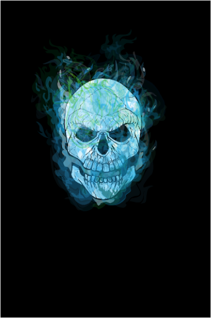
Step #7 - Alternatives
Comments Off on Fire Recipe by Me, Myself, and I
Posted in HeroMachine 3, Recipes
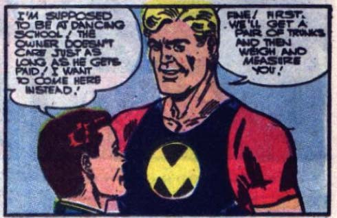
(From "Mr. Muscles" number 23, 1956.)
Comments Off on The rare occasion when dancing school would have been the better choice
Posted in Daily Random Panel

(From "Mr. Muscles" number 23, 1956.)
Comments Off on The Phantom Groper strikes (out) again
Posted in Daily Random Panel
I need a break from Open Critique Days, though they'll return next week, but in the meantime I thought it would be fun to have another Sharing Day!
Here’s the deal:
You can ask me any question you like about whatever you like, which I will answer either completely truthfully or not at all (in which case you can ask something else). I say that because, come on, there are some things no one should have to know.
But you can only do so if you answer the following question about yourself (note that you don't have to ask me anything, if you'd rather not, but I'd still be interested in your answer):
What is your favorite cartoon from your childhood?
Here's my answer for that one:
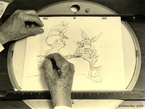
When I was a kid, not only did we have to walk to school uphill in the snow both ways (quite the feat considering I lived in Louisiana), but we also only had three channels from which to choose, and cartoons were only on Saturday mornings. It's a miracle any of us survived to adulthood. So you didn't have a lot of options, but fortunately we did have Bugs Bunny and the rest of the Loony Tunes gang.
Even as a kid, though, I could tell that there were good Bugs Bunny cartoons and lame Bugs Bunny cartoons. Only later did I realize that one guy was largely responsible for the good ones -- Chuck Jones. His timing, direction, and art were all so striking that even an ignorant eight year old could tell how superior they were to the Bugs-by-committee that took over the franchise before I was born. All the best ones were Jones joints, from "Duck! Rabbit! Duck!" to "The Rabbit of Seville" and "Bully for Bugs" and so many more. It got to the point where I'd drag my Underoos-clad butt out of bed at the crack of dawn to catch Loony Tunes, and if it wasn't a Chuck Jones one, I'd just turn around and crawl back under the covers.
Don't get me wrong, I loved my "Herculoids" and "Space Ghost" and "Transformers" cartoons, but for me, Chuck Jones' Bugs Bunny will always be the best cartoon of my childhood.
Now it’s your turn! What was your favorite childhood cartoon? And if you have a question for me, just know that I will most definitely not be posting pictures of myself in Underoos.
Comments Off on Sharing Day Toonstalgia
Posted in Sharing Day