We had a ton of great entries for Character Contest 75 - Random-palooza, so many thanks to everyone who took the time to spin the wheel and share their results. I've picked out a few of those submissions that have something out-of-the-ordinary about them to share with you, and of course at the end I'll announce the one I think is the overall winner.
And awaaaaaay we go! Don't forget, with most of these you can click on the image to see it at a larger size.
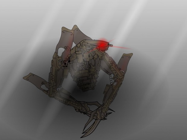
Abominal401 drew (literally!) "Mist Wanderer", and I thought this illustration really captured the spirit of the name. There's a moody melancholy about it and a sense of pathos I don't get out of many robot pictures.
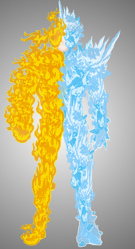
I don't think I've seen Albannach 'round these parts before, but I really liked the frost effects on "Frigid Blaze".
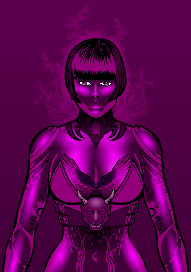
Of course, dblade always has something jaw-dropping, and "Midnight Seer in Magenta" is no exception. I liked this one better than the black and white version, maybe in part because without all the cool but distracting detail going on around her, we can focus more on the character herself. But I like all the tattoo types of effects and the smoky glow behind her.
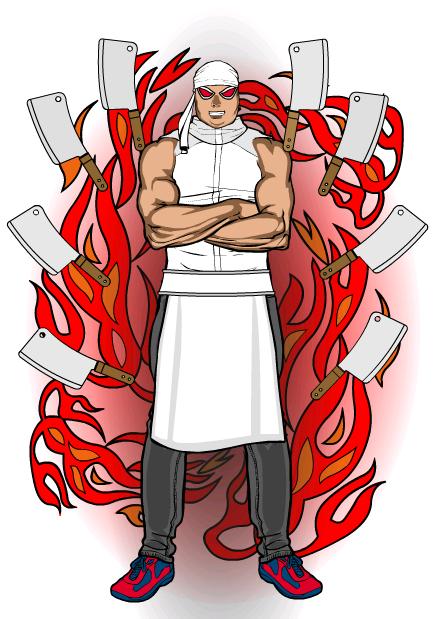
I'm a big Gordon Ramsay fan, so maybe that's why Gendonesia's "Knife Storm" appeals to me. I can totally see this being Gordon after he ingests some horrible bit of irradiated, nasty crap on "Kitchen Nightmares".
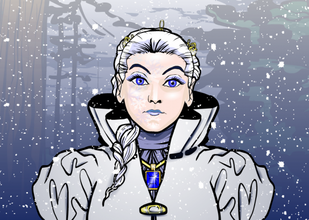
Headlessgeneral did an awesome job with the wintry background in "Frost Duchess", but I equally liked the subtle snowflake effects on her cheeks. That's a really nice touch. The whole image evokes a very clear and convincing feeling of winter. And Duchessness.
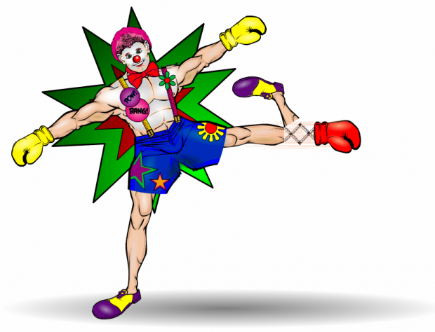
Headlessgeneral also pulled "Trick Foot", for which he did two different versions. The first was very good, but this silly version literally made me laugh right out loud. And on a Monday!
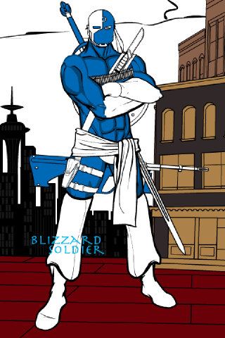
Hunter63 was very active this week, but I thought his or her "Blizzard Soldier" was the best of the bunch. I like the casual but ready pose, the positioning of the weapons, and the general look of the character. The simple blue and white color scheme in the costume works really well, also.
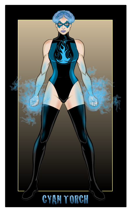
One of the reasons I like Imp's images so much is that they're always composed really well. As an actual illustration, they always look "finished", well-framed, well-posed, and with supporting graphic design elements that support the figure without overwhelming it. When you throw in a simple but elegant color scheme, pitch-perfect outfit selections, and an awesome energy effect like you get in "Cyan Torch", you end up with an image that works in every way. Great job once again, Imp!
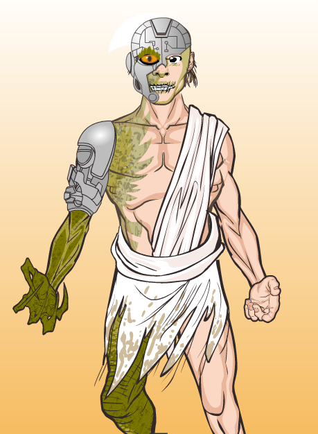
I thought Jack Zelger's "Cyberlizard" did a great job of combining the two disparate elements he had to deal with. The interface between the human and lizard parts is a nice touch ... so he's kind of a Were-lizard-cyborg, which ought to be a comic book right there.
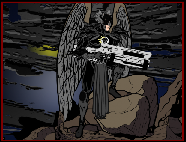
Kaldath's "Dusk Hawk" could teach Hawkman a thing or two about being a bad-ass.
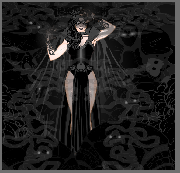
I also thought Kaldath's "Shadow Queen" was not only a great illustration but fit the random name perfectly.
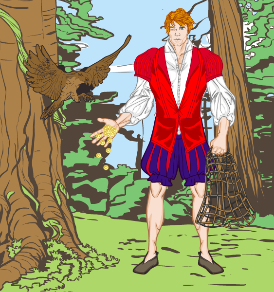
I don't know what the heck I would have done with "Falcon Deluder", but Kaylin88100 went after it with her usual plucky inventiveness, and I thought the resulting image was pretty darn good.
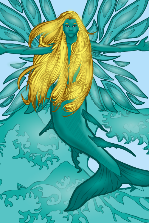
Kaylin88100 also gave us "Oceanic Wings", which I think is simply lovely.
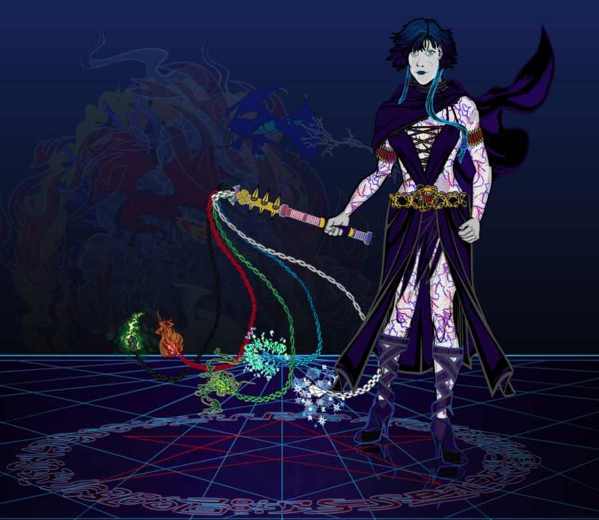
Keith Kanin's "Midnight Cleric" shows off a really awesome whip that I would love to own in any D&D campaign.
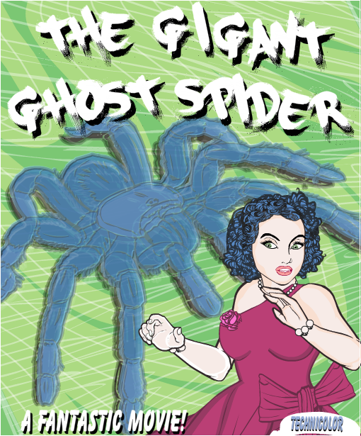
I loved Kytana's movie poster version of "Ghost Spider". I'd definitely rather see this than half the dreck that's coming out of Hollywood this season!
I don't know that I necessarily get "Deadly Chancellor" out of Langolier1's design, but I do think it's a neat looking guy.
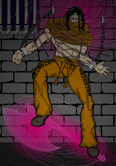
Luclucluc's "MindAxe" is all kinds of spooky awesomeness. I love the pipes used as jail cell bars, the nifty glowing axe effect, and the downright creepy design of the head and wrap. Great stuff for Halloween!
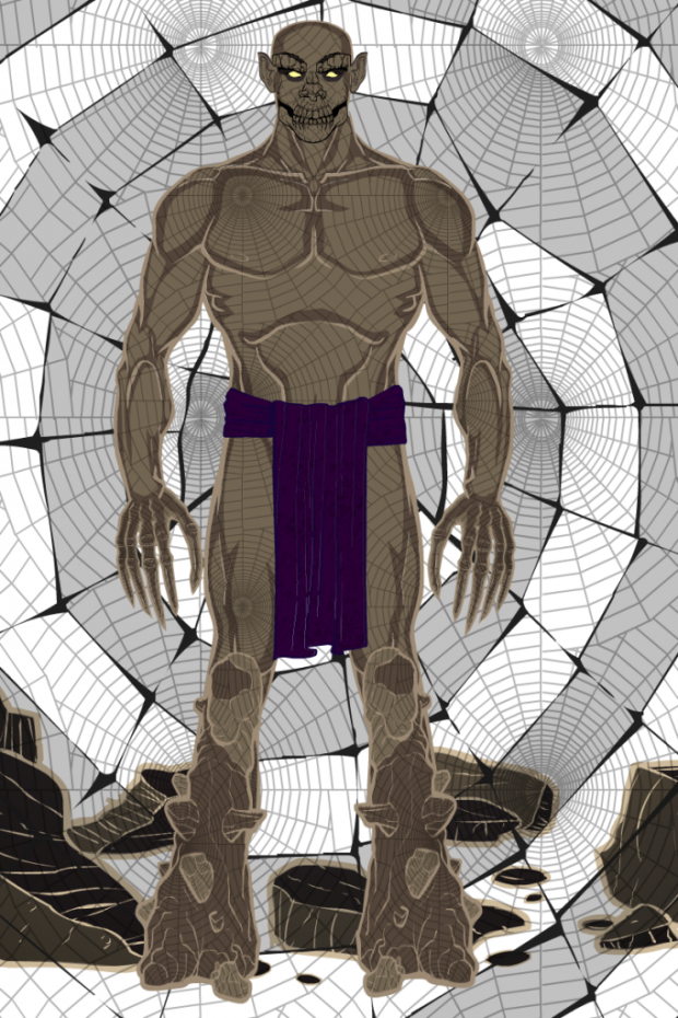
Maniacmick's "Web Golem" struck me as, again, something I'd love to run into during a D&D campaign. Though preferably only with that multiple-elements whip from earlier ...
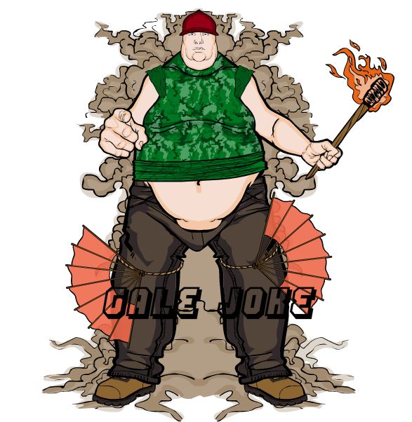
I'm always up for a good fart joke, so ... yeah. I give you Mashlagoo's "Gale Joke".
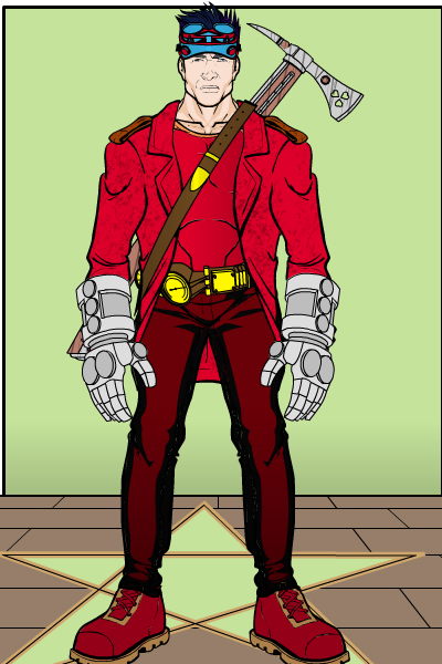
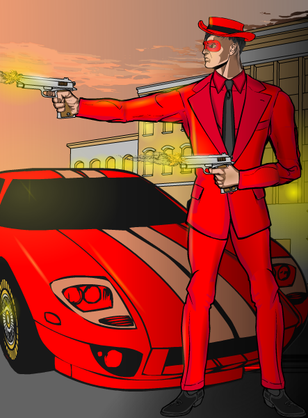
I thought Myro's "Scarlet Driver" had a real Golden Age type of feel to it, a pulp flair that I found very appealing.
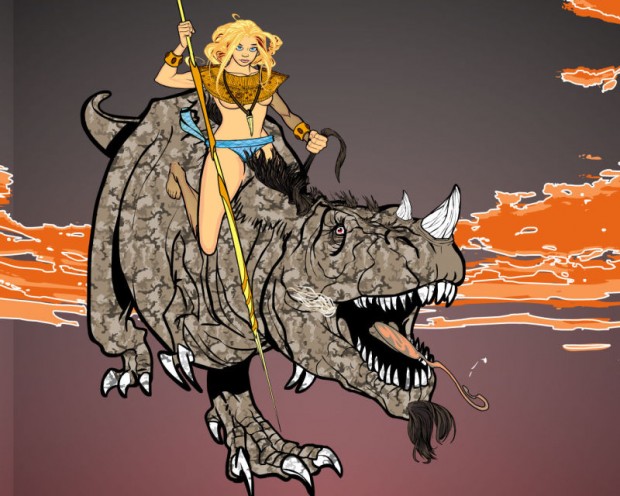
PapaKrok always gives us something awesome, and his "Dragonrider" definitely fits the bill. The rider fits the dinosaur perfectly and creates a concept I'd like to see more of.
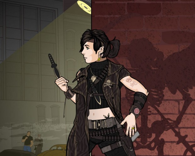
His "Soul Seeker" is even better, with a moody, evocative design. I love the character herself, the skeleton shadow, the setting, everything -- it all comes together to make a fantastic illustration.
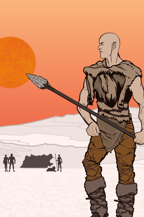
I thought SpellCheckingQuill's "Iceberg Star" also had a great feeling about it. I love the simple colors, the pose, the silhouetted tent, and the overall impact of the composition.
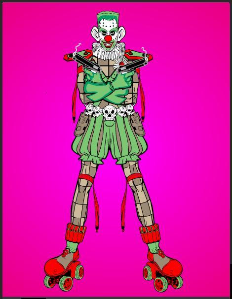
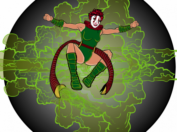
Skybandit was out of control this week, putting together something like three different groups of ten, committing to doing all of the random spins generated. And not only did s/he do all ten, but they were all put together into an overarching shared-universe type of setting! As if all that weren't enough, the actual images are awesome! So here are a few I picked out as especially cool. the first is "Bloodjape", who I think gives the Joker a run for his money as the Clown Prince of Creepiness.
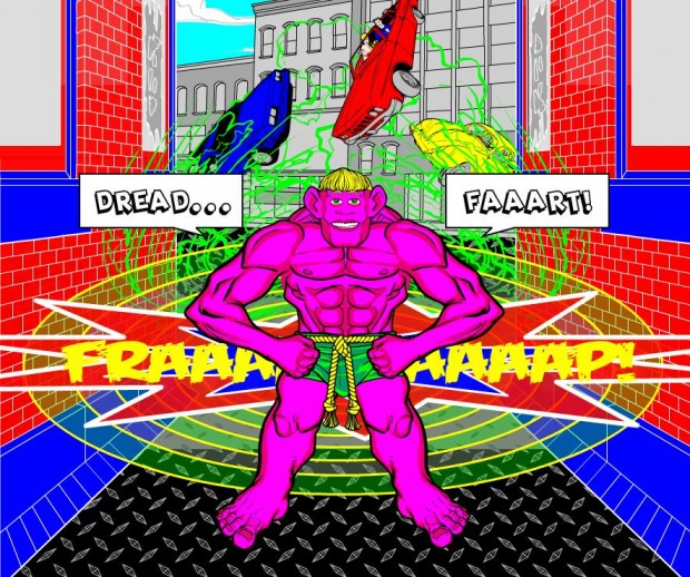
Second is "Dreadfart", for the aforementioned reason that I like stupid fart jokes (as if there were any other kind).
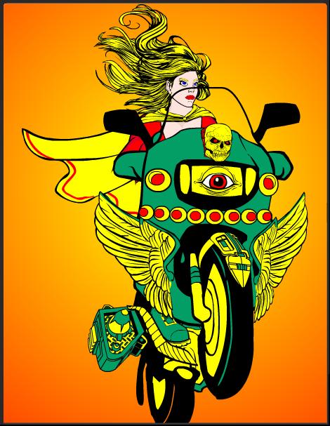
Third, "Highway Draft" is a great blend of cool Autoduel and Mystic Warrior.
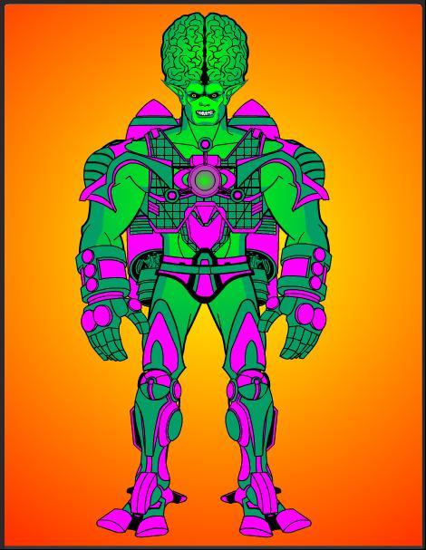
And finally, Technofist looks like what would happen if the Fantastic Four villain "The Impossible Man" sacked up and got truly mean.
Great stuff as you can see. I really appreciate Skybandit's tenacity and skill in taking on that monumental task, well done!
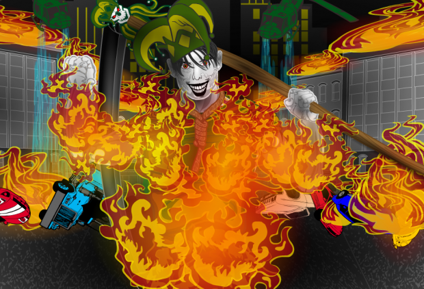
Moving on, I think "Ember Joker" may be Tarkabarka's best work to date. I love this illustration for the color, the concept, the execution, and the overall feeling of gleeful mayhem I get from it.
Finally, we come to Xenowolf's "Nerve Giggle". That's a tough combination to pull off, but I think this is a great composition, full of life and mayhem.
Those are all a lot of fun and very well done, but as always there can be only one overall winner. This week, I'm going with someone who's come tremendously far in design skills, and who's always willing to help out the other folks here despite what must be a truly formidable language barrier. I am talking about, of course, Tarkabarka! Let me know what you'd like as your prize and congratulations!
Congratulations as well to everyone who tackled this tough challenge. I appreciate all of your hard work, creativity, and dedication to good design!

