Many thanks to everyone who entered Character Contest 74 - Libra! This was the last of our Zodiac challenges, and I appreciate everyone's patience as we worked through its highs and lows.
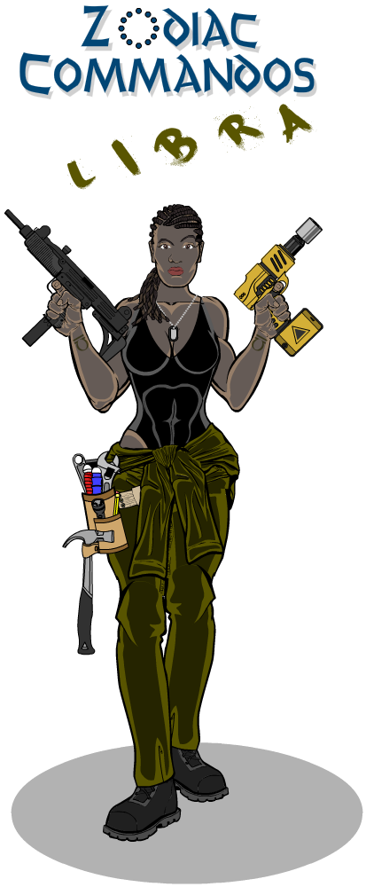
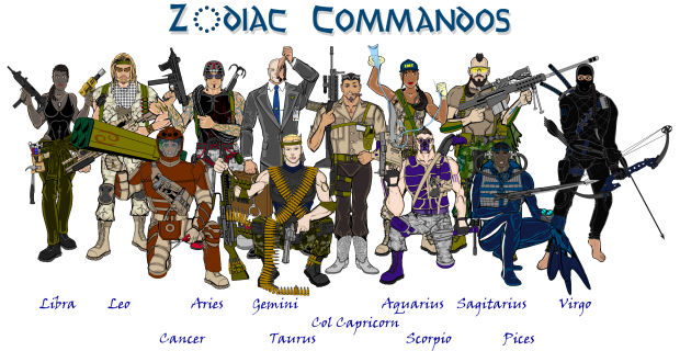
Before getting to our Finalists this week, I wanted to be sure to highlight the great work of Mark's "Zodiac Commandoes", his -- and I quote him here -- cheap GI Joe knockoffs. I've had a lot of fun seeing each new team member every month, and it's great to see the entire squad assembled. Thanks for the good times, Mark!
I love the drill gun she's holding, that thing's awesome.
And now, our other finalists for this week! Note that as usual, you can click on most of these images to see it at the original, larger size.
I thought Cliff's Yen Yang had excellent technique and created a fun, visually interesting image.
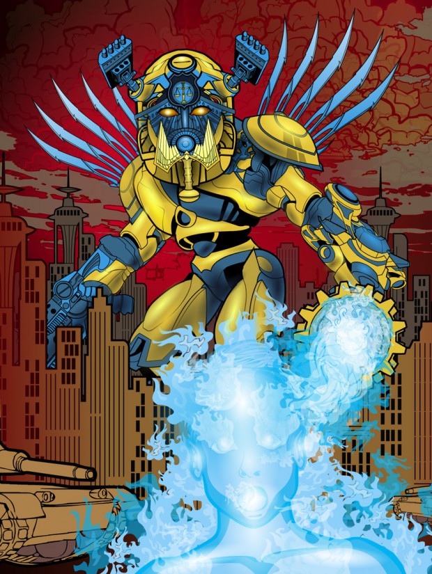
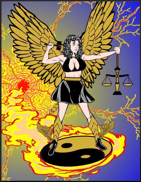
dblade always brings the Awesome, and this week is no exception. Called "Fiery Judgement", I love the play of cool blues against angry reds. A great composition!
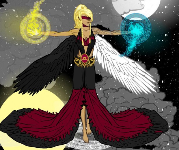
Dimmortald's "Despoine" shows tons of technique and an interesting dichotomy.
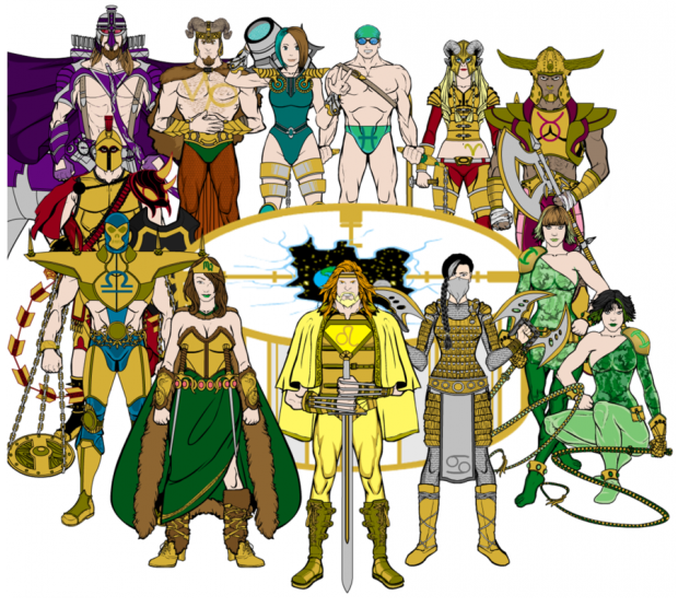
Frevoli, like Mark, has assembled all 12 of his entries into one really cool team shot, which I now share with you.
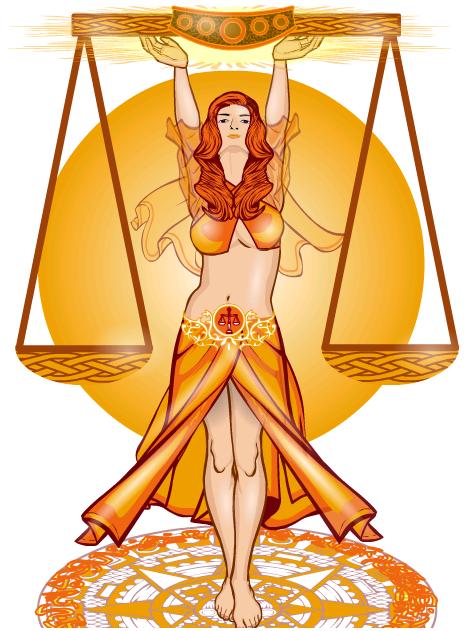
Gendonesia's "Leebra" shows how you can use different tones of the same color to excellent effect. I love the subtle movement of the figure. You don't have to do crazy, completely out of left field things with these concepts -- sometimes a straightforward execution of the main idea done very well is awesome all on its own. As in this case.
Kaylin88100 had two entries this week I wanted to highlight. The first is simply titled "Blue Libra" and I think has a lot going for it, from the contrast of the warm-toned scales with the cool-toned surrounding elements, to the great use of the seated figure, to the subtle touches of theme and shadow.
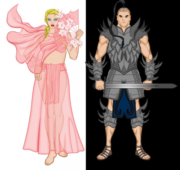
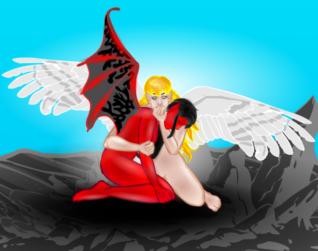
Her second entry is a study in balanced contrasts (for Libra, the scales, get it?!), titled "Love and War". I like both figures, and was happy to see the progression of the positioning of the female character's hand. The first two attempts were not quite right and would not have resulted in being a Finalist, but I think the final solution works great. Excellent sticktoitiveness there!
I liked kwnos' blue highlighting here. I have nothing fancier to say, I just think it's pretty.
Similarly, I find myself unable to look away from the hideous man-troll in Kytana's "Libra". I mean, I know it's contrasting images and all, but that guy is awesomely ugly. I can totally imagine running into him in a dark alley somewhere and -- this is probably TMI -- undoubtedly wetting myself in terror.
Newerlie's "Libra" is another impressive composition with a lot going on. Yet it's all pretty clear and easy to understand, as well as being visually appealing. Good job on this one!
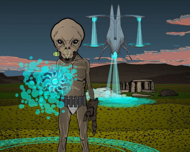
Like dblade, you can always look forward to PapaKrok's entries. I love the way the ship forms scales in the background, and the alien in front has that patented awesome PapaKrok "ick" factor.
I liked Skybandit's use of color and composition on this one as well. Very cool.
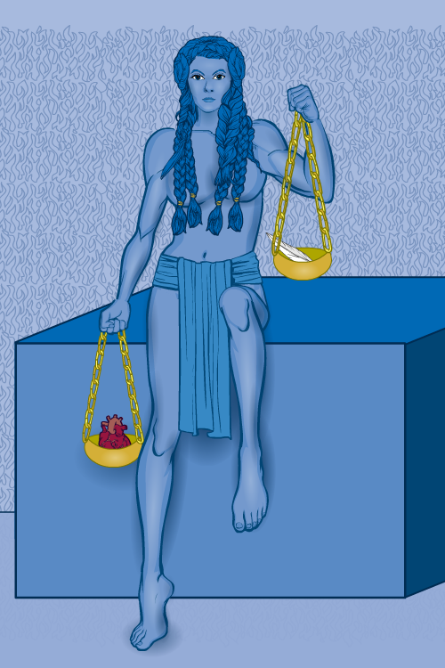
SpellCheckingQuill has a great profile view in this mythologically inspired illustration, titled "Ma'at".
I found Tarkabarka's "Eriel" quite moving.
Finally, Trekkie has another great entry in the robot-construction series that I love.
Which brings us to our winner this week. It was a tough call, but ultimately I went with ... Gendonesia! I thought it was the best expression of the sign and was easily one of the most visually arresting entries. Great job! Let me know what you would like for your prize and I'll throw it on The List.
Thanks again to everyone who entered and special congratulations to all of our Finalists! The Zodiac contests were fun, and I'm glad I did them, but now that they're over I'm glad to see them go. Next week we'll open it up a lot more and give you more creative control!

