Many thanks to everyone who entered Character Contest 71. I know it was a tougher theme than usual, so I appreciate your creativity very much.
Without further ado, here are the ones I thought stood out the most, your Finalists!
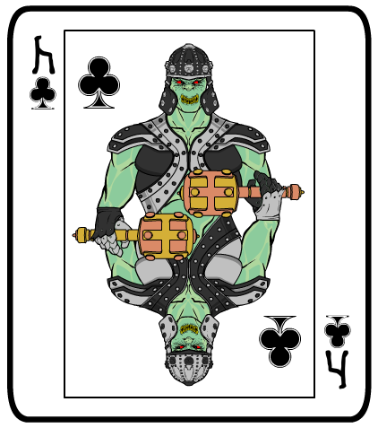
I was glad to see some folks take a literal approach and design actual playing cards. One of the best of those is Atomic Punk's "Goblin King". I like that it's an imaginary sort of critter but rendered in a classic way. The symbol instead of the "K" is a great touch, too. All the little details here work.
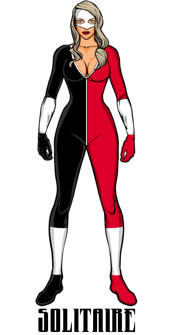
I also like stripped-down, minimalist, everything-matters kinds of creations, and Blue Blazer's "Solitaire" is a good example of why.
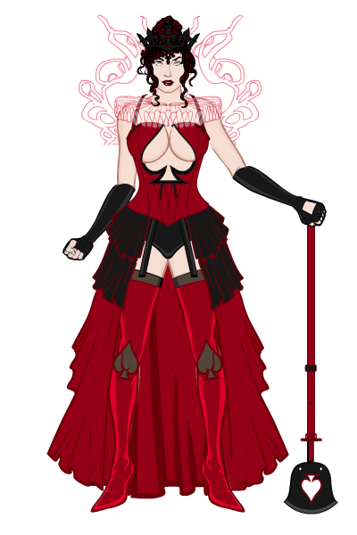
BornToBeALoser's "The Queen of Spades" has a number of interesting twists to it. The psychic ruffle should be a staple of more characters, in my opinion. And the introduction of a lot of red to a traditionally all-black suit is intriguing. But what really earned "Finalist" status for me is the nifty cut-out spade in the bodice. That's cool.
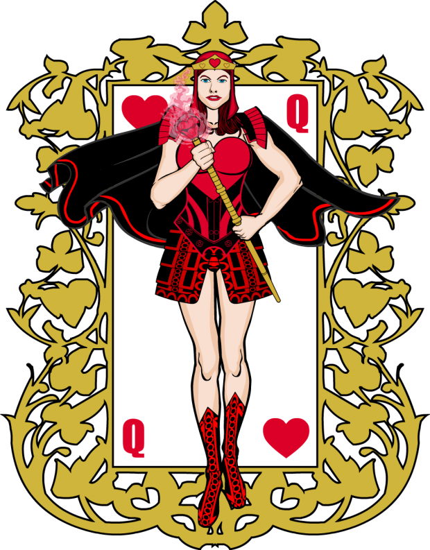
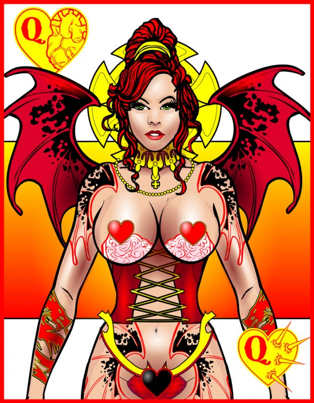
Brons' "Queen of Hearts" has a lot of dynamism that enhances the cool design. I do wish that bottom "Q" had been flipped, though. I like the subtle change of having one foot in front of the other, as if she's gliding right out of the frame.
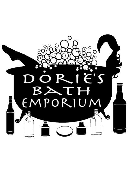
For something completely different, Cliff designed a business "card" that looks simply outstanding. Love the silhouetted leg and toucan. Maybe she's bathing in Fruit Loops? And don't judge me because that sounds hot.
dblade continues to bring the Awesome every week, and his "Queen of Hearts" is no exception. Look at that face -- the subtle shading and highlighting with gradients is outstanding.
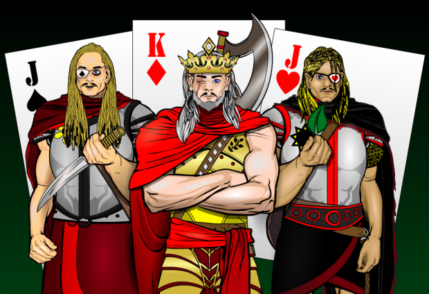
HeadlessGeneral's "One Eyed Royals" is a fantastic concept very well executed. The idea of having all the "one-eyed" face cards band together is genius, I tell you. GENIUS!
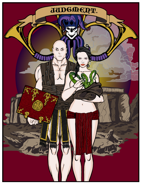
Imp went the Tarot route with his Adam & Eve twist "Judgment". I love all the elements and the overall composition is just great.
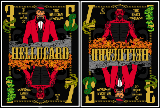
I don't know what a Hellucard is or why it needs a tribute, but MartianBlue's images blew me away.
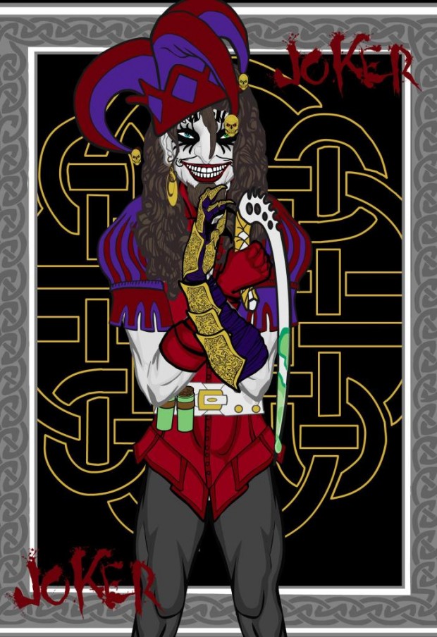
I thought more people would take on the Joker card, but maybe it's been overdone. Or should I say "Holy Overused Card References, Batman, it's the JOKER!" Regardless, I love newerlie's take on the concept, which introduces a maniacal, evil, disturbing twist on it. Very well done!
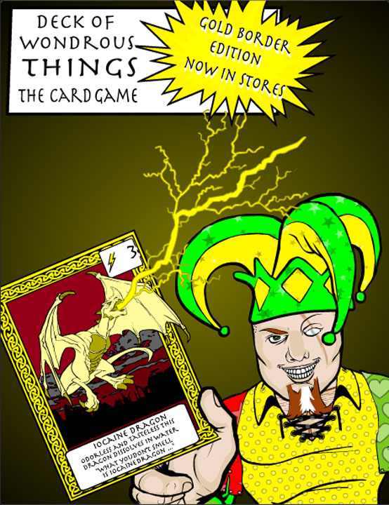
NGpm brought back some fond D&D memories with his "Deck of Wondrous Things" solicitation.
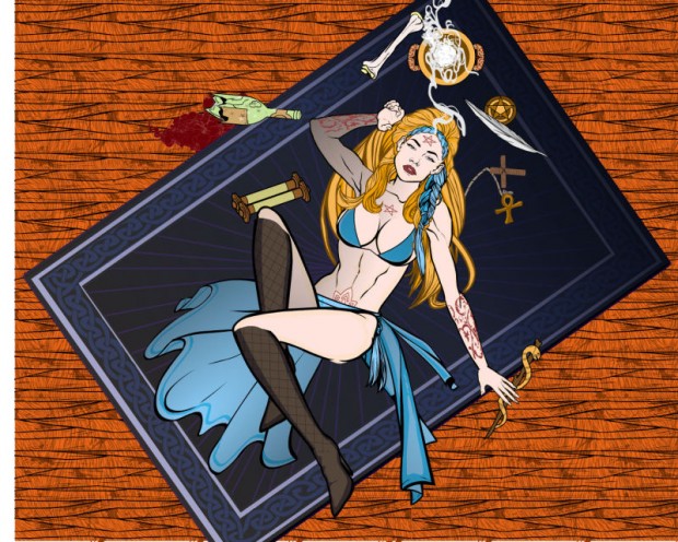
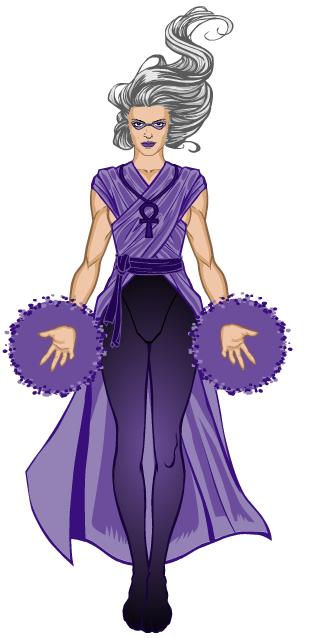
We all know PapaKrok is a master, but I think he might have outdone himself with "High Priestess". It's a brilliant composition, echoing all the elements in a classic card while being something else entirely. All the colors work, the perspective is inspired, and the character herself looks fantastic. The look of dreaminess on her face is outstanding. Stellar illustration, sir!
Sutter_Kaine shows once again that you don't need a dozen colors and fancy backgrounds to create a beautiful character illustration. His tarot-card "Magician" figure really pops off the screen through the subtle use of variations of just a couple of colors. Combined with excellent item choices, this is a real winner.
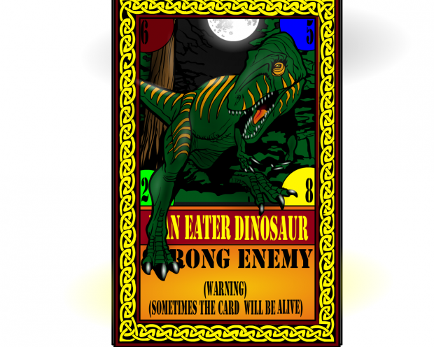
Tarkabarka's "Living Card" has lots of menace, mood, and malice, which are three of my favorite "m" words. It looks like the dinosaur is about to leap off the page, which is exactly what he was going for. Nice job!
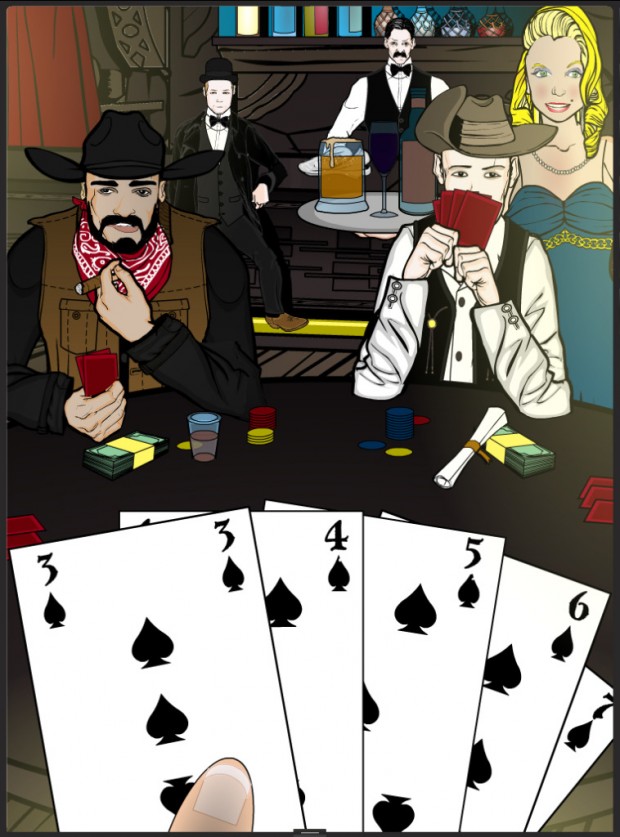
Finally, Unstable put together a wonderful scene in "Royal Flush Saloon Scene". Granted, that's not actually a royal flush he's got there, but still, it's close! Maybe one of the other players has it, which means this guy's about to bust out. Poker rules aside, the scene really works well, with good figure-ground relationships, clear layers of scenery, excellent detail in the subsidiary figures, and excellent use of color. This is definitely one of the best "scene" images I've seen in quite a while.
Those are all great, but alas, there can be only one overall winner. I ultimately had a tough time deciding this week between three entries -- PapaKrok, Unstable, and MartianBlue. I think "High Priestess" by PapaKrok is one of my all-time favorite HM images to date, with a rare combination of character, design, and concept. She looks flat-out awesome. But, I finally had to decide that it just doesn't quite fit the contest theme as well as the others.
MartianBlue's "Hellucard Tribute" looks great and is clearly an actual card while also, as I understand it, having a puzzle built right in, but Unstable's poker hand is a fantastic scene.
After much agonizing, I finally decided to give the win to ... Unstable! I think it's really hard to pull of a scene like that and this one is absolutely nailed. So congratulations, Unstable! Just let me know either via email or a comment to this post what you'd like for your prize.
Thanks again to everyone who entered, and congratulations to all of our stellar Finalists.

