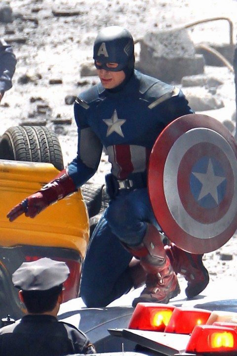
Over the last few days, several sites (NewsRama and SuperHeroHype among other) have released sneak peeks at the new Captain America uniform from the upcoming Avengers movie. If you're not wanting to spoil the joy of seeing it for the first time on the big screen, do not read further!
So I'm just going to post a bunch of the images, after which I'll give you my impressions. I look forward to hearing whether you think this should qualify as a "Bad Super Hero Costume" or not.
First, the good.
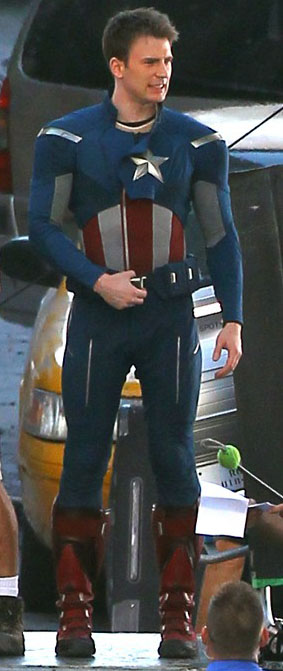
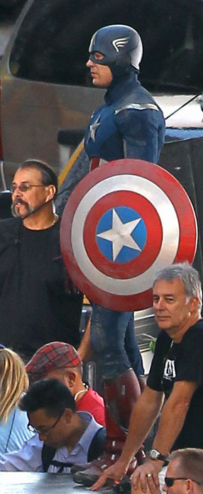
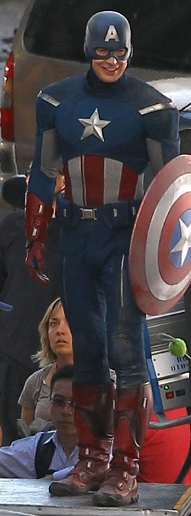
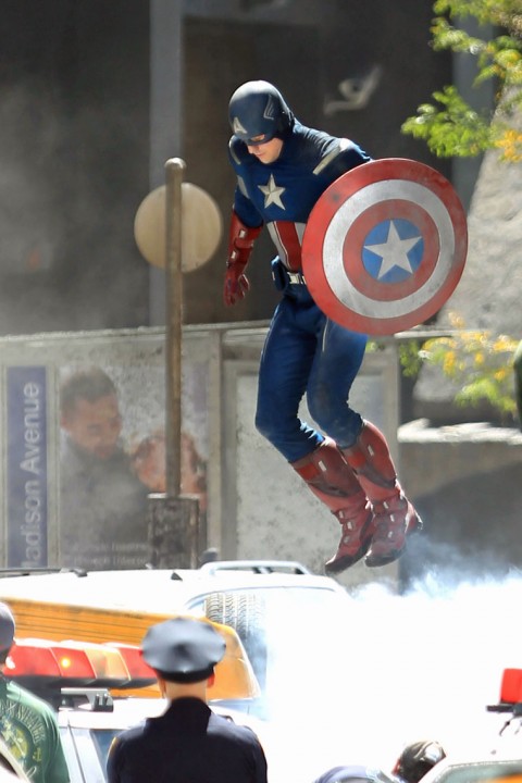
- Overall I think this looks pretty darn good. It's close to the original Kirby design, while getting rid of some of the more ... implausible bits like the floppy wings and pirate boots. It's definitely modernized in some good ways, especially in the boots and shoulder/chest pieces. I like the detailing you can see in some of the shots with the pant zippers and boot straps. Particularly in the action scenes, he looks mobile, quick, and cool.
- The first images I posted yesterday on the HeroMachine Facebook page showed a few things that bugged me, especially in the area where the neck joins the chest. It looked like he had a cloth cowl that was pulled down over a raised collar, which looked ... weird. A few others, though, look like maybe the cowl will be tucked under the collar, which I think looks a lot better.
- I like the detailing in the shoulder pads that you see when he's crouching on top of the police car (while ordering two double lattes, apparently).
- The design of the tunic, which pulls over from left to right to fasten that you see in the image where he's just standing around without his helmet, is awesome. It reminds me of Picard's off-duty "smoking jacket" from "Star Trek: The Next Generation". And anything that brings to mind the baddest-ass bald guy since Kojak is OK in my book.
And now, the bad.
- If the silver stripes on the shoulders are supposed to be cut-outs that show a white tunic underneath, I like them. If they're supposed to be actual silver stripes, though, I hate them with a white-hot intensity that will burn you. BURN you!
- I feel stupid even bringing it up, but like the "Superman Returns" European-style bikini briefs, I think Cap's chest symbol is too small. I'd like it to be maybe 20% bigger.
- The helmet wings ... I'm glad they're present, because it's a pretty iconic part of the design. But the helmet needs more detailing along the lines of the shoulder pads for it to work, in my opinion. Something like the Hitch design, with seams and some separation. Now, in some shots it looks like there's maybe a silver helmet-like part beneath the blue mask, which is pretty neat. But the wings still look like someone spray-painted them on with a template. Buddy John Hartwell had a good idea when I was discussing it with him, that maybe making the wings more rectangular in shape and putting them on a slight bulge in the helmet, at the depth of maybe half a pack of cigarettes, would look good. It would give the helmet some dimensionality, and could plausibly serve as the housing for some sort of communication gear.
- Personally, I like his ears sticking out of the helmet rather than sealed in.
- I really don't like the belt pouches being blue. You need some kind of separation there between the tunic and the pants. Making them a canvas beige would have been a better choice.
Facebook commenter Lydia Weatherbie had some good points about the ears being too vulnerable to shrapnel if not enclosed, and that the boots look too much like regular sneakers on the bottom parts. So I wanted to put that out there too even if I don't necessarily agree because I think they're valid points.
So there you have it. Overall I give it a thumbs-up, with the usual caveat that it's very difficult to judge a live-action super-hero movie costume just from stills, or even from surreptitious fan videos from the set. You have to see it in context, in motion, with all the effects going, to know if it works or not.
We are, however, geeks and cannot -- will not! -- let reason get in the way of a good trashing. So have at it in comments and let me know what you think!

