Monthly Archives: June 2011

Reason #13: He’s a hack

The upcoming "Hawk & Dove" relaunch features a cover by none other than Rob Liefeld, whose art (as you know) I hate with the white-hot intensity of the sun. Here's the cover:
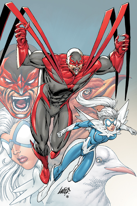
Apparently DC, having already decided to grant an entire line to two characters no one has cared about since the Nineties, went all-in by having the cover drawn by an artist no one has cared about since the Nineties.

Rob Liefeld is a hack. That means he never got the necessary grounding in the fundamentals of professional illustration (or human anatomy), the absolutely essential scaffolding upon which good art is built. Now, don't get me wrong, I'm not dissing hacks in general. I consider myself one in many ways, certainly when it comes to programming (I'm totally self-taught, so there are embarrassing gaps in the fundamentals anyone having gone through a structured program would have received). Sometimes, the only way to get clear of the choking jungle is to hack your way through.

But he's a bad hack. Whose hackery inspired twenty years of insipid imitation that gutted the artistic integrity of a medium I love.

Thus, after a long absence I bring you another installment in the "I Hate Rob Liefeld's Art" series!

Rather than type out my review of why this cover is a classic example of Liefeldian Hackery, I give it to you in image format. Enjoy! And if I missed anything, please chime in to let me know.
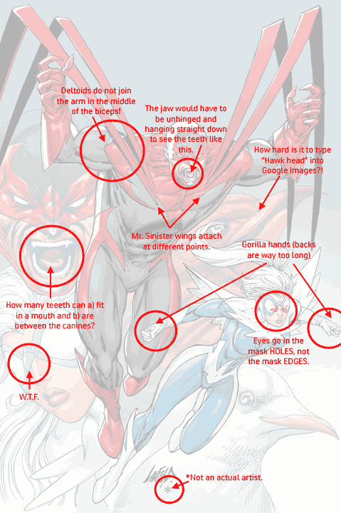
(Image and characters ©2011, DC Comics, Inc. If they choose to claim ownership of either, that is.)

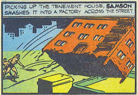
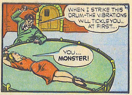
Great moments in collateral damage

(From "Big 3" number 1, 1940.)

Wilson?

We left our intrepid Lone Wolf Cub dithering in the cabin of his ship's captain while a fire raged in the hold, pondering whether to search the cabin or follow the leader upstairs. By almost a two-to-one margin, we have apparently decided our adventurer is the Straight Arrow type. Thus, up to the deck we go:

Continue reading

SOD.239 – Wildfire

One of my favorite Legionnaires.

Evil Villain Fail

(From "Big 3" number 1, 1940.)

SOD.238 redux

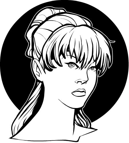
Thanks for the comments on that last Sketch of the Day. I've done a bit of tinkering and thought it would make a good example of how relatively small changes can have a major impact on an illustration.

First, here's the original for reference:

Continue reading

SOD.238

The curse of Wonder Man

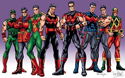
I would argue that no character in comicdom has a worse fashion history than Wonder Man. I've talked before about his penchant for hideous costumes, but just to refresh your memory, here's a retrospective of the character's modern incarnation:

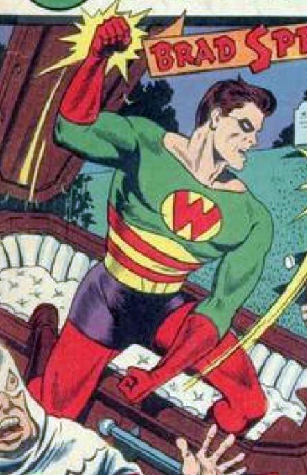
But did you know that Wonder Man's sartorial suckage is not just bad, but historically bad? And I mean that literally, because this is how the very first incarnation of the character appeared in 1944:

They were called "Four Color" comics for a long time, and you can see the tragedy that results when a hero flaunts that convention and puts together a five color costume. For the record, that's red, green, yellow, purple, and (though it's not visible here), brown for the boots. And those mutually clashing colors are cleverly arranged to cause maximum visual carnage. I can't figure out why you'd have horizontal red and yellow stripes, topped with an inverted yellow chevron just below the pecs, all on a field of green atop a set of purple biker shorts.

I've said it before and I'll say it again, but in light of this new historical evidence it bears repeating: Wonder Man richly deserves a Lifetime Achievement Award in Serial Bad Costuming. That's sixty-seven years of looking like a fool, folks! The only real wonder here is how he manages to keep looking terrible despite that many decades of retcons.

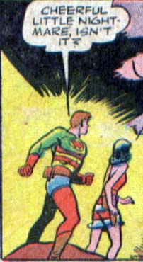
But I'll give the Wonder Man himself the final word on how to judge this little ensemble:

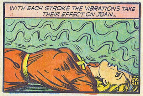
“Death Trap” & “La Petite Mort Trap” are NOT the same thing

(From "Big 3" number 1, 1940.)

HM3: The Fat Tattooed Mage Gloves of DOOM!

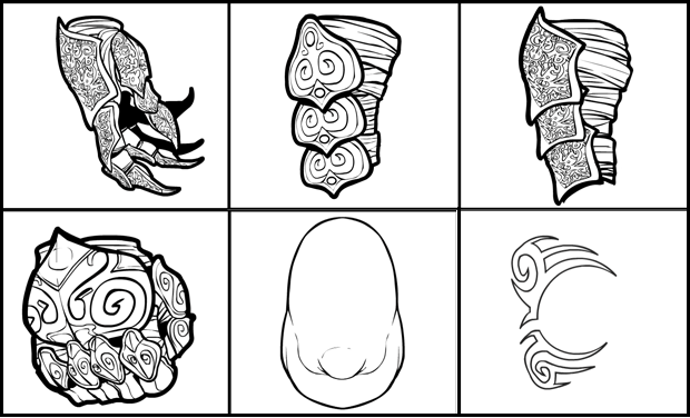
I've just uploaded several new items to HeroMachine 3, namely:

The first four items (the whole top row and the first one on the second row) are the prize for xxXBladeIIXx winning Character Contest 62. He wanted a "Mage glove". One was the first attempt, which neither of us was happy with, and the other is my redo, which I liked a lot -- spikier and cooler looking. Both hand portions are available in HandRight-Standard, while the upper parts are in GlovesRight/Left-Standard. While I was in there, I fixed the glitch with the Left boxing glove item, which was going to the wrong one when clicked.

The next one is a generic obese head in HeadMale-Standard.

Finally is the first of a pair of matched eye tattoos in Eyes-Standard, by dbalde dblade. The top part is one color and the bottom part the other, so you can get some neat effects. Thanks for that one, dblade!