We had a huge response to Character Contest 66: Cyborg -- thank you all so much for sharing your creativity! As a result of the larger than usual number of entries, I also have a larger than usual number of Finalists. There were just too many quality submissions to limit it to the usual 20 or so.
I hope you enjoy browsing through this creme-de-la-creme as much as I have. Without further ado, it gives me great pleasure to introduce to you (in alphabetical order) the following Finalists.
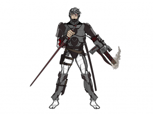
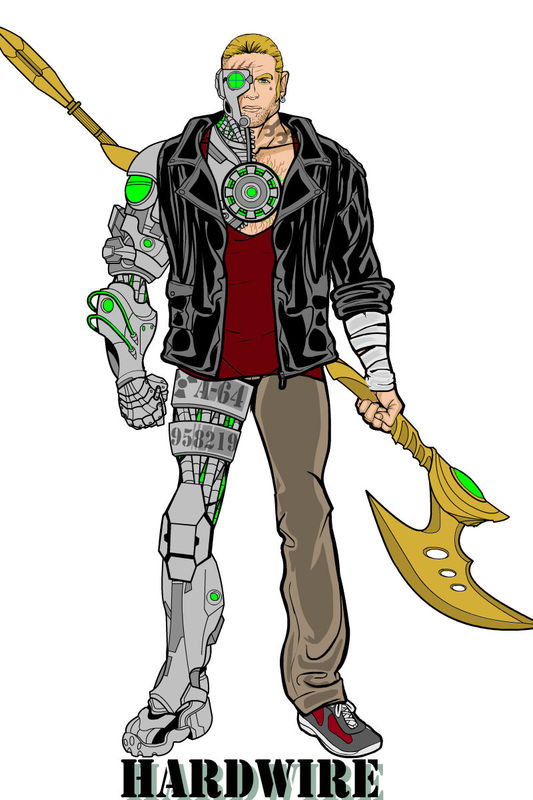
Alex went with a "traditional" super-hero look with "Hardwire", and I think he did a stellar job. I say this all the time, but having an awesome environment or setting isn't always necessary if you have a solid, believable, and well-executed character design. All the pieces here work great together, and the pure white background helps you focus just on the man ... er, machine ... cyborg himself. Itself. This is confusing! I like the techie looking shoe that echos the normal sneaker, the cool axe, and the nice touch of adding numbering to the leg bands. Great job, Alex!
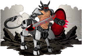
I really liked all of AMS' entries this week (as usual), but I picked out the Cyborg Centaur to highlight. It brought back fond memories of a couple of childhood toys, two Transformer-like centaur guys (one all white and one all black) that you could take apart as the limbs and such were held on with steel balls and magnets. Anyone remember what those were called? Anyway, this is a neat looking take on the concept of an organic/metal hybrid. Why limit yourself to human shapes when you start grafting on machines, after all? The setting is really nice, too. Any chance of adding that to the HM3 Custom Items Archive, AMS?
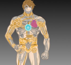
Asder's soft-focused see-through "Cyborg" has a lot of charm to it. I like being able to see under the skin to the mix of organic and metallic bits. The colors also complement the layout well.
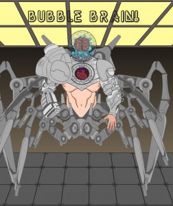
I don't think I've seen Bad People post before, but I thoroughly enjoyed this "Bubble Brain" entry. The brain in a jar is classic, but done very well here, with the added bonus of a heart-viewing portal. That would come in handy when you're thinking of dating a guy, because you can see ahead of time if he's heartless or not.
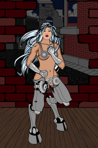
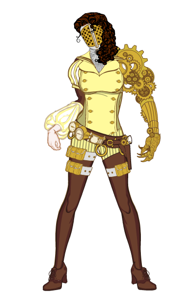
I love the attitude and sassiness borntobealoser put into his steampunk "Clockwork Cyborg". I can almost hear the clack-clack-clack or the gears in her neck as she's cocking her head to the side and computing whether to come on to you or fill you full of lead. Her left (our right) shoulder is also genius, just a totally cool assembly of mechanics to build a custom limb. Just as nice is the puffy sleeve and human hand on the other side to reinforce that this is not just a robot, but a cyborg, coal-driven or not. For bringing us a whole new level of "steamy", I definitely tip the hat to borntobealoser!
Brons' "Tisiphone" is a neat mix of gritty street-level grime, high-tech parts, and old-fashioned fantasy goodness.
dblade continues to bring it with both custom items for you all to enjoy and with great creations of his own, as in the crowd favorite "Cyber Witch". Not too much more to add to this, as it really speaks for itself.
Frevoli's "RoboWalrus" is just too funny not to include!
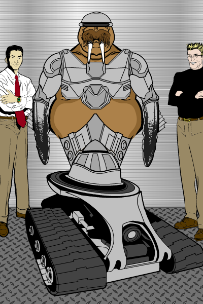
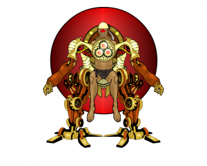
Headlessgeneral had two entries I liked a lot. In addition to the not-pictured Killbert (great name!), I thought this "Wheels" image showed a ton of creativity and a lot of hard work. The highlighting alone ... wow. I also think it's neat how the arms aren't strictly built along human lines, and the way the walker is also a chair for the guy. It's a neat take on replacement limbs.
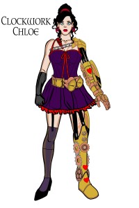
Much like borntobealoser's entry, Ian T. Healy brought us a cyborg lady of the night. Starring now in of one of his short stories (available now on SmashWords), it's Clockwork Chloe!
Jordan Xord's "Pirate" would certainly be at home up in the rigging. Repelling boarders with a hail of bullets. Another nice, clean, simple design that works.
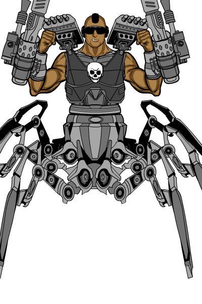
Kaylin88100 put a lot of work into a large number of submissions this week, which is cool on its own. But I really liked "Mind Control", perhaps in part because he brings to mind a much cooler "Validus" from the Legion of Super-Heroes. Only not as huggable. This is another really good take on the "Brain in a Jar" style of cyborg.
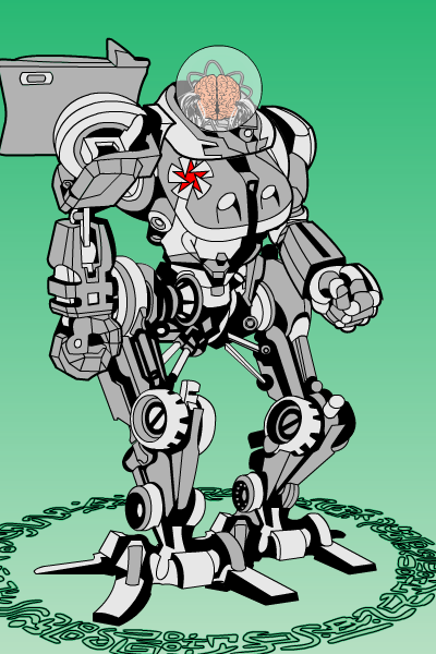
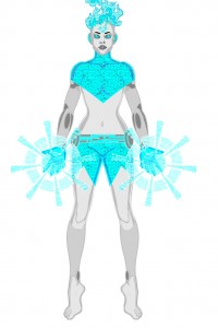
Kwnnos got an ethereal, "Ghost in the Machine" type of look out of "Cassandra" that's a nice contrast to some of the harder-edged submissions. Great use of patterning, colors, and item choices.
mercwithoutamouth has another addition to the Steamwork pantheon with "Steam". I like the combination of classic elements with the metallic bits, The tattoo on the human arm is a nice touch as well.
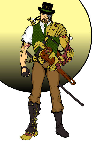
How could I not include Myro's "Hippoburg"?! I would totally want one of these.
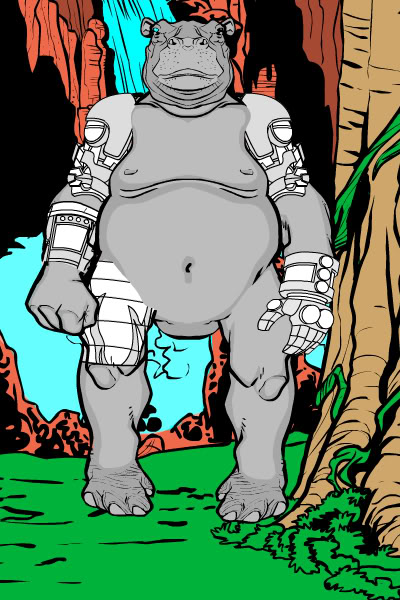
On a more serious note for Myro, I really like the dynamism and thought behind his "Turbo" illustration. I know the pose is originally from the innovative SeanDavidRoss, but Myro's use of the baggy pant bottoms to sell the idea that he's upside down is a fantastic touch. The boxers peeking out help, too. But what I particularly think is inspired is the idea that not all cybernetics have to be built around death-rays and bullets. This built-in sound system is something I could actually see happening in the real world. Really clever, and a well-executed image to illustrate it.
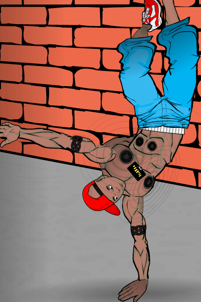
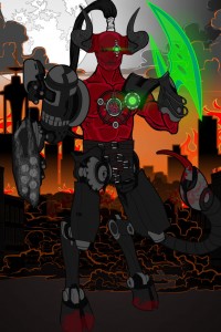
This is newerlie's second contest, I believe, and once again we have a wonderful submission. I'm glad you decided to join in on the fun! What I like about this one specifically (besides just the general quality of the demon cybersatyr body) is the use of that axe blade as a holographic weapon, and how it looks like it's coming out of the gauntlet at an angle. Nice job!
PapaKrok once again brings the brilliance with "CyberBabe", an illustration that I thought for a while was going to scare everyone else into not entering the contest at all! Luckily that wasn't the case, but this is still a wonderful image of a cyborg actually being assembled.
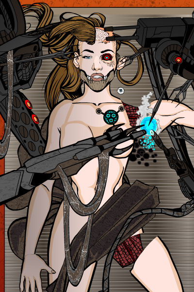
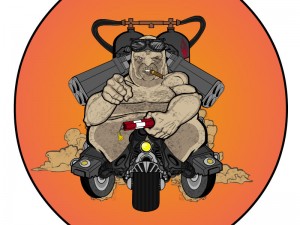
Actually, though, I think I liked his "Tankmunculus" better. It's like the bizarre love-child of Slimer from "Ghostbusters" and the Road Warrior.
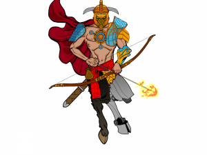
Pesky's "Cybertaur" has a lot of great elements to it, from the way it has a great flow to it, to the combination of real and artificial satyr legs, to the nice item choices, to the way the bow is being held (although the string should technically be on the other side of the forearm). A great image bursting with energy!
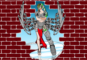
I'll agree with the other commenters that the small but vital addition of the reflection in the ice of Spidercow2010's "Linda" helps seal the deal on this neat character concept. I love the integrated arm keyboard, too, that's a great idea, which I will be calling Best Buy about having installed as soon as I am done with this post.
Tool's "Cyber Ninja" looks cool, although I do wonder just how stealthy he could be with that gigantic metal gun built in to his arm ...
Trekkie's "Caped Cyborg" is another good super-hero type of concept. I like the vaguely "Specter" vibe you get!
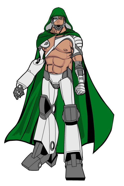
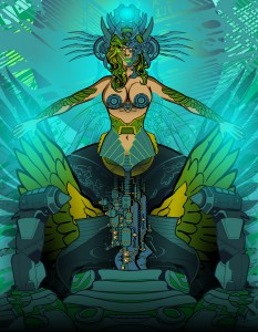
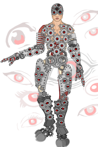
I don't think we've seen vodnik enter a contest before, but if all his or her entries are going to be of the high quality we got this week, I'm all for it! My favorite was this "Demetrius Panoptes", featuring really inspired use of insignia to build virtually the entire body. The buried eyes in the thighs and background elements adds a real sense of the otherworldly to the whole illustration. Definitely worth a click-through!
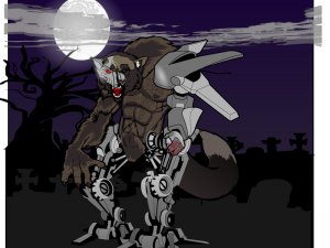
I liked both the not-shown "Windup Man" and this "CyberWere" by Watson Bradshaw. I chose to highlight this one because of the neat asymmetrical nature of the body, adding to the concept of a diseased creature lurching through the night to feast on the flesh of the nearest ATM machine, or coed, whichever comes first.
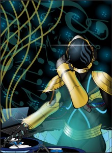
Finally, we have Zyp's clever, creative, and fun "Cyborg DJ". As he said, they replaced the arms and created the world's greatest disc jokey! A great combination of colors, background elements, and concept.
As you can see, picking just one winner from this great slate of Finalists is no mean feat. From the comments, it sounds like PapaKrok's "Cyber Babe", dblade's "Cyber Witch", and Zyp's "Cyborg DJ" were the crowd favorites. But you know me, I'm no slave to the crowd! Instead I'm going with an entry that I thought had a fantastic combination of personality, pose, style, and design. Namely, borntobealoser's "Clockwork Cyborg"! I guess you're going to have to change your handle now!
It was a tough choice, but something about her really caught my eye and made me want to know more about her, which to me is the hallmark of the successful character illustration. Great job, borntobealoser, and all of you Finalists!

