Thanks for the comments on that last Sketch of the Day. I've done a bit of tinkering and thought it would make a good example of how relatively small changes can have a major impact on an illustration.
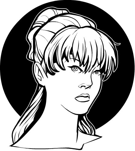
First, here's the original for reference:

Various folks thought the ear was in the wrong place, or maybe the figure's right eye (to our left). After working with it a bit, both of those observations were mostly correct. The ear is in the right spot, but because there was no jaw line it ended up looking more or less grafted directly onto the neck, instead of onto the skull. In the Open Critique Days, you'll often hear me talk about the "figure-ground relationship", which is basically a fancy way of saying it has to be clear what's on top of what. That's hugely important in a 2D drawing of a 3D world.
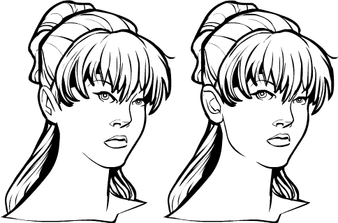
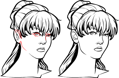
The solution in this case was to add a line for the bottom of the earlobe, clearly establishing that the ear is on top of the neck. Along with a strong jaw line, we now are able to separate out the skull from the neck that supports it.
The figure's right eye was also a bit too far over to the viewer's left, and tilted too far up. Moving and rotating it slightly helps establish a clearer relationship with the other facial elements. And finally, the opposite eye also needed to move in a bit, both giving a better distance between them and providing space between the eye and the side of the head. That visual distance again helps reinforce the spatial relationship between the elements.
That's three relatively small changes that make a big difference. Here are the two side-by-side:

And here they are with the redline edits marked on the original:

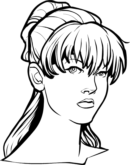
Just to tie it all up in a neat package with a bow, here's the full size revised version:

Thanks again for the feedback, I think I ended up with a much stronger illustration because of it. Her eye may still be a smidgeon too high, but I think I've about wrung this one for all the learning value it's worth for now.

