First, thanks to everyone who entered Character Contest 61. We had some fabulous images, and I sincerely appreciate your willingness to share your creativity with everyone.
Second, I had a very tough time deciding on the final winner this week. I'll go into the reasons at the end of the post, but suffice it to say that literally as I am typing this, I still haven't decided. Before I do, I thought I'd just post all of the Finalists, and then make my decision after seeing them all on the page at the same time.
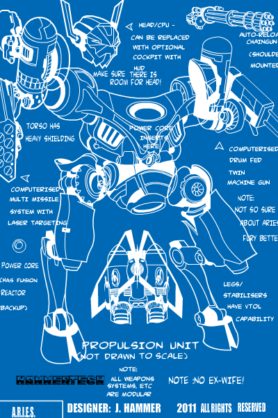
I absolutely love what "D" did with this fantastic blueprint of the ARIES 11. It's a great idea that I haven't seen done before and gets very high marks for creativity. Because "I haven't seen that done before" doesn't happen very often these days with HM3!
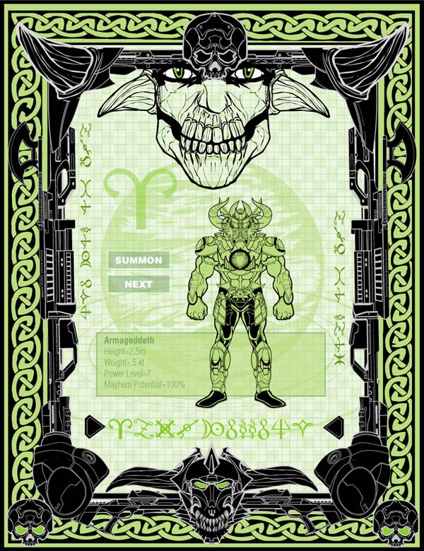
dblade also had a schematic-like approach to this display from the iRAM database, featuring a readout about his Armageddeth character. I liked the LED-like look of the greens, the authentic and cool looking layout of the screen elements, and the cool way he used guns to frame it at left and right. A very well-thought-out and nifty looking piece.
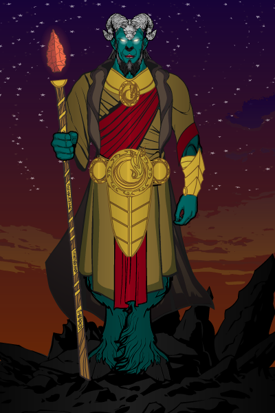
Domhellsing's "Aries" isn't super dupe complicated, but it does a great job selling the concept of the character and nailing the details. I really like the colors on the main character, the cool belt and neck torc, and the way the spear head floats away from the shaft. You don't have to do all kinds of crazy special effects to get a good illustration.
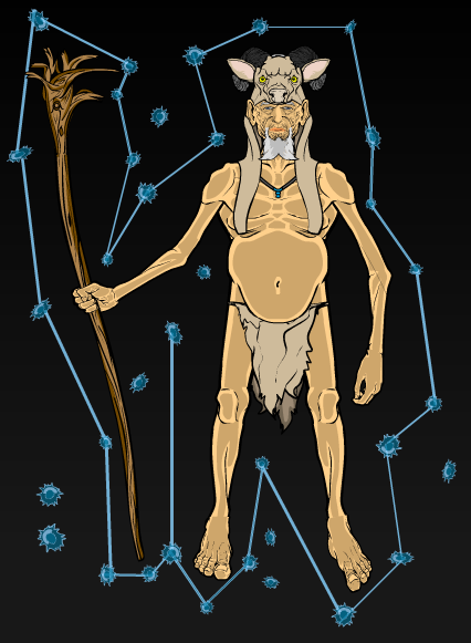
Martian Blue's illustration-within-a-constellation approach works great here. I love the look of the old man shaman figure, with his scrawny legs, pot belly, and big horny feet. A whimsical and intriguing looking guy all the way around. I think the constellation adds a wonderful touch to the whole illustration as well.
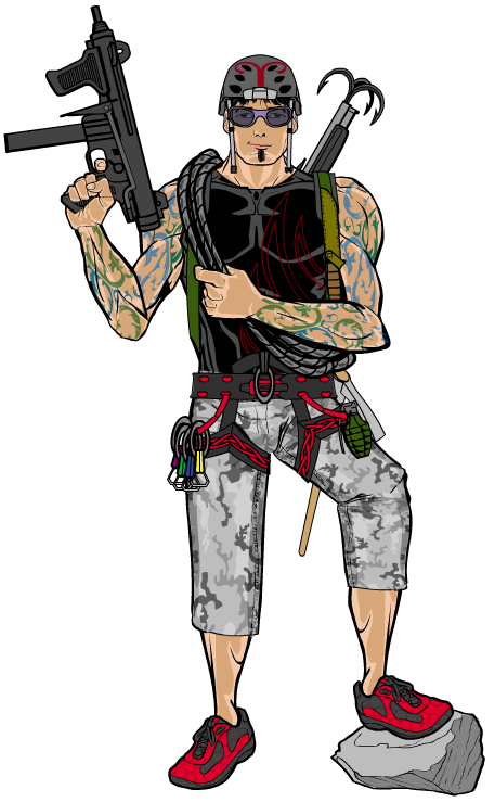
MLS is back with his Zodiac Commandos entry, and I think the rock-climbing Aries is his best yet:
PapaKrok is at his creepy best with his first "Aries" entry. I love how scary the main figure looks.
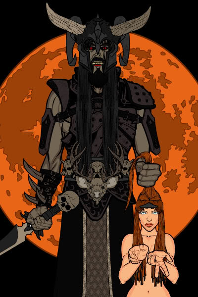
PapaKrok's second Finalist is a testament to kinetic fury titled "Slayer".
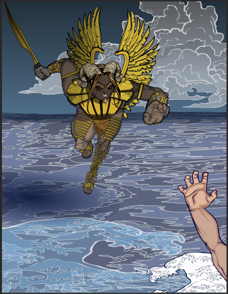
Sean David Ross has been doing some fantastic experimental work putting together alternate poses using unexpected bits, and I think his "Aries" is a stellar example of what he's been able to accomplish. I love the main figure's dynamism, obviously, but the background elements are all fantastic as well. The colors and gradients in the ocean are outstanding, combining with that wonderful figure to make a very powerful composition.
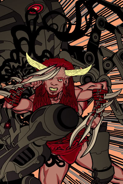
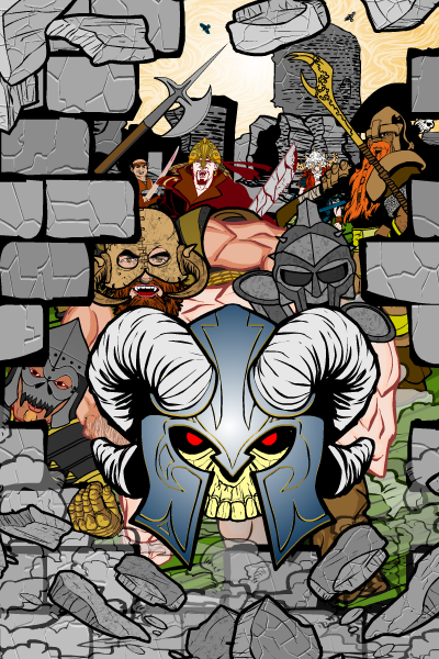
SpiderCow2010's POV style battering ram illustration has a ton of visual interest and great touches to bring the whole thing home. A fun and cool image.
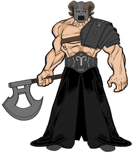
I said earlier that sometimes, simplicity is better, and Sutter Kaine absolutely proves that with his very powerful minimalist take he called "Aries: Mutate". I don't know the backstory here, but this is a wonderful example of how to do the basics right. When you go with a very clean concept like this, you have to nail every detail. And he does. The proportions of the lower body to the upper body are perfect for a big, huge, heavy bruiser. The belt with the Aries symbol in it has nothing extra, but every bit of it fits. The shoulder pad over the figure's left shoulder, while the right arm is behind the torso, helps add a very subtle twist to the torso, making for a much more dynamic feel than you'd expect. The colors are all in keeping with each other, but because of the arrangement of clothing, all of the relationships between body parts and outfit are clear and easy to understand without having to puzzle them out. The helmet is all about brutal efficiency. This is a killer, pure and simple. The fact that you can get that without having to spatter blood all over him or surround him with corpses is a real testament to the power of restraint.
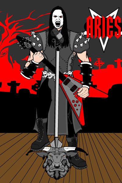
Tarkabarka too a very different and creative approach, giving us a lead singer/guitarist from a heavy metal band.
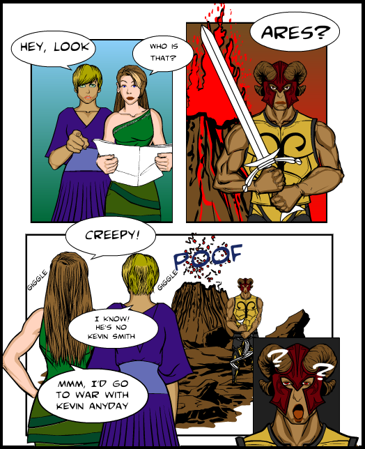
UnknownBlackPaper's tribute to "Xena" and "Hercules" star Kevin Smith, who played Ares on those series, is very cool. I still can't imagine how you get comic book panels out of this app, but I'm glad you do.
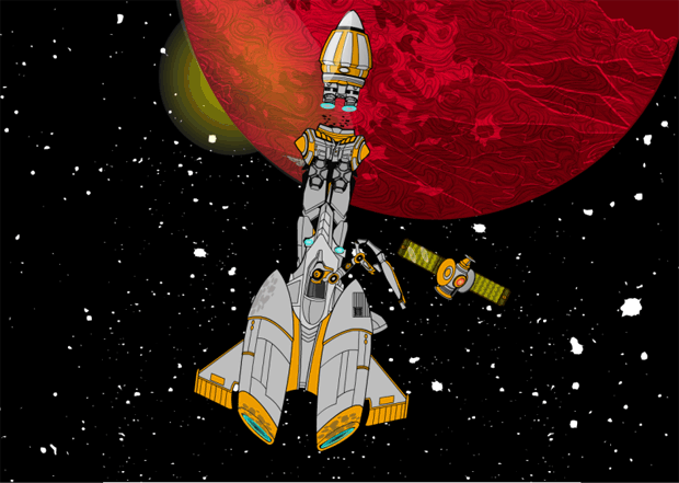
Watson Bradshaw also gave us a unique and nifty approach with his Aries rocket:
Finally, Zyp turned in an illustration he titled "The Hammer", which features one of my all-time favorite faces and poses. Just look at that guy! He seems to have stepped right out of "Braveheart", I love it.
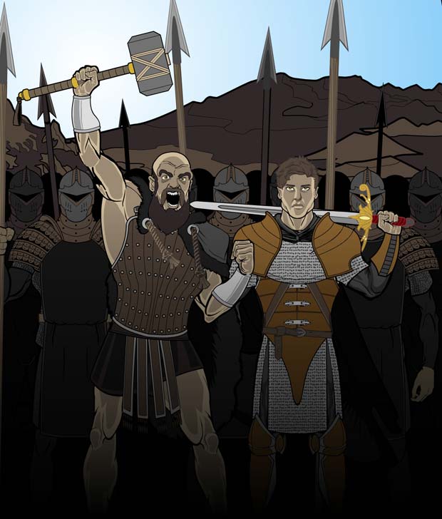
You can see why I am having such a tough time with this one!
So now I've gone through and reviewed them all a third or fourth time, and came up with the following Final Finalists: D, Zyp, Sean David Ross, Martian Blue, MLS, and Sutter Kaine. And in the finest tradition of cowardly judges everywhere, I'm going to punt the final call on to you:
You can only vote for one, and you can only vote once. This poll will close at midnight Mountain Time, so if you want to corral your friends you'd best act quickly!
Here's my personal rundown of those six; I look forward to hear your thoughts on who should win and why in the comments.
- D: I love the concept and the execution. On the downside, the actual mech itself isn't anything terribly new or exciting.
- Zyp: Love everything about it, but does it really say "Aries"?
- Sean David Ross: A creative and unusual pose with excellent features that really have the WOW factor. However, some of the small bits bother me, like the bisection of the figure by the horizon line, the tangential touching of the hand and forearm, and how small the sword and its arm are.
- Martian Blue: Whimsical and cool. My only hesitation is that the headdress looks more like a deer than a ram.
- MLS: I can't lie, I really can't find anything to critique on this one. It's just that without knowing the backstory of the Zodiac Commandos and that this guy is their mountain-goat-like climber, you might not get why this has anything to do with Aries.
- Sutter Kaine: A testament to the power of minimalism, but for some it might be TOO simple.
So there you have it! Now VOTE, and sound off in comments about why the one you picked should win.

