Most great super-hero costumes (our stock and trade here at HeroMachine.com) rely on a distinctive chest insignia or logo. Which brings us to this week's question:
For me, a great logo must do three things:
- It must be instantly recognizable.
- It must instantly and clearly identify the character who wears it.
- It must look awesome.
I've put together a list of logos that I think accomplish all three of these criteria, along with a brief discussion of each.
-

The Avengers: Team logos are tough, because they have to work on a number of disparate characters. And when it comes to a large group of heroes with a pre-existing, strong identities, the challenge is even harder. I always thought the Avengers logo did a good job of reflecting the essentially corporate nature of the team (corporate in terms of "This is how we do things"). However, since it was only rarely used on anything but a Quinjet, I'd have to give this one a pass, even though it's a nice design.
-

Batman: You know you've got a great logo when the character it adorns swings wildly between the campy Adam West version and the gritty Frank Miller "Dark Knight", while the logo basically stays the same. You know you've got a great logo when it changes less often than the one for Coke. You know you've got a great logo when it's instantly recognizable with no other adornment to people all over the world in numbers even Santa Claus would envy. And finally, you know you've got a great logo when it must be described as "The Goddam Bat Logo".
The stylized lines, the crisp symmetrical curves, the exceptional melding of both bat and man-with-cape, and its ability to be easily drawn even by young children while still looking distinctive and menacing, all make this one of the all-time greats in any genre.
-

Captain America: While I like this symbol for Cap, and it's certainly a logo, it's not really his insignia. I have to take points off for not wearing it on his chest, even though it looks cool and definitely is identified with the character.
-

Fantastic Four: I look forward to hearing from DOOM on why this would be a bad choice. Unlike the Avengers, however, the FF were designed from the ground-up as a team from the beginning. And it shows in both the design and usage of this logo. You'd think a four in a circle would be the equivalent level of challenge as composing the "Hot Pocket" jingle ("Hooooooot Pocket!" -- apologies to Jim Gaffigan), but it really works. Plus it's a bonus if one of your teammates can easily write it in the sky in flames. Well, until he died.
-

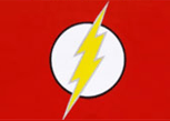
The Flash: I love this logo. The simple white circle sets off the bold diagonal lightning bolt very well, suggesting speed and power. It works great on its own, but it stands out even more against the striking red costume. The lightning is echoed in other costume elements, which also ties the whole costume together. Really, the Flash's logo serves as the organizing principle behind the entire costume, and that's darned impressive.
-

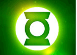
Green Lantern: The essence of a great logo is to strip away everything non-essential, until finally you are left with only the essence of what it signifies. The GL logo exemplifies that approach. Nothing is extra, nothing detracts from the hammer-like simplicity, nothing gets in the way of the core message. It looks great, it's easily recognizable, and it says everything you need to know about the being behind it.
-

The Incredibles: Like the Fantastic Four (whom they closely resemble, let's be honest), The Incredibles have the advantage of being designed as a team from the get-go. And like the FF, each of the team members has the logo emblazoned right in the middle of the chest where you typically find a solo character's. That speaks of a certain kind of unity only a family can have, a commonality of purpose (and good fashion sense!). Of course, these guys also had Edna on their side doing the design work, so that's a bonus. And the logo definitely looks great.
-

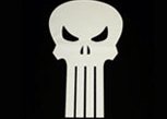
The Punisher: Love him or hate him, you have to admit the Punisher has a kick-ass logo. Oh sure, it sort of reminds you of a buck-toothed pirate flag, but would you dare say that to Frank Castle's face? I thought not. The black and white colors reflect the character's essential world view, and the skull leaves no doubt as to what business he's in. It all manages to look distinctive, even though it's just a skull on black.
-

Captain Marvel (SHAZAM): Like the Flash logo that followed it, Captain Marvel's bold diagonal lightning bolt both inspires and defines a core aspect of the character. The simple gold and red are even more appropriate here, as it suggests a bit of the classical influence behind his powers. Like the man-child himself, this logo bespeaks simplicity, strength, and hard-striking directness.
-

Spider-Man: For me, Spidey's logo hit its best stride with the introduction of the Black costume, when it was the only real design element to be had (besides the eyes). But no matter which version, I've always liked how it gave off just the right mix of creepy and cool.
-

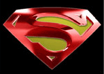
Superman: Like Batman, Superman's logo has remained pretty much the same since the relatively early days and endures as one of the most recognizable symbols in the world. Unlike Batman's, though, this one is hard to draw and a little unimaginative. I mean, it's his initial in a diamond. I can get that at the rodeo. I realize this is blasphemy, but there you have it, folks, I'm a blasphemer.
-

TransformersAutobots: Admit it, that steely robot face unnerves you. Go ahead, admit it. I'll hold you. -

Wonder Woman: Like Superman's, Wonder Woman's logo has always struck me as a bit unimaginative. I mean, it's just her initials. On the plus side, and also like Superman's, this would make an excellent tramp stamp tattoo.
-

X-Men: I include it here because this logo worked so incredibly well for the movies as a way of branding and marketing the team. However, it never really worked all that great in the comics as far as the costumes go. They didn't even put it on the Blackbird plane!
This is a tough choice; all of these are classic, beloved, and awesome logos. It's tough to get past the Big Two, Superman and Batman, because they've been around so long and their characters have been so incredibly successful. But for the reasons I gave, I'm going to pass on Superman. Your first initial in a diamond ain't gonna cut it no matter how many billions of dollars you've made, folks. Not in MY town!
So the standard has to become Batman's extraordinarily distinctive bat-logo, which is so cool it's used to summon him. Comparing it side-by-side with the others on the list, I have to eliminate all of them except for Green Lantern and the Flash. And not just because they were two of my favorite childhood comics!
Out of those two, I have to drop the Flash's, as I think it's a bit derivative of the Shazam logo that preceded it. Not as bad as the Golden Age Flash's, of course, but still, it's darn close.
Green Lantern, like Batman, has a logo that easily stands out and can be reproduced by almost anyone. Both incorporate the concept name of the character into the design (big bat for Batman, big green lantern for GL). I honestly think they're very close, although certainly Batman's had a much wider and longer exposure.
However, I'm going to shock the world by going with GL! Why? Ultimately they're very, very close, but the white circle tips the scale for me over the oval yellow. I like that GL's logo is symmetrical both horizontally and vertically.
But by all means, please chime in below with people I left out and shouldn't have, or people I included and shouldn't have, or why one of the other nominees would be a clearly better choice. I look forward to hearing from you!

