If you're feeling particularly brave, you might check out the new layout I've been coding for HeroMachine 3. It's based on the excellent work of Mark Shute, who did a wonderful usability test for me a while back, and Jim Marcus of LiquidCrack.com who actually designed the whole thing (which I posted about in September). BIG thanks to both of those guys!
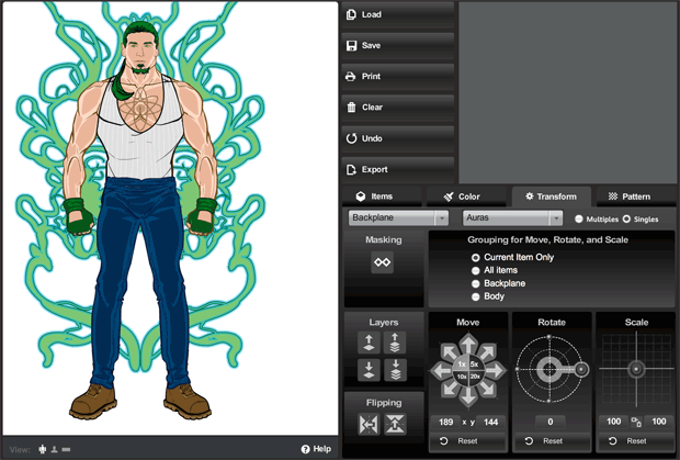
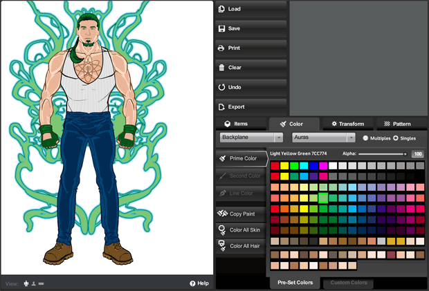
Here are a couple of screen grabs for those of you who can't or don't want to visit the live preview directly:


As you can see, it's a lot slicker and more modern. The old gold and brown color scheme and layout were always intended as nothing more than placeholders for whatever design we ultimately settled on. And it's certainly possible that at the end of the day, UGO will have their in-house design team do something different altogether.
In addition to the look-and-feel update, I've also moved some buttons around in an effort to group like-functions together more clearly and to make the initial user interface cleaner and less confusing. To that end I've moved the "Color All Skin/Hair" buttons to the new unified Color tab. I moved the "Flip" and "Mask" buttons to the Transform tab. I removed the "outline" feature since no one ever seems to use it, and it didn't really work like I'd hoped.
I also added a few new features. For instance, you can now flip items vertically in addition to flipping them horizontally. Not sure how useful that'll be, but it's fun! I removed the "arrow action" buttons that were intended to be what you'd click to make the manual entries for alpha, location, rotation, and scale take effect, but which were rarely understood or used. Instead, you now just enter your value and either tab out of the box, or click on some other part of the screen, or hit ENTER, and whatever you typed in there will be implemented.
I also updated some of the more irritating text box limitations. For instance you can now manually enter a location figure up to 1000 if you want (note that this would put the item completely off-screen). And you can now enter negative numbers in the Rotate box.
Please give it a look-see and let me know what you think, any major bugs you find that weren't there before, good and bad on the layout or control locations or really anything else you can think of. Thanks in advance for your feedback!

