Just to be different, this week I am going to list all the Finalists (including the winner) for "Character Contest 49: Scorpio", and then at the end just say which one won. Because that's the way rock and roll rebels like me like to roll. And rock. Or something.
Anyway, off we go!
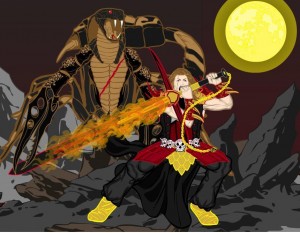
Asder was on FIRE this week, and as proof, here's his "Man vs. Scorpion King" complete with a sword that is on fire. There's a lot to like about this illustration, from the design of the characters themselves to the cool flame effect to the nice way he's pointed the toes on the human figure. A great example of "set design" in action.
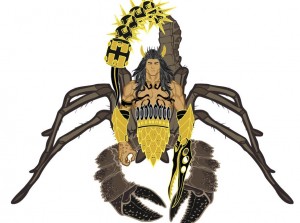
Asder's second Finalist is "Scorpion King". He (it?) looks totally cool and I think shows a lot of creativity in how it's assembled. The mace and spike tail in particular is wicked.
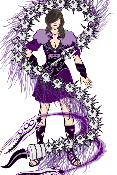
Finally, Asder gives us "The Scorpio Whip". I love that he uses "scorpio" in the name of the weapon instead of the character, just the kind of left-field thinking I cherish. And the whip itself kicks ass, a very cool concept well executed. The color scheme is tight as well, and supports the entire illustration perfectly. Excellent job, Asder!
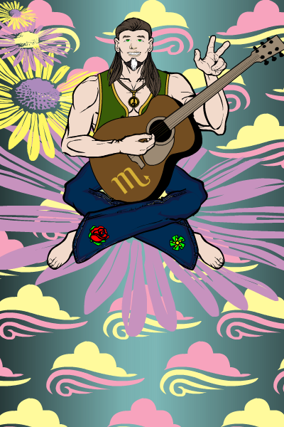
Atomic Punk's "70s Scorpio", a musical genius from the Age of Aquarius generation, makes great use of non-traditional elements in the sky and background to sell the story. I think it's a real hoot.
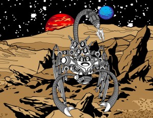
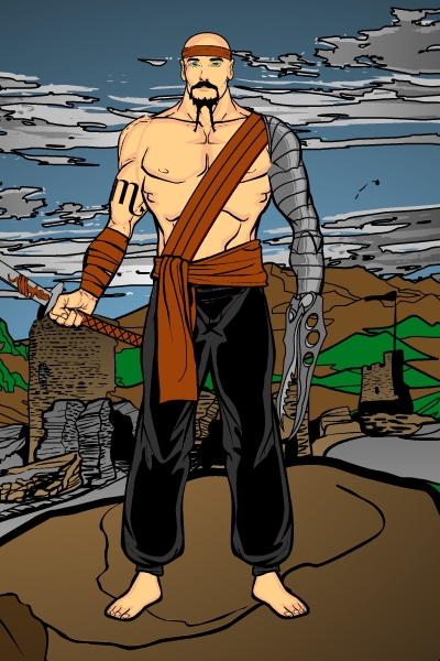
I love Cliff's imaginative use of pieces to build his "Scorpio BioMech". The planetoidal (I just made that word up!) surface is also very convincing and helps bring the entire concept together.
Galahad's "Scorpio" doesn't do anything crazy, but is a solid and interesting character nonetheless. You don't always have to push the program to breaking (literally in all too many cases) to get something cool.
"I forget what name I use" put together a very cool "Black Scorpion" image for us. The purple-to-black gradient in the background works great, and the back-lighting that I think MMI introduced us to in his "Cemetery" series is also a wonderful touch. Very moody and effective.
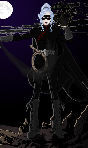
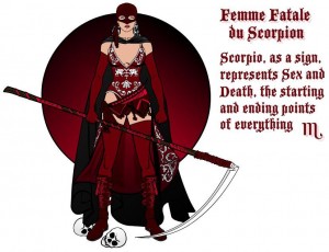
Speaking of MMI, his run of great characters continues this week with "Femme Fatale du Scorpion". I love the vaguely "Zorro" vibe, tight color scheme, and overall character design.
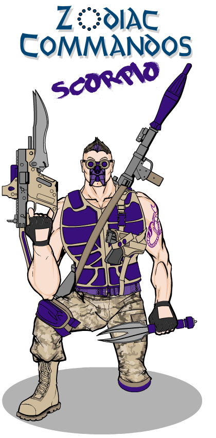
MLS promises a series of Zodiac-inspired characters, and that's the thing most likely to prompt me to actually doing the series each month. I like the improvised blade-gun Scorpio wields here a lot. The knife is also cool.
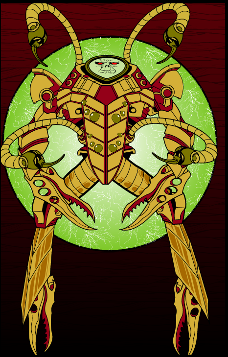
Like Cliff, Rancid assembled his own figure out of bits and pieces, and I love it. The face in particular is both eerie and intimidating, with the unusual flat-plane orientation. I think the background rocks too, an excellent energy-portal type of effect. The colors chosen also work great together and help bring it all home. Nice job Rancid!
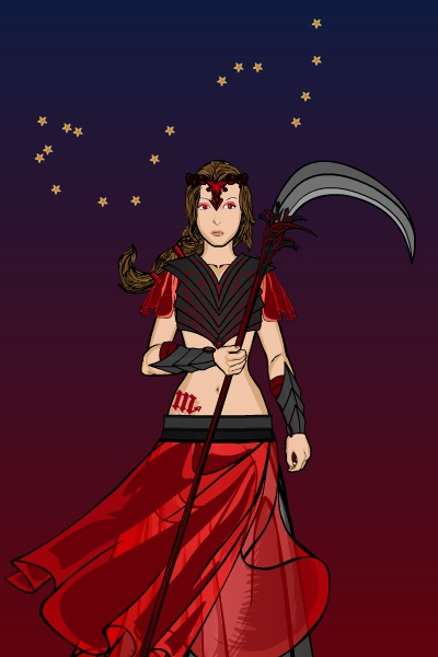
Finally, Sandcat makes great use of the two-color gradient and a hand-placed constellation to perfectly complement the innocence of "Scorpio".
Which brings us to the announcement of our winner. Namely, Asder! With that many great entries I couldn't deny the guy, and from the beginning I though "The Scorpio Whip" was a fantastic illustration.
So congratulations to Asder for the win, to all the Finalists for their great work, and to everyone who had the courage to share your work with the wide world!

