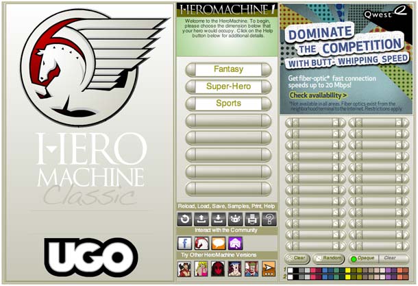
UGO has just launched updates to all of the previously existing HeroMachine "Editions". They share a more coherent set of controls and links now, and are all viewable at the larger browser size of the standard UGO layout. That's the good news. On the downside (depending on your perspective!), they all also now included ads in the upper right section.
I think the original HM Classic actually comes out the best for the revamp:

It has a simplicity that's still appealing, and which I think gets lost somewhat with the much more complex later iterations. I also still think that the Real Life Edition has the best overall look, the designers (i.e. not me) did a great job on that one. Finally, the changes we discussed here for the 2.5 version are now live as well, I think they look great largely due to your input. Thanks again for that!
Anyway, it was fun strolling down memory lane while doing these, I hope you get the chance at some point to go back through them.

