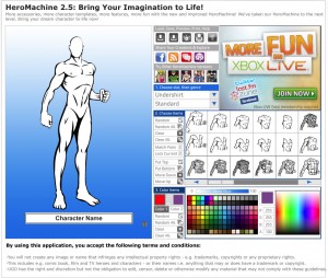
I've been asked by UGO to redesign the page for HeroMachine 2.5, which still gets the bulk of the visits. Obviously the whole UGO.com site has been redesigned, and the old comic-booky type feel just doesn't work any more. And the 2.5 version, while pretty much retired, is starting to look dated.
Plus, the new UGO pages are much wider than they used to be, which gives me more room to put stuff. Part of the frustration in the current layout is how tight the space was between that big honkin' ad in the upper right corner and the character window. Plus, I was never happy with how the controls were labeled, I thought they weren't very intuitive with just the icons. I was also asked to keep the links to the other HM versions (currently living outside the application itself) and the social networking links UGO now has on all their pages.
So, here's my first attempt at a full-width version. I am also working on one that would fit in the left-center wide column of the basic UGO page, with a right column for their usual assortment of links and features. That one's not ready yet, but I wanted to get some feedback on this one if possible before I submit it. Let me know what you think. The "new", default UGO header would be at the top, from the black bar down to the main big ad.


