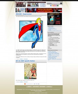
Here's the second pass at the site redesign, taking into account the feedback from the last time around. Changes include:
- new treatment in the top nav bar, including appropriate images for the three main HM versions;
- different color treatment for the main logo;
- icons for the "get connected" area below the search bar;
- Dateline below the headline for each entry;
- Tag line beneath each entry with links to comments and categories;
- Bottom UGO links area.
I'm feeling pretty good about this iteration, I'll incorporate whatever good suggestions come up in comments, then write it up and send it to UGO for feedback. There's still an awful lot of bright in-your-face color going on at the top thanks to the ads, but there's not really a way around that unless I go total grayscale for the top area, and I'm not willing to de-emphasize the links to the other HM versions enough for that.


