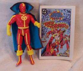
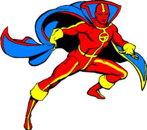
The hardest thing about art is knowing when to stop. The second hardest thing about art is trying to do fashion design with industrial grade road painting rigs. The people behind Red Tornado, sadly, learned neither lesson:


Someone should've stopped earlier with the stripes in honor of Maxim One, because he looks like roadkill via Maxim Two.
The question that has puzzled Super Hero Fashion Philosophers for years has been whether the red on Red Tornado is "flesh" or clothing, because if it's flesh, suddenly the garish yellow stripes are not decorative, but utilitarian, in that they are actually clothing. And not just any clothing, but the only clothing standing between us and a serious case of Naked Robot.
Which in turn makes you realize, queasily, that he's got the worst case of one-strap-thongism this side of a Lady GaGa concert. Seriously, I don't want to know where that groin strap goes. Just ... no.
Given that unsettling concept, we'll opt to believe that in fact the red isn't skin, but some sort of cloth-like covering. Yes, I know, he's basically just a giant toaster oven and thus human norms of sexuality and clothing don't apply, but even toasters should be afforded a little dignity.
That only gives relief from a moral outrage standpoint, however, not from fashion outrage, because the stripes just don't make sense. Not only are there too many of them, but why do the pants stripes go under his briefs? It's a very awkward break. And integrating the chest insignia with the central stripe just adds to the confusion, tying it down instead of making it stand out like a good insignia should.
The whole effect of the striping is to make what should be a character who's all about chaotic twisting and dynamism instead look static and tied down (literally). Lines of consistent thickness and uniform direction serve to stabilize him when that's the exact opposite of what a tornado should be.
OK, let's leave off the stripes for now ... Wait, of course I am kidding. How could I talk about stripes and not deal with that ridiculous arrow on his head? Seriously, look at that thing. It's ludicrous. What is it pointing at? His nose? Are we to assume that his tortured twisting is going to fling off an astounding stream of Red Snot? I have no idea what that thing is supposed to denote, graphically. It's just a big yellow distraction.
Oh, and why do the leg stripes continue through his boots, making the cuffs look like they're just sewn on without being, you know, actual boot tops? I hate that.
Moving on, I also hate his cape. It's way too big for a guy who functions in high winds. Believe me, at my wedding we did an outdoor dance, and my wife's veil (which was nowhere near as voluminous as that gigantic blue number Tornado sports) almost beat me to death. Of course, for some unknown Comic Book Physics reason, only his bottom half rotates, which whatever, but still, the cape goes all the way down. Wouldn't that grab him by the throat and choke him to death? Ha ha, he's an android, he doesn't need air, sucker! Unfortunately.
The black stripe on the cape mirrors the same thickness as the out of control, and yet too-controlled, yellow stripes of the costume, again destroying anything dynamic that might have arisen from the design. Plus it's black. Why black, when there are no other black elements to the costume? Because the rest of the cape is blue, which also doesn't appear anywhere else!
See, thinking about it makes you dizzy, just like you would be in a real tornado! And that is pure, beautiful genius.
Stay twisty, my friends.
(All art and the Red Tornado character are © DC Comics, Inc.)

