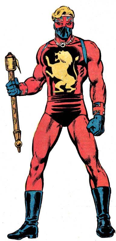
Once the mightiest empire in the world, Great Britain’s fortunes have ebbed and flowed over the centuries, so it’s only appropriate that their national super hero has as well. I don’t know that any character, however, has hit the extremes in terms of costume design like Captain Britain has. He started out pretty bad, with this muddle of an outfit:

It ranges from uninspired (the boots and the lower body) to the confusing (what the hell is going on with those gloves?) to the good idea poorly executed (Union Jack mask) to the outright bad (rampant golden lion) to the utterly cheesy (hip disco necklace). There’s too much red throughout, and the nods to the flag are either too half-hearted to be good, or too smushed to be worthy like on his gloves. Having the only gold appear in the massive chest emblem is a problem as well, making him seem out of balance somehow, a visual tic only exacerbated by the non-symmetrical animal design. And yes, I know, that’s how they are on real shields, but it doesn’t work on a chest piece like this.
Finally, I don’t know what the heck is going on with those shoulder straps. Does he have some sort of tiny backpack holding his wallet and other necessities in there? Is it a harness for his mace club weapon thingie? I don’t know, but it’s irritating.
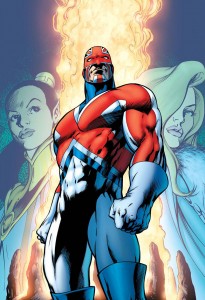
Luckily things got better for Captain Britain — much, much better. In fact, I would say this revision of his costume is right up there with my all-time favorite super-hero outfits:
Everything about this character design is great. The Union Jack looks like a national symbol, boldly splashed across his massive upper body, loud and defiant. Echoing it in the helmet is also great, and note how much more effective the design is by covering the head, with the bars across the entire piece of head gear, rather than cut off halfway like in the first attempt. And carrying the stripe through to the big chin guard is just genius, I love it.
The lower body was in danger of being as lackluster as the original design, but the addition of the simple thigh boots — as much as I usually hate thigh boots — really punches it up. You also don’t have any extraneous colors to distract from the color design. You just get smacked in the face with the red, white, and blue. And with no chest insignia or animal logos to get in the way, you can’t escape the in-your-face “I am GREAT BRITAIN!” effect of the bars and the colors. Just a great, great costume.
Plus, the design works with the character’s new physical form, as well. The first iteration looked wimpy and pasty by comparison, sort of an “excuse me” kind of guy. This fellow is going to beat the snot out of you, and if you don’t like it, too late, you have a fist in your pie-hole.
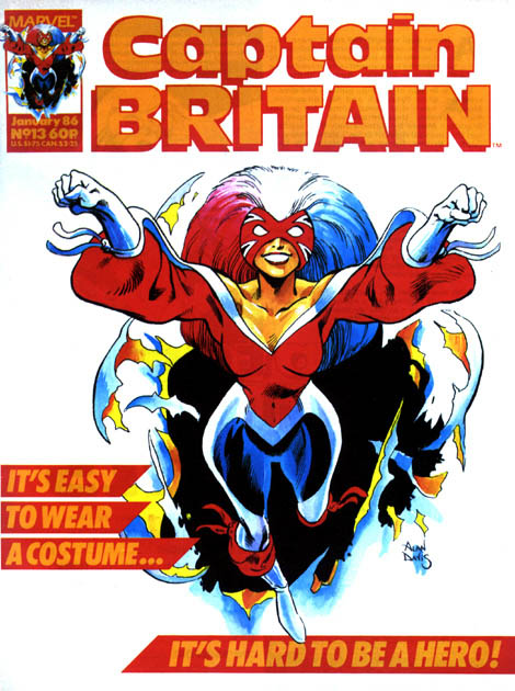
Unfortunately, Marvel was unable to leave well enough alone. With the restless yearning for novelty that characterizes way too much of the industry, they tried to drive sales by having Captain Britain’s role taken over by a woman in a new costume (his sister, I think). I don’t so much have a problem with female heroes, as I do with the outfit they made her wear. We went from one of the best designs in history to … this:

Contrary to the cover verbiage, I would bet that it is, in fact, very hard to wear that particular outfit, because the involuntary gag reflex any normal human would have while donning it would surely get in the way.
We’ll start with the hair. Oh my goodness, the hair. I’m all for a consistent color theme, but that’s just wrong. That poor girl … somewhere a Troll doll is weeping for its missing locks.
You’ve still got the Union Jack pattern in the mask, but once again we’ve lost the top and the chin piece, so you’ve just got the eye and side-of-the-head covering, all of which is obscured by that god-awful hair. It’s back to the same problem as the original design, where half measures fall fully short once again.
Worse, they’ve completely abandoned the design of the torso, keeping the colors but not the graphical arrangement. The result is a plain-Jane, ordinary blouse that doesn’t shout either “super” or “Britain”. And I don’t know what the heck is going on with that white strap attaching the gloves to the plunging v-neck, but it makes absolutely no sense at all.
The problems continue as you go down the body. I hope those are jodhpurs, because otherwise that woman has some serious health issues. You don’t go from that waist to those hips in any kind of normal human anatomy. And the white striping doesn’t help with that, either, it makes it look as if she’s about to expunge a balloon from her pants.
Finally, the part that bugs me the most are the … scarves? … attached to her calves in lieu of boots. Why would anyone do that? What purpose does that serve? It’s both pointless and distracting, and it makes me want to rip them off her for use in covering up that ridiculous wig.
Luckily at some point Marvel went back to the middle design, proving that even in a genre built on change, sometimes the good things last.
(Images and characters © Marvel Comics. Thanks to reader Gero for the suggestion to profile Captain Britain!)


Long Live Cap’n Crunch
The female version is none other than Betsy Braddock, otherwise known as Psylocke.
http://en.wikipedia.org/wiki/Betsy_Braddock#Fictional_character_biography
My Gag Reflex didn’t keep lunch down when I saw the final version.
The person that designed the last costume must have had vision problems.
Thanks for using my suggestion, Jeff. I hadn’t ever seen the first of the two costumes for the first Captain. It’s almost as bad as the second Captain’s, and I didn’t think something like that was even possible…
Hey, it could be worse…
It could be Britannic!!!
Union Jack will always be superior.
The guy redesign is pretty good. And the hair on the female — all I could think was “Austin Powers.”
What about Lionheart, for a better use of he lion/better female iteration? http://en.wikipedia.org/wiki/Lionheart_%28comics%29
Seems with the way things are going in the UK this may be the new “Captain Britain”
http://www.moonbattery.com/british-muslim.jpeg
I agree with Tophat. Union Jack is a kick @$$ character with a kick @$$ costume.
I would like to give a few comments on this, a couple of years later.
The guy that designed the second costume, Alan Davis, who drew the masterful Alan Moore run on CB where it first appeared, was actually the plotter and artist on the issues following Moore’s exit, which is where the female Captain ‘Psylocke’ Britain appeared.
He designed that one too. BOTH designs come from his mind…
I guess he had a bad day when he took that to the page.