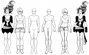
I'd like to get your feedback on two possible female templates. The image below has the two generic ones (with faces for reference) in the middle, then two sample characters with outfits on so you can see how they might look dressed.
The major change has been in the pose. We discovered that trying to put a female in the pose the male is in -- arms akimbo, held out from the body, weight evenly distributed, feet on the same level -- made her look very mannish, no matter what her body was like. At the end of the day, the point of this whole thing is to get a drawing that looks good, as if it were commissioned at a convention by a real comics artist, NOT to make my life easier. So I am probably going to have to abandon the concept that the poses would be exactly the same and that it would be up to the user to put it however they wanted. That's still possible, but I have to make the default image, I think, the best it can possibly be for those who don't want to go the extra mile.
I'm curious to get your input on that, as well.
Anyway, here goes:
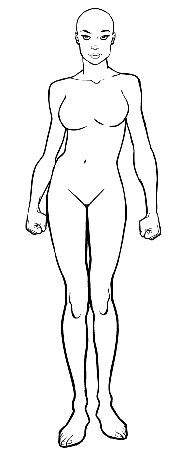
Which (if either) do you like better? In addition to the physical differences (the one on the left is more full-figured, the one on the right more athletic), obviously the major thing is the pose itself -- feet together, hips and shoulders parallel to the ground, weight evenly distributed, versus one hip and shoulder cocked, feet slightly set back from one another.
Here's the hip-cocked one up close:

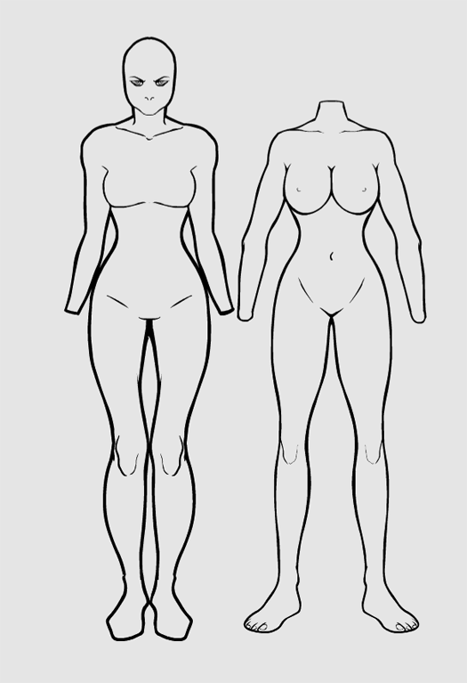
For reference, on the right is the Zombie Female body and on the left was my last attempt at a new female template:

Some of the criticism before was that the new body was too tensed-up, so hopefully the latest version will come across as more relaxed and confident.
I look forward to hearing your thoughts on these.


