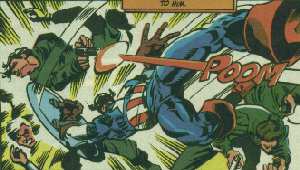
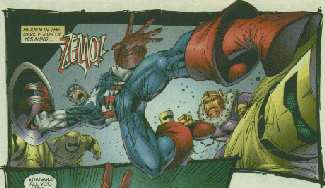
Under the theory that you can never have too much whiny sniping and carping, I wanted to follow up last week's post showing how Rob Liefeld can't even swipe right with another example, this time featuring the exact same character as in the original from Jim Steranko's "Captain America". First, the original and then Liefeld's version:


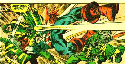
(Edited to add: Actually that first image is from James Frey's "Nomad" mini-series, here's Steranko's original original:)

Let's start with the background, because Rob has taken a lot of flak over the years for his complete incompetence when it comes to setting (and rightfully so, I hasten to add). It's doubly ironic, then, that he fumbles his chance to mimic that exact same technique from Steranko Frey -- note how in the original all you have is a white gradient with yellow-highlighted action lines radiating out from Cap's tremendous assault. You'd think Rob would be salivating at the opportunity to skip having to draw annoying background details and yet, he blows it by going the opposite way.
Frey's and Sterenko's lack of background lets the figures hold center stage, and their lines help accentuate the action, enhancing it by making it seem like Cap has exploded right into the middle of these guys. Contrast that with Liefeld's plain blue line-free (for once) plane and the difference is striking.
First of all you've got blue, a calming color, instead of the original angry yellow. You're trading BLAM! for HOHUM.
The absence of lines also lessens the impact of Cap's body, removing that sense of explosion and dynamism and instead giving the impression he's just floating serenely along on a pretty blue-sky day. Perhaps Baron Zemo (being played here by The Great Pumpkin) will even pick him some daisies.
Next let's take a look at the arrangement of the figures surrounding our hero. Steranko and Frey have one guy getting a shield to the gut while his gun fires across Cap's torso, making you feel like he's really in a scrum here. Liefeld moves that figure completely behind the shield and makes him vertical, to the point where you can't even tell if he's getting hit or he's just background clutter.
The other Steranko and Frey figures are all hunched over or flung into the air or grasping their heads in agony -- clearly Cap has jacked these thugs UP son! Liefeld, meanwhile, has only one guy actually getting hit and the other background figures leaning in as if ready to jump on our boy. That's much less aggressive and assertive, making you wonder if Cap's really in control here or just passing through.
And don't even get me started on what the hell is wrong with Cap's crotch; I can only assume he put on Bucky's g-string by mistake and his sausage thighs are thus slowly getting squeezed mercilessly.
Finally, I want to end with another puzzling example of Rob breaking from his usual mode and having it fall flat on him.
We all know he hates to draw feet and usually leaves them out whenever remotely plausible (or even not so plausible). And yet while Steranko Frey cuts Cap's boot off with the panel border, Liefeld draws it in, striking a thug in the face.
What I don't understand is, why?
First of all it's not a very good foot, looking like something ripped off a stubby-toed dwarf and slapped onto the end of Cap's ankle, but let's set that aside for the moment. Visually the effect of this design decision is that it appears as if Cap's flinging himself into the panel border and stopping there cold. The panel is a visual barrier, and when you further complicate that with a figure getting smashed into it, you end up with a guy looking like he's just drop-kicked a wall.
In Steranko Frey's original, Cap's foot breaks the panel border, leading the viewer to think the action has carried all the way through and is continuing beyond where we can see. You get a very dynamic feeling, with the forced perspective of Captain America flinging himself with great force from the background, through the foreground, and on out to the side to continue the rampage, dudes flying willy-nilly all over the place and exploding lines and yellow explosions and guns and POOM! and dizZAM that rocks!
With Liefeld you've got Spastic Man having a seizure and kicking a wall, full stop, action over, those guys in the funny hat are about to kick his ass.
This is the opposite effect from last week, where the figure's foot was stuck in the top of the frame. The difference is largely because Steranko has all the action zooming from left to right, and the foot breaking the panel border carries that on through. "My Face Is Being Eaten By A Starfish Man", by contrast, had his foot jammed into the top while all the action was from top-right to bottom-left, so he looked like he was literally hung up and blowing in the wind. This layout is all about a guy jumping into and through a gang of opponents; jamming his foot into the border instead of breaking it stops the action when what is needed is to allow it to continue.
It's the difference between copying a layout and understanding it. It's the difference between mastering your tools and being a slave to them. It's the difference between a true artist and a hack.
And it's yet another reason why I hate Rob Liefeld's art.

