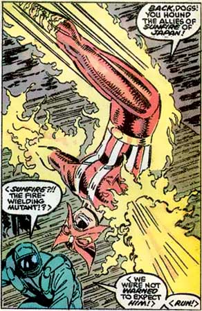
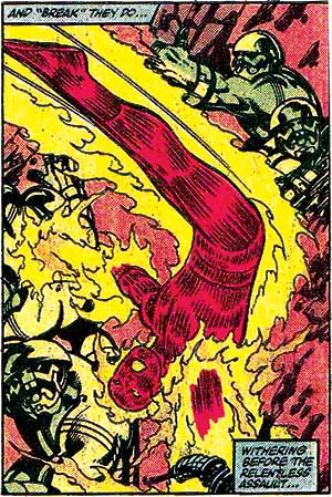
Pretty much every artist has at some point "derived inspiration from" or "paid homage to" or "flat out stolen" work from another artist, but the thing is that when you do that, what you come up with still has to be good. Which Rob Liefeld is not. As evidence, and with a tip-o-the-hat to Glenn Hauman, here are two panels for you to compare. The first is from Rob Liefeld's New Mutants #93, cover date September, 1990, and the second is from Fantastic Four #247, by John Byrne back in October 1982:


I don't have a problem with him lifting the design from Byrne, but I do think this is a great example of his deficiencies as an artist. Let me run down the reasons for you.
The most obvious is the feet, which Liefeld has simply lopped off with a panel border. The problem with doing that is that it reduces the effectiveness of the layout; Byrne's Human Torch seems to really be flying freely, whereas Liefeld's "My Face Is Being Eaten By a Starfish" Man seems to literally be trapped by the page itself. Visually a comic book panel has power, able to not only frame the action but affect it. When your eye hits his feet cut off at the ankles intersecting that frame, your brain translates that into "trapped". And that's directly at odds with what this entire illustration is supposed to convey -- freedom, flight, movement, dynamism. Byrne's character looks like he's flying into the panel, while Liefeld's looks like he's hanging from it.
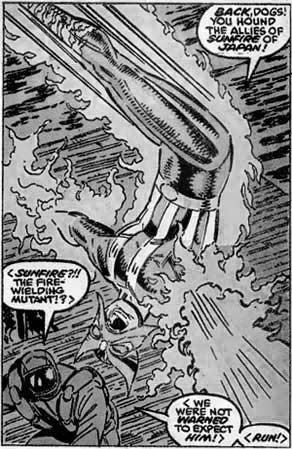
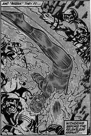
The other problems are harder to see in color, and since the artists can't control that, I've desaturated them for you so you can more easily see what I am talking about:


Look at the linework in the figures' legs. Byrne has all the lines traveling parallel to the figure's legs, whereas Liefeld has them cross-hatched. Partly that's on the inker, of course, but you see the same thing in his pencils, so I think it's probably safe to say this is something Liefeld intended. But look at what a difference it makes -- visually Byrne's lines enhance the movement of the figure, all flowing in the same direction, while Liefeld's are completely at odds with everything else going on. The result is that your eye comes to a jarring halt there, and you have to mentally sort out the dissonance. It's a little thing that makes a big difference.
You also see a similar dynamic at work in the background. Liefeld takes a lot of flak for his complete lack of skill at drawing anything remotely resembling a scene. But here you see why that's important. Byrne isn't exactly laying out the mosaic of the Taj Majal here, but the figures and the rock lines all help reinforce the flow of action. Even the angle of the background lines in Byrne's drawing is steeper than Liefeld's, and that matters because the steep angle reinforces the idea that this is fast, frenetic action taking place. The closer lines are to horizontal the more your brain thinks "horizon", which we translate as flat, placid, still, and serene. Not emotions you want to invoke when you're drawing a fire-flinging character zipping around blasting bad guys.
Finally, I want to point out the arrangement of the figures within the panel. Notice how Byrne's Torch has his head overlapping the shoulder of the background figure at the bottom left of the panel while his rump overlaps the other guy in the upper right. That again reinforces the idea of depth, showing you that Johnny Storm is flying above the other guys. That overlapping is an important tool in the illustrator's kit.
Which, naturally, means it's nowhere to be found in the Liefeld panel. Look at the missed opportunity with the starfish mask touching the outline of the background character's shoulder, but not overlapping it. The effect is much, much weaker when your lines do that -- touching lines set up a tension as your mind tries to sort out which object is on top of which. Byrne drives the point home like a thunderbolt, while Liefeld's pussyfooting around leaves the whole composition on shaky ground.
Yes, these are all fairly minor points, but the thing is, they matter! Liefeld leaves us with a much, much weaker comic book panel than Byrne's, because all those little things add up. That's what being a really good comic book artist is all about -- knowing your craft and making use of every weapon in your arsenal to make the most effective illustrations and pages you possibly can. Liefeld, due to either laziness, haste, or incompetence -- or all three -- badly misses the mark even when he has the shortcut of looking at a better artist's layout to start with.
Rob Liefeld can't even steal right, and that's reason number twelve why I hate his art.

