Many thanks to everyone who submitted one of the 69 entries for the most recent Character Contest! I really appreciate your creativity, hard work, and willingness to share your creations with the rest of us. After the jump I'd like to show you the illustrations I thought were most deserving of an Honorable Mention and of course the winner.
I often say "Less is more" or "Simplify simplify simplify", so I want to start out by highlighting Gene's "Talon4", which I think exemplifies that idea:
This is a very clean, simple character design that works. When you do something more minimalist like this you have to be sure that every element is there for a reason, supporting the overall effect. When you do that, everything seems more solid, more relevant, and more powerful. Sticking with a basic two-color palette also helps here, avoiding distracting gew-gaws and bright baubles. Well done, Gene!
You see something similar at work in Melis' "Spellweaver", a take on a Stargate-style magic user that uses a smaller set of colors, consistent costume design, and a clarity of vision that evokes a very powerful character:
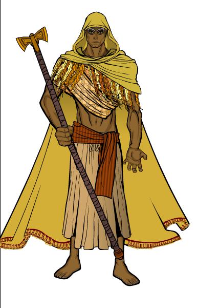
For me, looking at both of those brings me a very strong sense that there is a story behind the character, that they're "real" in some kind of sense beyond just a random collection of bits and pieces. I got the same feeling from RJ_MCD's "Frank2", and I just had to laugh looking at his mystic Seventies vibe:
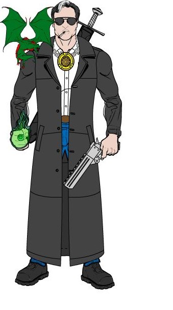
I don't know for sure how he got the glowing ring but I bet it involved Courvoisier somehow.
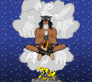
Several folks designed characters reminiscent of Native American magic, which I thought was pretty neat. The most ambitious of these (as usual) came from Hammerknight. Sometimes "scenes" can come off looking kind of cheesy, but Hammerknight's gets the job done nicely by keeping clutter to a minimum and making great use of color and transparency to make some very convincing cloud effects. Plus, the alternate pose is one of the most convincing I've seen yet:
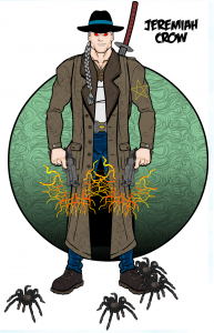
Imp (who seemingly could win every week) took a somewhat harder-edged approach to the culture, with his spell-blasting revolvers and enchanted spiders:
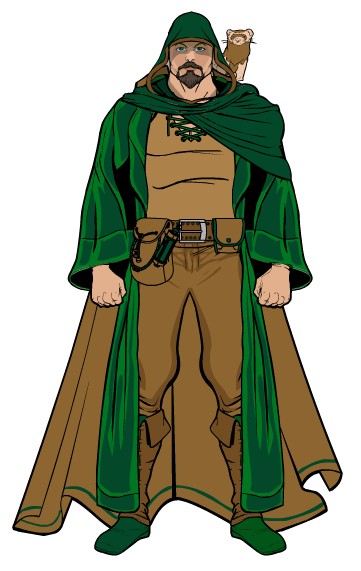
Finally, I wanted to finish up the Honorable Mentions with Doomed Pixel's excellent steampunk "Wizard":
That's just an excellent design. The cogs in the upper right corner make a great element to anchor the composition, and help to further set the stage. All of the item choices are spot-on, including the hand-crafted belts and thigh pouches. I also liked the use of the arm-cannon as a glove with the hand slapped on, that worked to bulk him out and make him look like a different body template. You've again got a pretty consistent color palette. Just a really nice, solid, pleasing, entertaining design.
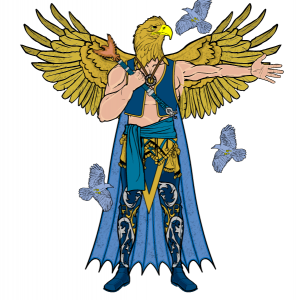
And now, your winner. As soon as I saw this one I liked it very much, and at the end of the day had to go with it. I give you Abadon's "Argral, God of the Eagles":
All the "big" stuff works here, from the outfit to the birds flitting around to the logo-topped hand-staff (which looks awesome). But the little stuff works too, especially the way he was able to take the looking-left eagle head and tie it in to the gesturing arm to make it look like the figure is calling someone over. This isn't the most ambitious submission ever, but it works as a character and as an illustration very well. Congratulations to Abadon, who now gets to choose either any one item to be included in HeroMachine 3 or to have a caricature of his head put into the program. And kudos as well to all of our Honorable Mentions, as well as the other great entries that I didn't have room for on this page. Well done, everyone, and many thanks for your time!

